


Help picking kitchen paint colors
hjf234
11 years ago
Sort by:Oldest
Comments (3)
Related Stories
COLORColor Palette Extravaganza: Room-by-Room Help for Your Paint Picks
Take the guesswork out of choosing paint colors with these conveniently collected links to well-considered interior palettes
Full Story
COLORPick-a-Paint Help: How to Create a Whole-House Color Palette
Don't be daunted. With these strategies, building a cohesive palette for your entire home is less difficult than it seems
Full Story
COLORPaint-Picking Help and Secrets From a Color Expert
Advice for wall and trim colors, what to always do before committing and the one paint feature you should completely ignore
Full Story
COLORPick-a-Paint Help: How to Quit Procrastinating on Color Choice
If you're up to your ears in paint chips but no further to pinning down a hue, our new 3-part series is for you
Full Story
COLORPick-a-Paint Help: 11 Ways to Mine Your World for Colors
Color, color everywhere. Discover the paint palettes that are there for the taking in nature, shops and anywhere else you roam
Full Story
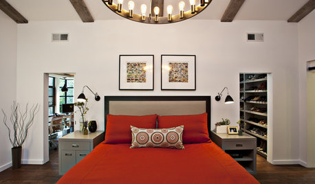
ENTRYWAYSHelp! What Color Should I Paint My Front Door?
We come to the rescue of three Houzzers, offering color palette options for the front door, trim and siding
Full Story
EXTERIORSHelp! What Color Should I Paint My House Exterior?
Real homeowners get real help in choosing paint palettes. Bonus: 3 tips for everyone on picking exterior colors
Full Story
Guest Picks: Give Your Home a Helping of Spring Greens
Celebrate garden growth with this collection of housewares and gardening gear in the shades of budding plants
Full Story
PRODUCT PICKSGuest Picks: Help Your Home Blossom With Floral Decor
Sprinkle hints of spring around your rooms with fabrics, wall coverings and more that recall nature's charms
Full Story
TURQUOISEHow to Pick the Right Blue Paint
Periwinkle, Turquoise, Midnight or Sky? Here's Help Choosing the Blue for You
Full StoryMore Discussions


MuleHouse
eam44
Related Professionals
Lafayette Kitchen & Bathroom Designers · White House Kitchen & Bathroom Designers · Bay Shore Kitchen & Bathroom Remodelers · Auburn Kitchen & Bathroom Remodelers · Crestline Kitchen & Bathroom Remodelers · Eagle Kitchen & Bathroom Remodelers · Franconia Kitchen & Bathroom Remodelers · Paducah Kitchen & Bathroom Remodelers · Billings Cabinets & Cabinetry · Rowland Heights Cabinets & Cabinetry · South Riding Cabinets & Cabinetry · Short Hills Cabinets & Cabinetry · Hermosa Beach Tile and Stone Contractors · Redondo Beach Tile and Stone Contractors · South Holland Tile and Stone Contractorsa2gemini