


Crazy Idea, Crazy Me? Both? Neither?
mamasheshe
11 years ago

Related Stories
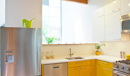
COLORCrazy for Color? Your Kitchen Cabinets Want In
Make over your kitchen in spectacular fashion with just colorful cabinet paint? Now there's a bright idea
Full Story
DECORATING GUIDESYour Decor: Crazy for Kilim
Accent Your Home With This Global Geometric Pattern
Full Story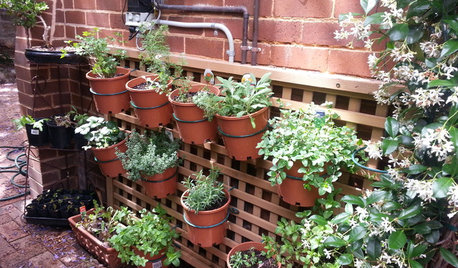
FARM YOUR YARD14 Crazy Places to Grow Edibles
Some Houzzers may lack ground for gardening, but they’re never short on imagination
Full Story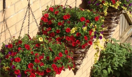
CURB APPEALCrazy for Colorful Cones: 5 Container Plantings Beyond the Bowl
Give even a small garden an exuberant vibe with hanging cones overflowing with blooming beauties
Full Story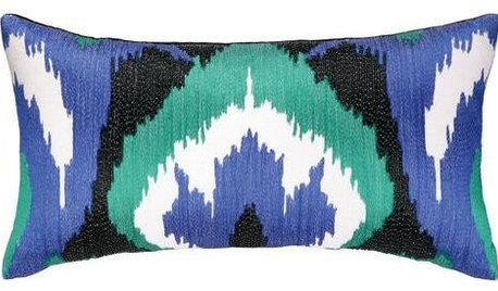
PRODUCT PICKSGuest Picks: Crazy for Cobalt
Hot in the design world and cool to the eye, cobalt-blue accessories and furnishings like these make a statement wherever they go
Full Story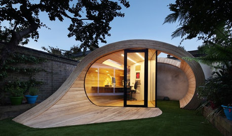
OUTBUILDINGSIs It a Shed? An Office? Neither — It’s a ‘Shoffice’!
This sinuous structure in a London backyard supports gardening and writing in a most unusual fashion
Full Story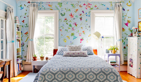
DECORATING GUIDESStroke of DIY Design Genius: 14 Crazy Cool Hand-Painted Walls
See how these homeowners used paintbrushes and permanent markers to create custom wallpaper
Full Story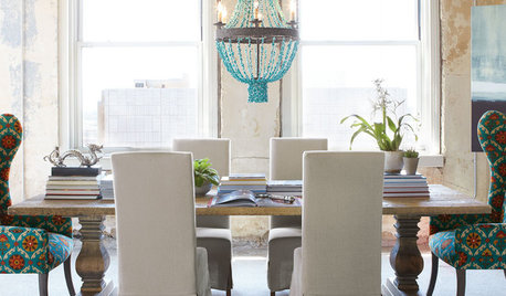
SHOP HOUZZShop Houzz: Stone Crazy for Turquoise
Treat yourself to the exotic new look of turquoise
Full Story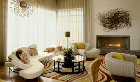
DECORATING GUIDESGo Crazy With Your Decorating — You'll Fit Right In
Trending in home looks everywhere: boldness and individuality. Get the scoop and see some adventurous examples here
Full Story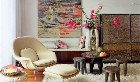
DECORATING GUIDES6 Ways to Get a Decorated Room You'll Both Love
Blending two different design styles? These decorating strategies will help you harmonize without compromising a successful result
Full StoryMore Discussions


mamashesheOriginal Author
mamashesheOriginal Author
Related Professionals
Flint Kitchen & Bathroom Designers · Lenexa Kitchen & Bathroom Designers · Owasso Kitchen & Bathroom Designers · Ramsey Kitchen & Bathroom Designers · Saratoga Springs Kitchen & Bathroom Designers · Fremont Kitchen & Bathroom Remodelers · Oklahoma City Kitchen & Bathroom Remodelers · Overland Park Kitchen & Bathroom Remodelers · Hawthorne Kitchen & Bathroom Remodelers · Manville Cabinets & Cabinetry · Prospect Heights Cabinets & Cabinetry · Richardson Cabinets & Cabinetry · Watauga Cabinets & Cabinetry · Wheat Ridge Cabinets & Cabinetry · Pacific Grove Design-Build FirmsmamashesheOriginal Author
CEFreeman
mamashesheOriginal Author
mamashesheOriginal Author
User
mlandrigan
jejvtr
mamashesheOriginal Author
eam44
User
User
User
User
User
User
User
eam44
User
lascatx
Gracie
suzanne_sl
User
chiefy
User
mamashesheOriginal Author
chiefy