


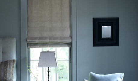
What do you think of this fabric for a roman shade?
redroze
14 years ago
Sort by:Oldest
Comments (35)
Related Stories
DECORATING GUIDESRoman Shades: The Just-Right Window Coverings for Summer
Calm and minimal, frilly or faux, There's a Roman shade for you
Full Story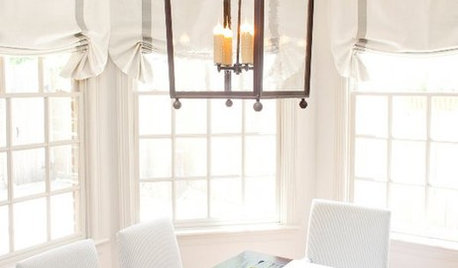
DECORATING GUIDESRooms Reign Supreme With Roman Shades
Relaxed or tucked into lavish folds, Roman shades triumph over plain curtains for a tailored, elegant window look
Full Story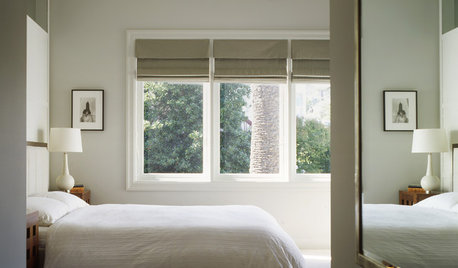
WINDOWSYour Windows: Roman Shades 101
Give your shades a personal touch with pattern, texture and trim
Full Story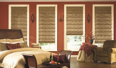
WINDOW TREATMENTSHow to Choose the Right Window Shades
Should you roll with rollers or do as the Romans do? This mini guide to choosing window shades can help
Full Story
SMALL KITCHENS10 Things You Didn't Think Would Fit in a Small Kitchen
Don't assume you have to do without those windows, that island, a home office space, your prized collections or an eat-in nook
Full Story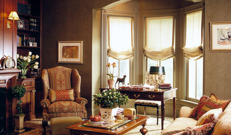
A Relaxed Shade Swoops In
Create a soft, casual look for your windows with gently draped Roman shades
Full Story
DOORSYour Door: Shades of Privacy and Light
Set the right scene with a woven roman shade for your glass door
Full Story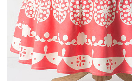
PINKGuest Picks: Think Pink for the Home
From delicate and soft to bright and punchy, pink hues add a cheerful element to any room
Full Story
WINDOW TREATMENTSBalloon Shades Float Into Fashion
Use these formal window treatments to add texture and luxury to traditional rooms
Full Story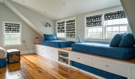
WINDOW TREATMENTSRoller Shades Raise the Curtain on Style
The humble window treatment is stealing the scene with fresh patterns, color and pizzazz
Full Story


redrozeOriginal Author
steff_1
Related Professionals
Hybla Valley Kitchen & Bathroom Designers · Town 'n' Country Kitchen & Bathroom Designers · Glade Hill Kitchen & Bathroom Remodelers · Honolulu Kitchen & Bathroom Remodelers · Lakeside Kitchen & Bathroom Remodelers · Phoenix Kitchen & Bathroom Remodelers · Placerville Kitchen & Bathroom Remodelers · Rolling Hills Estates Kitchen & Bathroom Remodelers · Skokie Kitchen & Bathroom Remodelers · York Kitchen & Bathroom Remodelers · Lindenhurst Cabinets & Cabinetry · Red Bank Cabinets & Cabinetry · Warr Acres Cabinets & Cabinetry · Redondo Beach Tile and Stone Contractors · Turlock Tile and Stone Contractorssteff_1
fin1
rhome410
redrozeOriginal Author
redrozeOriginal Author
plllog
redrozeOriginal Author
plllog
kateskouros
kateskouros
rhome410
oilpainter
rubyfig
Fori
redrozeOriginal Author
rubyfig
redrozeOriginal Author
plllog
elizpiz
redrozeOriginal Author
redrozeOriginal Author
plllog
mcraney
remodelfla
beekeeperswife
rosie
redrozeOriginal Author
elizpiz
redrozeOriginal Author
mcraney
redrozeOriginal Author
plllog
beekeeperswife