


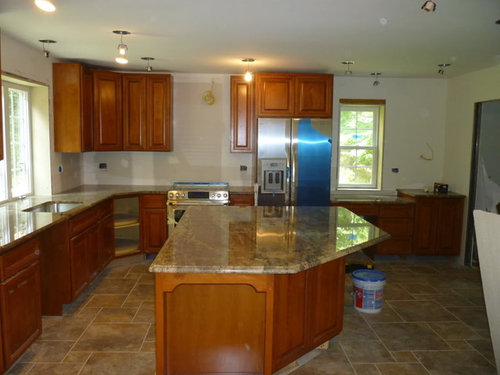
Backsplash attempt #1
allie22031
13 years ago
Sort by:Oldest
Comments (26)
Related Stories
KITCHEN BACKSPLASHESHow to Install a Tile Backsplash
If you've got a steady hand, a few easy-to-find supplies and patience, you can install a tile backsplash in a kitchen or bathroom
Full Story
MATERIALSKitchen Ideas: How to Choose the Perfect Backsplash
Backsplashes not only protect your walls, they also add color, pattern and texture. Find out which material is right for you
Full Story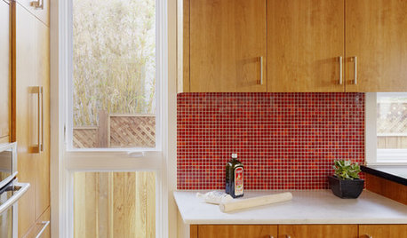
KITCHEN DESIGNKitchen Color: 15 Ravishing Red Backsplashes
Bring some zing to your kitchen with a backsplash of ruby-colored tiles or back-painted glass
Full Story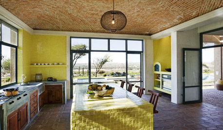
KITCHEN DESIGNKitchen Color: 7 Sensational Yellow Backsplashes
Warm up a white kitchen or add some zing to wood tones with a backsplash that glows
Full Story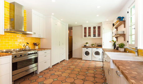
KITCHEN DESIGNNew This Week: 4 Surprising Backsplash and Countertop Pairings
Make your kitchen workspace stand out with colored ceramic tile, back-painted glass, butcher block and more
Full Story
KITCHEN BACKSPLASHES10 Top Backsplashes to Pair With Concrete Counters
Simplify your decision making with these ideas for materials that work well with concrete
Full Story
KITCHEN COUNTERTOPS10 Great Backsplashes to Pair With Stainless Steel Counters
Simplify your decision-making with these ideas for materials that work well with stainless steel counters
Full Story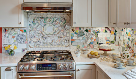
MOST POPULARKitchen of the Week: Broken China Makes a Splash in This Kitchen
When life handed this homeowner a smashed plate, her designer delivered a one-of-a-kind wall covering to fit the cheerful new room
Full Story
KITCHEN DESIGNHow to Lose Some of Your Upper Kitchen Cabinets
Lovely views, display-worthy objects and dramatic backsplashes are just some of the reasons to consider getting out the sledgehammer
Full Story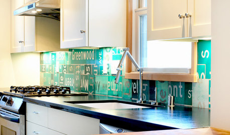
BEFORE AND AFTERSReinvent It: Street Signs Become a Lively Kitchen Backsplash
City surplus as unique decor? A Seattle family said sure, and now it's the star of their remodeled kitchen
Full Story
numbersjunkie
cardamon
Related Professionals
Arcadia Kitchen & Bathroom Designers · Georgetown Kitchen & Bathroom Designers · Beachwood Kitchen & Bathroom Remodelers · Bethel Park Kitchen & Bathroom Remodelers · Rancho Cordova Kitchen & Bathroom Remodelers · Spanish Springs Kitchen & Bathroom Remodelers · Sweetwater Kitchen & Bathroom Remodelers · Sharonville Kitchen & Bathroom Remodelers · Burr Ridge Cabinets & Cabinetry · East Moline Cabinets & Cabinetry · Foster City Cabinets & Cabinetry · Warr Acres Cabinets & Cabinetry · North Bay Shore Cabinets & Cabinetry · Channahon Tile and Stone Contractors · Foster City Tile and Stone Contractorslimom_2bts
bill_vincent
davidro1
dianalo
bill_vincent
bill_vincent
Sharon kilber
paintergirl94
marcy96
homechef
allie22031Original Author
twosit
allie22031Original Author
sayde
User
marcolo
allie22031Original Author
padola07
pharaoh
misplacedtxgal
lyvia
fran1523
marcy96
melissastar