


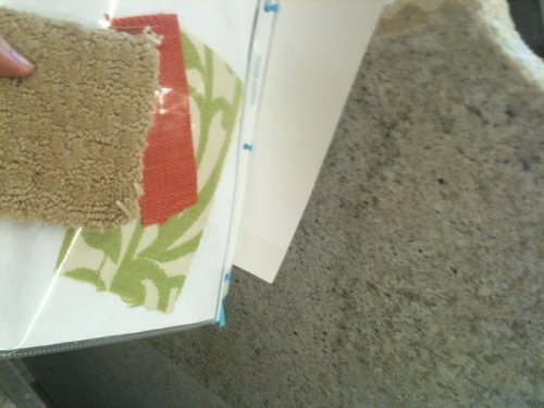
Design theory help: what does counter style do to space?
marg143
9 years ago
Related Stories

INSIDE HOUZZHow Much Does a Remodel Cost, and How Long Does It Take?
The 2016 Houzz & Home survey asked 120,000 Houzzers about their renovation projects. Here’s what they said
Full Story
REMODELING GUIDESBathroom Workbook: How Much Does a Bathroom Remodel Cost?
Learn what features to expect for $3,000 to $100,000-plus, to help you plan your bathroom remodel
Full Story
HOUZZ TOURSHouzz Tour: Istanbul Apartment Does a Double Take
Two apartments and two contrasting design styles combine in a single stunning home with a view in Turkey
Full Story
KITCHEN DESIGNKey Measurements to Help You Design Your Kitchen
Get the ideal kitchen setup by understanding spatial relationships, building dimensions and work zones
Full Story
MOST POPULAR7 Ways to Design Your Kitchen to Help You Lose Weight
In his new book, Slim by Design, eating-behavior expert Brian Wansink shows us how to get our kitchens working better
Full Story
UNIVERSAL DESIGNMy Houzz: Universal Design Helps an 8-Year-Old Feel at Home
An innovative sensory room, wide doors and hallways, and other thoughtful design moves make this Canadian home work for the whole family
Full Story
BATHROOM DESIGNKey Measurements to Help You Design a Powder Room
Clearances, codes and coordination are critical in small spaces such as a powder room. Here’s what you should know
Full Story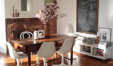
DECORATING GUIDESVintage Modern: What Does It Mean?
Objects With History Warm Up Clean Lines in Fresh, Eclectic Interiors
Full Story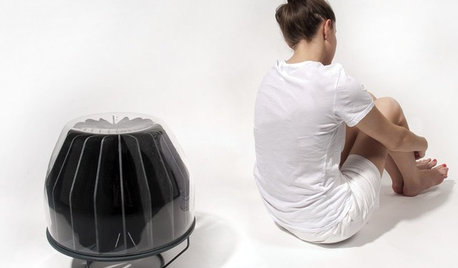
GREEN DECORATINGA New Breed of Space Heaters Helps You Stay Toasty in Style
Shiver no more with style-conscious heaters that let you turn down the thermostat and snuggle up in warmth
Full Story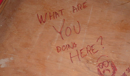
FUN HOUZZDoes Your Home Have a Hidden Message?
If you have ever left or found a message during a construction project, we want to see it!
Full StoryMore Discussions


marg143Original Author
marg143Original Author
marg143Original Author
marg143Original Author
GenB
marg143Original Author
badgergal
marg143Original Author
greenhaven
romy718
Hydragea
nosoccermom
marg143Original Author
greenhaven
marg143Original Author
greenhaven
greenhaven
marg143Original Author
greenhaven
romy718
marg143Original Author
greenhaven
marg143Original Author