


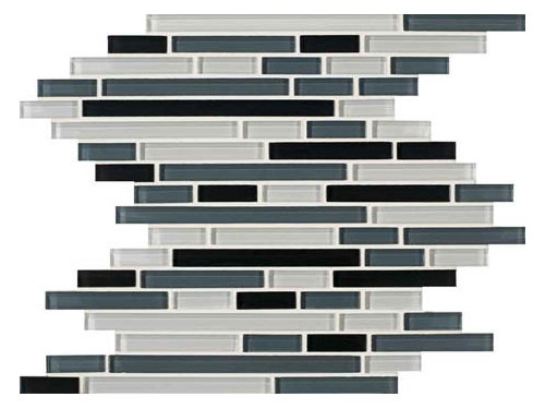
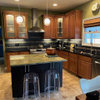
Please help me with backsplash choice!!
scoutfinch72
14 years ago


Sort by:Oldest
Comments (24)
Related Stories
LIFE12 House-Hunting Tips to Help You Make the Right Choice
Stay organized and focused on your quest for a new home, to make the search easier and avoid surprises later
Full Story
ORGANIZINGDo It for the Kids! A Few Routines Help a Home Run More Smoothly
Not a Naturally Organized person? These tips can help you tackle the onslaught of papers, meals, laundry — and even help you find your keys
Full Story
REMODELING GUIDESWisdom to Help Your Relationship Survive a Remodel
Spend less time patching up partnerships and more time spackling and sanding with this insight from a Houzz remodeling survey
Full Story
COLORPick-a-Paint Help: How to Create a Whole-House Color Palette
Don't be daunted. With these strategies, building a cohesive palette for your entire home is less difficult than it seems
Full Story
MOST POPULAR7 Ways to Design Your Kitchen to Help You Lose Weight
In his new book, Slim by Design, eating-behavior expert Brian Wansink shows us how to get our kitchens working better
Full Story
BATHROOM MAKEOVERSRoom of the Day: See the Bathroom That Helped a House Sell in a Day
Sophisticated but sensitive bathroom upgrades help a century-old house move fast on the market
Full Story
COLORPaint-Picking Help and Secrets From a Color Expert
Advice for wall and trim colors, what to always do before committing and the one paint feature you should completely ignore
Full Story
SELLING YOUR HOUSE10 Tricks to Help Your Bathroom Sell Your House
As with the kitchen, the bathroom is always a high priority for home buyers. Here’s how to showcase your bathroom so it looks its best
Full Story
KITCHEN DESIGNHere's Help for Your Next Appliance Shopping Trip
It may be time to think about your appliances in a new way. These guides can help you set up your kitchen for how you like to cook
Full Story
HOUZZ TOURSMy Houzz: Saturated Colors Help a 1920s Fixer-Upper Flourish
Bright paint and cheerful patterns give this Spanish-style Los Angeles home a thriving new personality
Full StoryMore Discussions
lilyinmtl
lilyinmtl
Related Professionals
Montrose Kitchen & Bathroom Designers · North Versailles Kitchen & Bathroom Designers · Cherry Hill Kitchen & Bathroom Designers · Creve Coeur Kitchen & Bathroom Remodelers · Durham Kitchen & Bathroom Remodelers · Kuna Kitchen & Bathroom Remodelers · Omaha Kitchen & Bathroom Remodelers · Panama City Kitchen & Bathroom Remodelers · Pueblo Kitchen & Bathroom Remodelers · Beaumont Cabinets & Cabinetry · Foster City Cabinets & Cabinetry · Lakeside Cabinets & Cabinetry · Wildomar Cabinets & Cabinetry · Spartanburg Tile and Stone Contractors · Riverdale Design-Build Firmsplllog
blondelle
cindyinct
chihuahua6
msrose
remodelfla
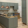
scoutfinch72Original Author
muscat
scoutfinch72Original Author
blondelle
muscat
scoutfinch72Original Author
blondelle
plllog
muscat
lady_iles
stretchad
scoutfinch72Original Author
scoutfinch72Original Author
plllog
straycat2010
remodelfla