


What does @ 50% of paint color mean?
Peke
10 years ago
Featured Answer
Sort by:Oldest
Comments (22)

Cindy103d
10 years ago
cookncarpenter
10 years agoRelated Professionals
Hillsboro Kitchen & Bathroom Designers · Pueblo Kitchen & Bathroom Remodelers · Skokie Kitchen & Bathroom Remodelers · Weston Kitchen & Bathroom Remodelers · Weymouth Kitchen & Bathroom Remodelers · North Chicago Kitchen & Bathroom Remodelers · Hawthorne Kitchen & Bathroom Remodelers · Effingham Cabinets & Cabinetry · Forest Hills Cabinets & Cabinetry · Hanover Park Cabinets & Cabinetry · Salisbury Cabinets & Cabinetry · Chattanooga Tile and Stone Contractors · Dana Point Tile and Stone Contractors · Edwards Tile and Stone Contractors · Oak Hills Design-Build Firms
williamsem
10 years agocookncarpenter
10 years agoJbrig
10 years agowilliamsem
10 years agobreezygirl
10 years agonosoccermom
10 years agosayde
10 years agoPeke
10 years agoVertise
10 years ago
foodonastump
10 years ago
Bunny
10 years agoVertise
10 years agoPeke
10 years agoUser
8 years agolast modified: 8 years agoartlover2333
8 years agolast modified: 8 years ago PRO
PROSombreuil
8 years ago
merrymissmary
3 years ago
millworkman
3 years agoPeke
3 years ago
Related Stories
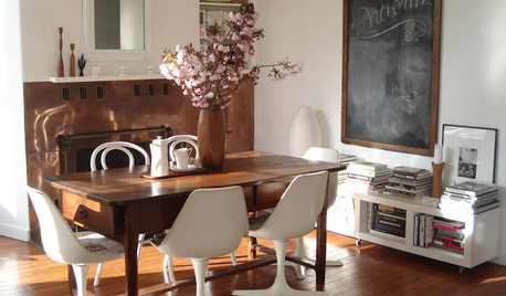
DECORATING GUIDESVintage Modern: What Does It Mean?
Objects With History Warm Up Clean Lines in Fresh, Eclectic Interiors
Full Story
INSIDE HOUZZHow Much Does a Remodel Cost, and How Long Does It Take?
The 2016 Houzz & Home survey asked 120,000 Houzzers about their renovation projects. Here’s what they said
Full Story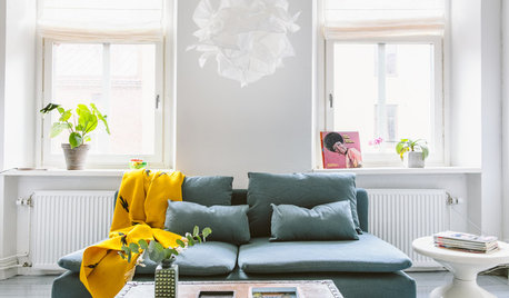
HOMES AROUND THE WORLDMy Houzz: Simplicity and Meaning in a City Apartment in Sweden
Essential and treasured items provide just enough personality for this medical student’s 3-room flat in Gothenburg
Full Story
REMODELING GUIDESContractor Tips: What Your Contractor Really Means
Translate your contractor's lingo to get the communication on your home project right
Full Story
MOST POPULARWhen Does a House Become a Home?
Getting settled can take more than arranging all your stuff. Discover how to make a real connection with where you live
Full Story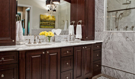
REMODELING GUIDESBathroom Workbook: How Much Does a Bathroom Remodel Cost?
Learn what features to expect for $3,000 to $100,000-plus, to help you plan your bathroom remodel
Full Story
KITCHEN DESIGNHow Much Does a Kitchen Makeover Cost?
See what upgrades you can expect in 3 budget ranges, from basic swap-outs to full-on overhauls
Full Story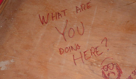
FUN HOUZZDoes Your Home Have a Hidden Message?
If you have ever left or found a message during a construction project, we want to see it!
Full Story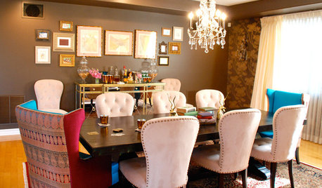
FEEL-GOOD HOMEDoes Your Home Make You Happy?
How to design an interior that speaks to your heart as well as your eyes
Full Story
LIFEYou Said It: ‘Just Because I’m Tiny Doesn’t Mean I Don’t Go Big’
Changing things up with space, color and paint dominated the design conversations this week
Full StoryMore Discussions


2LittleFishies