


Design Around This #21: Bold Patterned Tile - Post Designs Here
cawaps
11 years ago
Related Stories
LANDSCAPE DESIGNSee a Pattern Here? It's Conceptual Gardens, for Art's Sake
Make a brilliant impression with artful landscape designs that celebrate the avant-garde
Full Story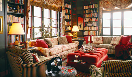
PATTERNGo for the Bold: 14 Great Ideas for Patterned Upholstery
Dare to distance yourself from neutral, solid furniture fabrics for rooms that spring to life
Full Story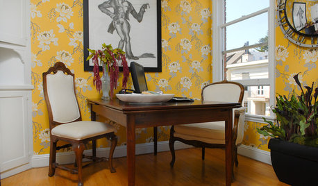
DECORATING GUIDESRooms Spring to Life With Bold Floral Patterns
No shrinking violets here. These fearless patterns show that flowers can give power to everything from English cottages to modern lofts
Full Story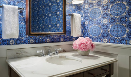
BATHROOM DESIGNYes, You Can Go Bold With Wallpaper in a Powder Room
The smallest room in the house can make the biggest design impact. Here are 10 of our favorite papered powder rooms
Full Story
DECORATING GUIDESBold Patterns: Harlequin and Argyle
Go Subtle or Big With Diamond Patterns on Wall, Window, Furniture or Floor
Full Story
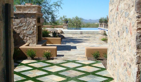
BATHROOM DESIGNHex Tiles: Big and Bold in the Bath
Six-sided tiles are huge now and popping up in increasingly creative bathroom installations. What will designers do with them next?
Full Story
PATTERNDesign Details: Herringbone Around the Home
Add interest and class to backsplashes, floors, walkways, and even the fireplace
Full Story
TILEWorld of Design: How Modern Geometric Designs Are Reinventing Cement
Intricate and eye-catching, the patterns of today’s cement tiles mark a break with their past while preserving an age-old technique
Full Story
LIVING ROOMSNew This Week: 5 Living Rooms Designed Around the Fireplace
Overcome one of design’s top obstacles with tips and tricks from these living rooms uploaded recently to Houzz
Full Story
TILENew Tile Trends Play With Pattern and Geometry
See tile designs from brazen stripes and plaids to delicate florals, as manufacturers around the world show their latest
Full Story

purplepansies
cawapsOriginal Author
Related Professionals
Agoura Hills Kitchen & Bathroom Designers · North Versailles Kitchen & Bathroom Designers · Sun City Kitchen & Bathroom Designers · 20781 Kitchen & Bathroom Remodelers · Green Bay Kitchen & Bathroom Remodelers · Lincoln Kitchen & Bathroom Remodelers · Mesquite Kitchen & Bathroom Remodelers · Omaha Kitchen & Bathroom Remodelers · Overland Park Kitchen & Bathroom Remodelers · Alton Cabinets & Cabinetry · Aspen Hill Cabinets & Cabinetry · Billings Cabinets & Cabinetry · Jefferson Valley-Yorktown Cabinets & Cabinetry · Mount Holly Cabinets & Cabinetry · Woodland Design-Build Firmspurplepansies
cawapsOriginal Author
sochi
cawapsOriginal Author
purplepansies
purplepansies
sochi
cawapsOriginal Author
sochi
purplepansies
oldbat2be
pricklypearcactus
palimpsest
palimpsest
cawapsOriginal Author
cawapsOriginal Author
purplepansies
kittycatpaws
cawapsOriginal Author
cawapsOriginal Author
sochi
purplepansies
a2gemini
ae2ga
cawapsOriginal Author
sochi
ae2ga
palimpsest
cawapsOriginal Author
ae2ga
ae2ga
purplepansies
purplepansies
dilly_ny
eam44
purplepansies
eam44
dee850
cawapsOriginal Author
ae2ga
cawapsOriginal Author
cawapsOriginal Author
pricklypearcactus
angie_diy
ae2ga
pricklypearcactus
pricklypearcactus
cawapsOriginal Author