


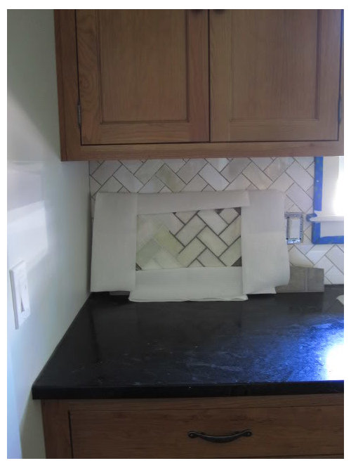
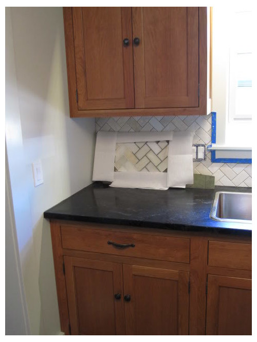
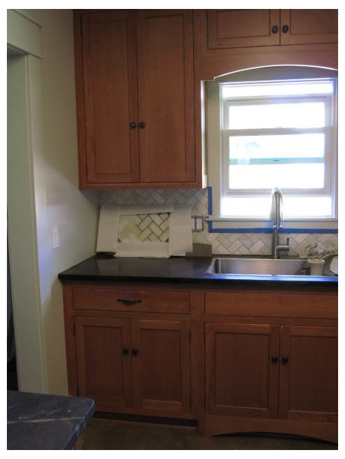
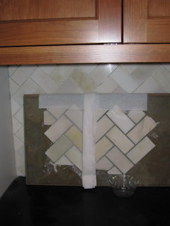
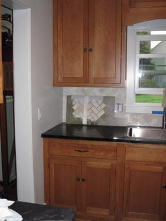
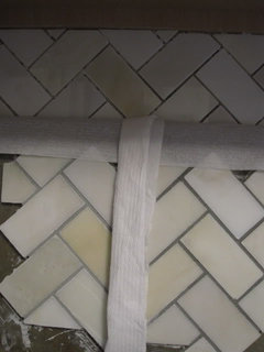
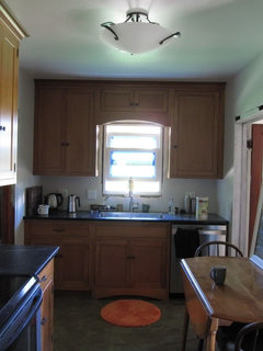
Samples of grouted herringbone backsplash, please give feedback
enduring
12 years ago

Featured Answer
Sort by:Oldest
Comments (43)

Daicey
12 years agomarcolo
12 years agoRelated Professionals
Euclid Kitchen & Bathroom Designers · Freehold Kitchen & Bathroom Designers · Adelphi Kitchen & Bathroom Remodelers · Forest Hill Kitchen & Bathroom Remodelers · Biloxi Kitchen & Bathroom Remodelers · Idaho Falls Kitchen & Bathroom Remodelers · Pico Rivera Kitchen & Bathroom Remodelers · Vista Kitchen & Bathroom Remodelers · Alton Cabinets & Cabinetry · Cranford Cabinets & Cabinetry · Ham Lake Cabinets & Cabinetry · Lackawanna Cabinets & Cabinetry · Beachwood Tile and Stone Contractors · Redondo Beach Tile and Stone Contractors · Pacific Grove Design-Build Firmsleela4
12 years agobrickton
12 years agodee850
12 years ago
enduring
12 years agoenduring
12 years agoboxerpups
12 years ago
function_first
12 years agopricklypearcactus
12 years agoerinct
12 years agomarcolo
12 years agobrianadarnell
12 years agohonorbiltkit
12 years agowolfgang80
12 years agolazydaisynot
12 years agoboylanite2
12 years agopupwhipped
12 years agoenduring
12 years ago
Emily
12 years agodee850
12 years agoenduring
12 years agodianalo
12 years agoenduring
12 years agompagmom (SW Ohio)
12 years agobjturner27
12 years agobreezygirl
12 years agolazydaisynot
12 years agoenduring
12 years agodesertsteph
12 years agobreezygirl
12 years agoMajra
12 years agoellendi
12 years agoboxerpups
12 years agoenduring
12 years agobadgergal
12 years agolfielder54
12 years agoenduring
12 years agoonerae
12 years agoabbeys
12 years ago
Bunny
12 years agoangie_diy
12 years ago

Related Stories
REMODELING GUIDES9 Ways Grout–Yes, Grout–Can Add to Your Design
Choose From a Palette of Grout Colors for a Warm, Unified Look
Full Story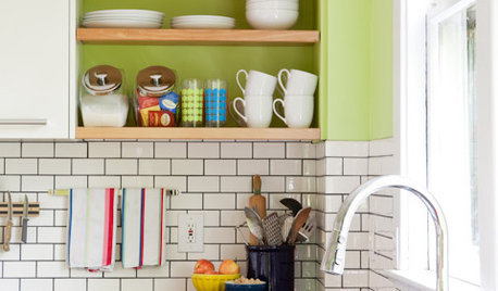
KITCHEN DESIGNSubway Tile Picks Up Gray Grout
Heading into darker territory, subway tile offers a graphic new look for kitchens, bathrooms and more
Full Story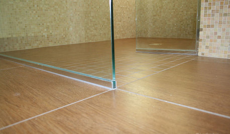
TILEEpoxy vs. Cement Grout — What's the Difference?
Grout is grout, right? Nope. Cement and epoxy versions have different appearances, durability and rules of installation
Full Story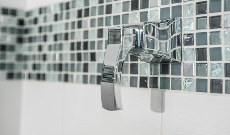
TILE3 Key Steps for Grouting That Looks Its Best
Get your grout right to keep your tile beautiful and for an installation that will last
Full Story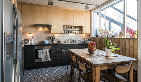
KITCHEN DESIGNA Two-Tone Cabinet Scheme Gives Your Kitchen the Best of Both Worlds
Waffling between paint and stain or dark and light? Here’s how to mix and match colors and materials
Full Story
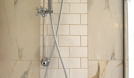
BATHROOM DESIGNConvert Your Tub Space Into a Shower — the Tiling and Grouting Phase
Step 3 in swapping your tub for a sleek new shower: Pick the right tile and test it out, then choose your grout color and type
Full Story
KITCHEN DESIGNThe Future of Backsplashes
Grout is out. Continuous sheets of glass, stone, metal and porcelain are saving cleaning time and offering more looks than ever
Full Story
DIY PROJECTSDIY Backsplash Makeover: Get a New Tile Look for Less Than $50
Give old tile a painted faux-stone facade for a brand-new look at a superaffordable price
Full Story
KITCHEN DESIGN8 Top Tile Types for Your Kitchen Backsplash
Backsplash designs don't have to be set in stone; glass, mirror and mosaic tiles can create kitchen beauty in a range of styles
Full Story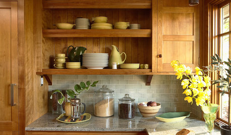
KITCHEN BACKSPLASHESHow to Choose a Backsplash for Your Granite Counters
If you’ve fallen for a gorgeous slab, pair it with a backsplash material that will show it at its best
Full StoryMore Discussions


marcolo