


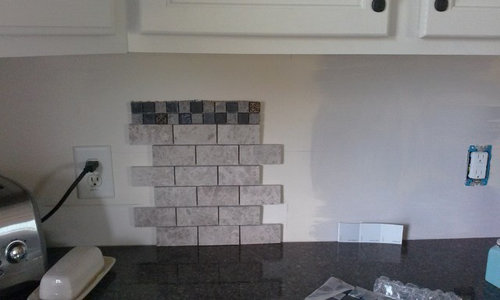
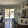
Problems with paint, plus backsplash or not?
greenhaven
9 years ago

Sort by:Oldest
Comments (35)
Related Stories
REMODELING GUIDESThe Hidden Problems in Old Houses
Before snatching up an old home, get to know what you’re in for by understanding the potential horrors that lurk below the surface
Full Story
LANDSCAPE DESIGNProblem Solving With the Pros: How to Build a Garden in an Urban Canyon
Skyscrapers, noise and deep shade create an unlikely sweet spot for a timeless green retreat in New York City
Full Story
ECLECTIC HOMESHouzz Tour: Problem Solving on a Sloped Lot in Austin
A tricky lot and a big oak tree make building a family’s new home a Texas-size adventure
Full Story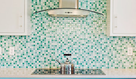
KITCHEN DESIGN9 Popular Stovetop Options — Plus Tips for Choosing the Right One
Pick a stovetop that fits your lifestyle and your kitchen style with this mini guide that covers all the basics
Full Story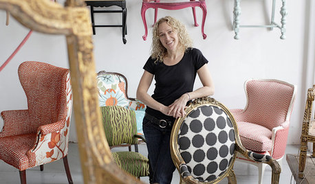
TASTEMAKERS3 Extreme Chair Makeovers — Plus DIY Reupholstering Tips
Spoiled seats and forlorn frames get kicked to the curb by a Philadelphia reupholstery whiz with a flair for salvaging and artistic designs
Full Story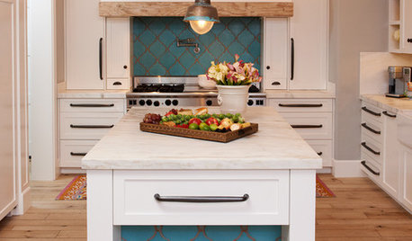
KITCHEN DESIGN10 Gorgeous Backsplash Alternatives to Subway Tile
Artistic installations, back-painted glass and pivoting windows prove there are backsplash possibilities beyond the platform
Full Story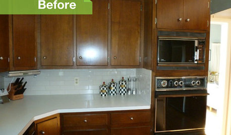
KITCHEN DESIGN3 Dark Kitchens, 6 Affordable Updates
Color advice: Three Houzzers get budget-friendly ideas to spruce up their kitchens with new paint, backsplashes and countertops
Full Story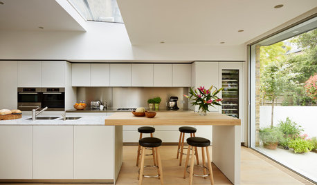
MATERIALSKitchen Ideas: How to Choose the Perfect Backsplash
Backsplashes not only protect your walls, they also add color, pattern and texture. Find out which material is right for you
Full Story
MOST POPULARThe Right Way to Test Paint Colors
Here are 5 key steps to take to ensure you're happy with your wall paint color
Full Story
KITCHEN DESIGNHouzz Quiz: Which Kitchen Backsplash Material Is Right for You?
With so many options available, see if we can help you narrow down the selection
Full Story


sjhockeyfan325
lazy_gardens
Related Professionals
Four Corners Kitchen & Bathroom Designers · Kalamazoo Kitchen & Bathroom Designers · Montrose Kitchen & Bathroom Designers · Bensenville Kitchen & Bathroom Designers · Sunrise Manor Kitchen & Bathroom Remodelers · Blasdell Kitchen & Bathroom Remodelers · Centerville Kitchen & Bathroom Remodelers · Fair Oaks Kitchen & Bathroom Remodelers · Princeton Kitchen & Bathroom Remodelers · Fairmont Kitchen & Bathroom Remodelers · Rowland Heights Cabinets & Cabinetry · Wells Branch Cabinets & Cabinetry · Phelan Cabinets & Cabinetry · Albertville Tile and Stone Contractors · Hermiston Tile and Stone ContractorsgreenhavenOriginal Author
Gracie
greenhavenOriginal Author
Lisa
greenhavenOriginal Author
GrisWorld
Gracie
romy718
Bunny
greenhavenOriginal Author
SusanNJ72
romy718
Kooops
Errant_gw
greenhavenOriginal Author
greenhavenOriginal Author
greenhavenOriginal Author
Gracie
greenhavenOriginal Author
vdinli
vdinli
breezygirl
oldbat2be
greenhavenOriginal Author
Gracie
desertsteph
amck2
maggieq
greenhavenOriginal Author
greenhavenOriginal Author
romy718
greenhavenOriginal Author
Gracie