


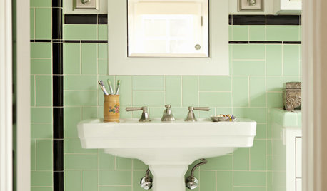
Another stab at layout...and beginnings of BS consideration
steph2000
11 years ago


Related Stories
BATHROOM DESIGN9 Surprising Considerations for a Bathroom Remodel
Don't even pick up a paint chip before you take these bathroom remodel aspects into account
Full Story
KITCHEN DESIGNKitchen Layouts: A Vote for the Good Old Galley
Less popular now, the galley kitchen is still a great layout for cooking
Full Story
KITCHEN LAYOUTSThe Pros and Cons of 3 Popular Kitchen Layouts
U-shaped, L-shaped or galley? Find out which is best for you and why
Full Story
WORKING WITH PROSHow to Hire the Right Architect: Comparing Fees
Learn common fee structures architects use and why you might choose one over another
Full Story
MOST POPULARWhat to Know About Adding a Deck
Want to increase your living space outside? Learn the requirements, costs and other considerations for building a deck
Full Story
KITCHEN DESIGN10 Ways to Design a Kitchen for Aging in Place
Design choices that prevent stooping, reaching and falling help keep the space safe and accessible as you get older
Full Story
KITCHEN DESIGN8 Good Places for a Second Kitchen Sink
Divide and conquer cooking prep and cleanup by installing a second sink in just the right kitchen spot
Full Story
HOMES AROUND THE WORLDThe Kitchen of Tomorrow Is Already Here
A new Houzz survey reveals global kitchen trends with staying power
Full Story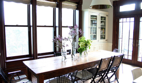
MOST POPULARFirst Things First: How to Prioritize Home Projects
What to do when you’re contemplating home improvements after a move and you don't know where to begin
Full Story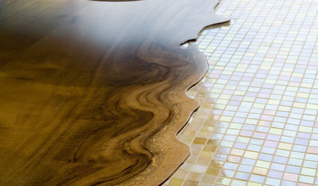
REMODELING GUIDES20 Great Examples of Transitions in Flooring
Wood in One Room, Tile or Stone in Another? Here's How to Make Them Work Together
Full StoryMore Discussions


palimpsest
numbersjunkie
Related Professionals
Federal Heights Kitchen & Bathroom Designers · South Sioux City Kitchen & Bathroom Designers · Albuquerque Kitchen & Bathroom Remodelers · Beaverton Kitchen & Bathroom Remodelers · Biloxi Kitchen & Bathroom Remodelers · Garden Grove Kitchen & Bathroom Remodelers · Ogden Kitchen & Bathroom Remodelers · South Park Township Kitchen & Bathroom Remodelers · Sun Valley Kitchen & Bathroom Remodelers · York Kitchen & Bathroom Remodelers · Bonita Cabinets & Cabinetry · Warr Acres Cabinets & Cabinetry · Charlottesville Tile and Stone Contractors · Mill Valley Tile and Stone Contractors · Santa Rosa Tile and Stone Contractorssteph2000Original Author
mpagmom (SW Ohio)
palimpsest
steph2000Original Author
rosie
palimpsest
steph2000Original Author
mpagmom (SW Ohio)
palimpsest
steph2000Original Author
palimpsest
steph2000Original Author