Shop Products
Houzz Logo Print
saltlife631

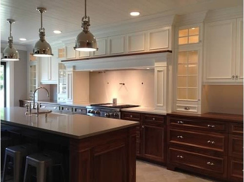
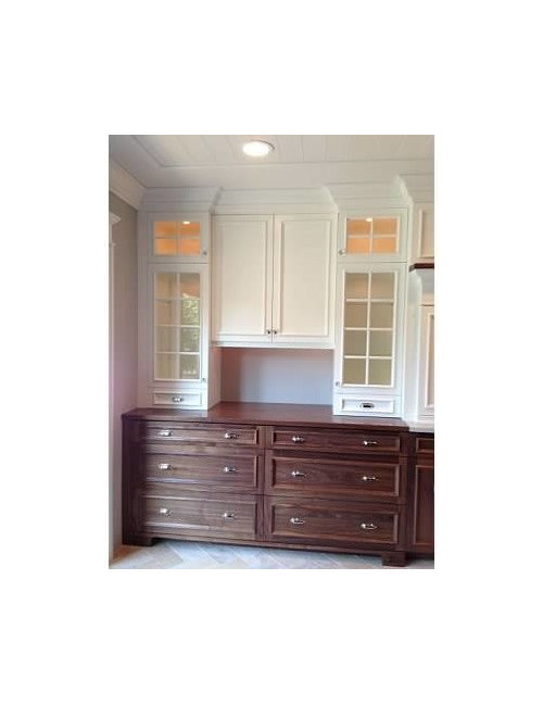
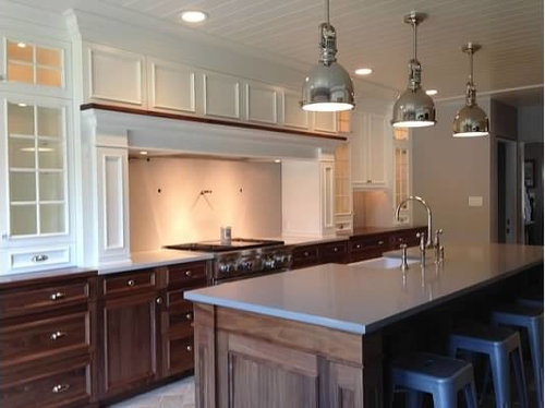
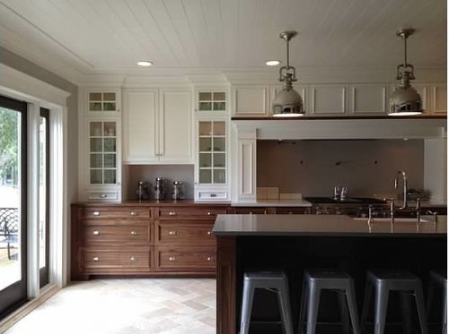
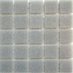
Calling all GW angels...Backsplash help!!!

SaltLife631
10 years ago

First off I would like to give credit where credit is due and state the obvious. So many of the individuals who regularly post on this forum as well as those who drop in from time to time are talented beyond belief. In a design world where many professionals push their agenda it is valuable to have a resources such as this. My wife and I spent countless hours on this forum pouring over the details of your impeccably done tasteful, classy and timeless kitchens. So for that we tip our hats and say thank you.

One of the last details we have to complete in our kitchen is the backsplash. We feel as though all of the details up until this point have come together in a fashion that speaks to who we are and have helped us to accomplish what we were trying to achieve. This is a working kitchen...The main backsplash area above the range is 7' across X 2 1/2' high with each backsplash area in the hutch style pieces along the wall being 3' across X 1 1/2' high. We have searched high and low and have found what we believe to be some good options, we are just not quite sure we found the one. We are open to any and all backsplash suggestions you might have!!! The leading contenders as of now are Walker Zanger Gramercy Park in Heirloom White 2x6 and Waterworks Architectonics in pumice 3x6.

Some details that may help you to suggest backsplash options are:
Floors: Unicom Starker Quartzite in Gold laid in a herringbone pattern. They do not make the 6x12 tile we wanted for our herringbone pattern so we cut each 12x12 in half and polished all of the edges.
Cabinets: The lowers are natural walnut with no stain and the uppers are painted Benjamin Moore White Dove (OC-17).
Countertops: The island countertop is Caesarstone in Pebble, the landing countertops on each side of the range are Caesarstone in London Grey and the countertops for the hutch style pieces along the wall are CraftArt DIY in Black Walnut.
Wall, Trim & Ceiling Color: The remaining walls in the room are painted Benjamin Moore Shale (861) which is a grey, while the trim and the ceiling are both Benjamin Moore White Dove (OC-17).


This post was edited by SaltLife631 on Wed, Aug 28, 13 at 14:33

Comments (41)

  • mark_rachel
    10 years ago
    last modified: 9 years ago

    AMAZING kitchen!!! I would stick to something simple. Cream subway with something more interesting in the nook over your range. Something to add some texture. If you wanted color I would go subtle like MOP. Great job!!

  • kylady7
    10 years ago
    last modified: 9 years ago

    Since I am so new at this I certainly do not feel Qualified to give any suggestions..Will leave that to those that are in the "know"
    But I wanted to comment on you Absolutely BEAUTIFUL Kitchen....It is Absolutely breathtaking! You and your wife have certainly done a Phenomenal job, and I'm sure you will make the right decision on your backsplash.
    I Love the white and wood cabinets mixed together, If I ever have a Large enough kitchen that would be my choice!
    Will you please tell me what your flooring is? I know wood seems to be the choice for so many kitchens and I think that is the way I will go....Then I see a floor like yours...and absolutely Love it!
    Hope your back splash decisions will soon be done!

  • kylady7
    10 years ago
    last modified: 9 years ago

    Oops...didn't read your post well enough ...found the answer when I reread...Sorry

  • palimpsest
    10 years ago
    last modified: 9 years ago

    I think you could go with something with a bit more variation than either of those. I don't usually go for pattern but this kitchen could carry a patterned backsplash pretty well.--Or a plain tile with glaze variation.

  • Vertise
    10 years ago
    last modified: 9 years ago

    Beautiful kitchen! I can picture a swirling stone. Including brown would be handsome.

    This post was edited by snookums2 on Wed, Aug 28, 13 at 16:13

  • SaltLife631
    Original Author
    10 years ago
    last modified: 9 years ago

    Thank you for the kind words...At the end of a long renovation your words of encouragement serve as motivation to make the final push!

    teachertile- We thought about doing the 2x6 Walker Zanger Gramery Park in heirloom white everywhere. We have seen this and know it will work. We just aren't sure if we will be missing an opportunity for something else so to speak. Thanks again for your thoughts.

    calyle7- You are definitely qualified enough, if you see something you think might work please pass it along. As far as the lowers and uppers go we are glad we made the plunge. We clean daily as it is so I am not sure we could have handled an all white kitchen, the mix served as an ideal solution for our OCD needs, HA! We couldn't be happier with the way the floor turned out. It really looks like natural stone but is a porcelain product which we were after for the durability. This particular tile comes in several other really nice natural looking colors. The herringbone pattern works with the rest of the house. I am glad you found the answer you needed as far as the flooring, one thing to point out is that many tile companies rebrand tiles with their own name. For instance another company sells this same exact tile made by Unicom Starker and calls it Dessert Gold.

    palimpsest- What type of pattern did you have in mind? We like the look of Bee's arabesque as well as others. If we go with a pattern we want to make sure it compliments the herringbone floor. We loved Jeffrey Court's Irish Ice collection that had a significant amount of glaze variation but unfortunately it is discontinued.

  • lavender_lass
    10 years ago
    last modified: 9 years ago

    I agree with Teacher...keep the hutch backsplashes very simple (cream subway) and do something else behind the range. The hutches are beautiful 'as is' but the range could use a focal point.

    Your floors are lovely, so the obvious choice is to do a similar backsplash, but maybe not on the diagonal. Similar to this, but with rectangular tile... {{gwi:1936299}}From Farmhouse plans

    Another option might be to design a tile backsplash with an Old English scene of trees...or maybe even something like this, although I may have been watching too much Game of Thrones, lately :) {{gwi:1936300}}From Farmhouse plans

  • SaltLife631
    Original Author
    10 years ago
    last modified: 9 years ago

    snookums2- Were you thinking a solid slab or tiles?

  • pricklypearcactus
    10 years ago
    last modified: 9 years ago

    Wow!! Your kitchen is absolutely stunning. The details are impeccable. Is it too matchy-matchy to suggest a herringbone pattern for the backsplash? I love the texture herringbone adds.

  • live_wire_oak
    10 years ago
    last modified: 9 years ago

    For the hutch areas, I would actually consider walnut veneer, and also consider putting it in the back of the glass cabinets. Without stuff in the cabinets to weigh it down, it feels a little "floaty" and disconnected from the lowers. Especially since the color tones flow directly to the ceiling with no break. (Have you thought about painting your ceiling a soft gray? It's the "6th wall")

    For the large area behind the range, I also think a pattern, and not anything too subtle. Take a page from Oldbat2b's kitchen and do something simple and geometric, but not shy and retiring. Something with the warm browns of the walnut, a hint of grey, all on a white background would be perfect.

    I'm thinking of a patterned repeat "wallpaper" like this from Hakatai, but with different colors.


    Something like the brown in this (B32-Teak)

    to replace the red, and something like A-33 Smoke to replace the orange.

  • Vertise
    10 years ago
    last modified: 9 years ago

    Yes, I meant a slab. Sorry for being vague. I was also just thinking about the range area. Aside from it just looking good, I think bringing some of the brown upwards would be good for balance.

  • sparkier73
    10 years ago
    last modified: 9 years ago

    I'd do something like in this picture posted recently in the kitchen photo gallery. A glass mosaic backsplash over the cooktop, and a 4-5 inch strip of the same mosaic for the hutch back-splashes surrounded by an ivory subway tile.

  • Anne Harris
    10 years ago
    last modified: 9 years ago

    You clearly put a lot of thought into this kitchen and it shows. Absolutely stunning!

    I agree with others that the area above the stove says "dress me up please". I immediately thought of Oldbats's kitchen.

    Congratulations on a stunning kitchen!! I hope you enjoy it for many years!

    Do you have a dog that matches your kitchen? There seems to be an unconscious bias here to pick colors that match our pets!

  • palimpsest
    10 years ago
    last modified: 9 years ago

    What is your target for price per square foot?

  • kitchendetective
    10 years ago
    last modified: 9 years ago

    Maybe something from the Studio Moderne line from Walker Zanger in the area under the hood?

  • SaltLife631
    Original Author
    10 years ago
    last modified: 9 years ago

    lavender_lass- Thank you for the options. One of your pics reminded me that I probably should have said that we will be having a pot filler as well. I have never seen Game of Throwns myself but I have heard certain family members talk about dragon eggs!

    pricklypearcactus- Thank you very much for noticing the details! We look forward to sharing all of the details when we are done. Texture does bring an added element in. I guess the only way to find out if it is too matchy matchy is to lay it out, we are up for trying anything. One look we were strongly considering is using the same tile everywhere (probably something with variation in the tile) and over the range creating a complimentary pattern to serve as a focal point.

  • amykath
    10 years ago
    last modified: 9 years ago

    I really like the coloring of this tile. I also like the bit of shimmer as well.

    Your kitchen is drop dead gorgeous! Very well thought out and fabulous details!!

  • kitchendetective
    10 years ago
    last modified: 9 years ago

    at,
    Do you think that backsplash is Sonoma Tilemakers Vihara?

    Other than the price, this is very cool!

    Here is a link that might be useful: Artistic Interlocking Circles

    This post was edited by kitchendetective on Thu, Aug 29, 13 at 8:48

  • SaltLife631
    Original Author
    10 years ago
    last modified: 9 years ago

    live_wire_oak- We have a piece of walnut veneer so we will definitely give it a shot in the hutch areas. We did try it as well one other option in back of the glass cabinets but it was not the right look for us. What ended up anchoring the upper cabinets was our dishes. The ceiling is a different sheen than the cabinets. In person this creates a slight variance that is hard to capture in pictures. Oldbat2b's space is very well thought out and came together very nice. What do you think of the geometric Beau Monde from Ann Sacks? http://www.decorpad.com/photo.htm?photoId=94807
    We have not looked into anything from Hakatai but will definitely do so. Thank you for your well thought out response. By the way very nice job on your kitchen I am a big fan of the glass cabinets.

    snookums2- Caesarstone does sell the London Grey we used for the countertops in that area in thinner pieces. I will give the regional sales manager a call and see if there are any in my area. This option would be really easy to care for as well which is always a plus.

    Sparkier73- Is that somebody's kitchen on here or a web picture someone posted? Some of the glass mosaics from Oceanside would work in that scenario. The design would tie the spaces together without being exactly the same. Thanks for your help.

  • palimpsest
    10 years ago
    last modified: 9 years ago

    Beau Monde Spencer--you can select the colors. I don't think I would do a dramatic color shift.

    This post was edited by palimpsest on Thu, Aug 29, 13 at 11:47

  • LE
    10 years ago
    last modified: 9 years ago

    Well, it obviously depends on your personal taste and how much variety your eye craves, but... Put me down on the side of "subtle" in this case. I think you could add shimmer or texture, or a soft color with a glaze variation. I personally would not add a lot of pattern to this room. You have a lot of lines within your cabinetry and your ceiling already, which are varied and complement each other well.

    A bold pattern on the wall would risk being a little too much like wearing a plaid shirt with striped pants, if you know what I mean! (Not that it's never been pulled off successfully-- I'm sure it could be done, I just don't get the impression that's your style)

    Or to use another analogy, because I'm full of them: it doesn't need another main ingredient, just a sprinkle of something on top.

  • TxMarti
    10 years ago
    last modified: 9 years ago

    Your kitchen is just gorgeous! I'm no good with picking backsplash but I agree with the subtle. The cabinets are the star of your kitchen. I love the wood and paint combo.

    I know this isn't your big reveal, but what floor tile did you use?

  • SaltLife631
    Original Author
    10 years ago
    last modified: 9 years ago

    Anne2326- Your kind words hit home and are much appreciated. Our original thought process was to have a focal point above the range. But as our search has dragged on it has proven difficult to find a complimentary focal point that works with the other lines and elements in the room so we decided to keep an open mind about having a focal point or not having a focal point. Hopefully we can come up with something. We have two dogs who might have to make a garden Web appearance when we post a finished thread!

    palimpsest- We don't have a specific price point in mind because we have struggled with this decision. At the end of a long renovation some days we feel like we would spend whatever it takes for the right back splash and other days we remember that we have already went over our budget and maybe this is an area for some savings.

    kitchendetective- We were not familiar with this particular Walker Zanger line but there are some very nice options! I vaguely remember somebody posting on here about using the circle pattern in a shower and whether to do the whole wall, just a focal point or none at all. Do you have a personal favorite from this collection?

    MadsMama- Do you have a general price point for Artistic Tile? We like the Arpell from the Waterjet Collection but were told somewhere along the line that it was priced very very high even as far as expensive tiles go and weren't sure it would work for our space anyway. Are all of there collections similar in price to the Waterjet or is the Waterjet on the high end of their product lines? Also how do you feel herringbone over the range would work with the herringbone on the floor? Thank you very much for your kind words about out space, it has been a labor of love and we hope to share any advice we can with other members on here. I look forward to seeing your kitchen especially your back splash as everything I have seen from Artistic Tile is gorgeous!

  • mark_rachel
    10 years ago
    last modified: 9 years ago

    I like this.

  • mark_rachel
    10 years ago
    last modified: 9 years ago

    I like this one too. Remember beekeeperswife's old kitchen? Maybe something like that?

  • Gracie
    10 years ago
    last modified: 9 years ago

    You have a lot of squares and rectangles, so I'd avoid those shapes in your backsplash.

  • palimpsest
    10 years ago
    last modified: 9 years ago

    I asked because I usually hesitate to even suggest the Ann Sacks that starts at $90/sq.ft and can end up in the $100s/sq ft.

    Some of the Ann Sacks and Walker Zanger stone mosaics are great if you don't mind the expense. I know the Ann Sacks Beau Monde allows you to select the stones that are used for the individual elements. So you could do a pattern but reduce the contrast or tie in other finishes easily, whatever you wanted to do.

    The thing that I like about their structured patterns is that they are a genuine pattern and not an inadvertent pattern that shows up in some busy backsplashes.

    It's also a series of such well-defined areas that you don't need to consider where to start or stop and those sorts of problems that can happen, especially with patterns.

    This post was edited by palimpsest on Thu, Aug 29, 13 at 13:55

  • kitchendetective
    10 years ago
    last modified: 9 years ago

    Let's see if this image shows up from a Studio Moderne blog:

    This is the Paramount pattern. I'm not sure how the available colors actually look, so they may not work, but I, too, would be leery of using the squarer versions, although I like them for themselves. And I'm wondering about the scale, now, too. I kind of like the idea of incorporating some gray--if it matches or coordinates with your island top--in the backsplash. I'd be a bit worried about using a gray and white marble next to your perimeter counter top, though. Might appear as an unsuccessful attempt to match surfaces. Thinking out loud, here. Since you mentioned liking a discontinued lace pattern, I'm trying to think of tone on tone patterned tiles that are not too square. I love those walnut cabs!!!!!!!

  • Vertise
    10 years ago
    last modified: 9 years ago

    "You have a lot of squares and rectangles"

    That is what I was feeling, that some movement would be complementary. Had chocolates and creams in mind but don't know if there is even anything out there like that.

    Not that you will like this one, but something like this Philadelphia Swirl is soothing and not detracting from the rest of the kitchen (but with the pattern horizontally). I really can't see the details of the current materials clearly though, just colors ...

    {{gwi:1936307}}

  • SaltLife631
    Original Author
    10 years ago
    last modified: 9 years ago

    aktillery- Is that the Viahara from Sonoma Tile? We saw a sample in the store and thought we may have found the one. It is a very nice quality tile. When we got home we thought something about it didn't work in our space. Maybe I will post a photo of it and see what you think. Thank you for the kind words we tried to make sure to devote time to both the small and large details alike. We didn't want anything to feel as though it was an after thought. We look forward to posting some quality photos highlighting the details shown in these pics as well as some of the others.

    kitchendetective- Good eyes! I am not sure if that is the exact tile but it does look like Vihara from Sonmoma Tile. Thank you for the link it didn't work for me but I googled it. We really like a lot of options from Artistic so I guess we will have to look more into price as well as time frame. Some tiles reach a point in both areas that don't make sense for us.

    palimpsest- We are a fan of the Ann Sacks Beau Monde series as well. All of those options are a good asset to have. As you mentioned we would be looking for a less dramatic color shift. We never would have thought a tile in that price point would even be something we would think about, considering we need approx. 27-30 sq. ft. above the range. That would be a tough price point/investment to justify for us but never say never. However, not sure but if something were perfect for the space we may consider it at this point! We want to find a tile that completes the space in our eyes.

    lori_inthenw- Your analogies cracked both of us up, you are very funny! It is tough to find the balance between style, price, timelessness as well as some other factors. For instance we have asked ourselves "Is it worth it to have the more expensive tile we love now but we might get tired of sooner or should we go with something more subtle, cost effective and timeless?" Hopefully we can find the right balance. The Walker Zanger Gramercy Park fits what you are saying. By the way I am going to go put my plaid pants striped shirt and polka dot tie away for tomorrow and change to something else. I think I will still go with the argyle socks and saddle shoes though.

  • Laura
    10 years ago
    last modified: 9 years ago

    SaltLife, happy to answer your questions about Artistic Tile…there is a wide range of prices. From the ones that I priced out, they were anywhere from $20 to over $200 (ouch!) per SF. I love Arpell - it was one of the ones on my “short list” - it was around $100. The waterjet is definitely their higher priced line. Others are much less - for example, the glass Coltrane Treble Gloss mosaic pattern was around $25/SF, and very pretty. We chose a waterjet mosaic (Veneto), but it was (well) under $100 - a splurge for me, but love, love it. I should mention that our designer was passing along her discount of up to 25% on the retail pricing.

    So, I guess the bottom line is you shouldn’t rule out Artistic Tile because of price - they do have some relatively reasonable options! Also, if you haven’t already looked at New Ravenna, they have beautiful patterns, too. And they have a quick ship line that is less pricey. Good luck!

  • a2gemini
    10 years ago
    last modified: 9 years ago

    Salt life- that is one gorgeous kitchen. Awhile ago, we posted a lot of choices for breezygirl and might help to look at some of them.
    I want to see your kitchen on the big screen but I wouldn't rule out diamond tiles or arabesque despite the squares. Beekeeper has a lot of square glass and it looks great.

  • amykath
    10 years ago
    last modified: 9 years ago

    Salt, I just looked for the source of the photo I displayed and for the life of me cannot find it again. I am not sure what the brand of the tile was in the pic. Sorry!

  • kitchendetective
    10 years ago
    last modified: 9 years ago

    There is a couple of textures here that may interest you. Each of the listings comes in multiple colors and glazes. If you look through the entire site, you can find many of the available glazes.

    Here is a link that might be useful: Dunis Studios

  • jess1979
    10 years ago
    last modified: 9 years ago

    I wanted to say you have a beautiful kitchen and I can't wait to see what you pick for the backsplash. I was looking through Houzz for ideas for our remodel and saw something that made me think of you. I don't know if I can post the picture, I will try. It is by Rob Kane kitchen interiors and called full furnished. If you like the decorative pieces in the Gramercy Park they would work in this.

  • blackchamois
    10 years ago
    last modified: 9 years ago

    Love the herringbone pattern on the floors. And that Pebble looks fantastic on your beautiful island. Do you happen to have any closer-up pics of the LG perimeter counters?

    Thank you for sharing! Just lovely!

  • mlweaving_Marji
    10 years ago
    last modified: 9 years ago

    Your kitchen is beautiful and looks like a place you'll spend many happy hours.
    If you decide to go over the $100/sf range do take a look at the New Revenna waterjet mosaics. They are just gorgeous. Here's one with sinuous lines that would complement your spaces and the browns to pick up your walnut.

    [

    [(https://www.houzz.com/photos/miraflores-collection-vittoria-contemporary-entry-phvw-vp~5431111)

    [Contemporary Entry[(https://www.houzz.com/photos/contemporary-entryway-ideas-phbr1-bp~t_741~s_2103) by Exmore Tile, Stone & Countertops New Ravenna Mosaics There are quite a few more in the silk road collection that would be very complimentary to your space.
    I ended up deciding against them strictly on budget reasons, but would be delighted to see someone else take advantage of their gorgeous designs.
    I also think that the Ann Sacks Beau Monde would be beautiful yet subtle if you could make the colors work.

  • avasings
    10 years ago
    last modified: 9 years ago

    Hi,
    I would LOVE to see a more close up picture of your London Gray! Are you happy with the look?

  • oldbat2be
    10 years ago
    last modified: 9 years ago

    If you could post pictures taken from straight on (take two for a panorama if you are unable to get everything in for the full width), I/we can try to photoshop some options for you. (The angled shots are tough). What color are the counterstools? (They read blue to me). Love your walnut and lamps, you've put together a lovely kitchen.

  • Beth K
    5 years ago

    Hello saltlife631 and anyone else who can help with this, I'm hoping you can answer a question for me. we are having custom cabinets made and they are being laquered in white. Our space is a large open concept family/kitchen. We are having the cabinets go to the ceiling with crown molding on top. The question is how to finish the crown molding on top of the cabinets and remaining crown molding around the room. I want the crown on top of the cabinets to be laquered and then the remaining crown to be painted in the same color paint. My contractor thinks I'll notice the difference in finish between the laquer and the paint. I don't want to laquer all of the trim all the way around the room. He suggests laquering the cabinets only and painting all trim including what's on top of the cabinets. I think you said you laqured the crown on top of the cabinets and painted the rest. Is that correct?