

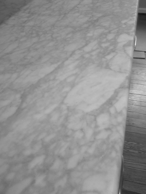
Sneak Peak: Fun time! Accent color for gray and white kitchen
SparklingWater
10 years ago
Sort by:Oldest
Comments (7)
Related Stories
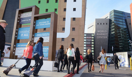
EVENTSSneak a Peek at Where the Pros Go to Get Inspired
At the 2015 Summer Las Vegas Market, thousands of retailers, designers and home pros will gather to discover the latest home decor trends
Full Story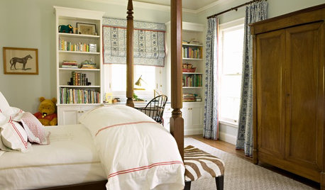
COLOR8 Neutral Rooms That Sneak In Color Interest
Kick up your favorite palette's visuals without diluting the tone-on-tone look, following the lead of these sophisticated spaces
Full Story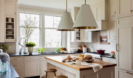
MOST POPULARHouzz Tour: Easygoing and Elegant in White, Cream and Gray
The renovation of an 1860s Massachusetts home creates a sophisticated, serene and comfortable living space
Full Story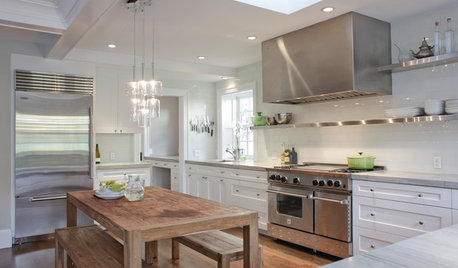
KITCHEN DESIGNCooking With Color: When to Use White in the Kitchen
Make sure your snowy walls, cabinets and counters don't feel cold while you're riding white's popularity peak
Full Story
DECORATING GUIDES9 Ways to Boost Your All-White Color Scheme
Grays, seafoam, metal, wood and more help embolden a white-on-white look so it doesn't leave you cold
Full Story
COLOR10 Pretty Ways to Refresh a Gray Palette
Energize your favorite gray shades with pick-me-up accents as fresh as a spring day
Full Story
MOST POPULAR50 Shades of Gray
Gray is hotter than ever, thanks to a hit novel full of risks and dark secrets. Tell us: Which paint shade possesses you?
Full Story
DINING ROOMSColor Feast: When to Use Gray in the Dining Room
The right shade of gray pairs nicely with whites and woods to serve up elegance and sophistication
Full Story
FURNITURE11 Reasons to Love a Gray Sofa
See how a sofa in this neutral shade can take on anything you mix with it, from soft to sharp and everything in between
Full Story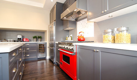
COLORCooking With Color: When to Use Gray in the Kitchen
Try out Trout or shake up some Martini Shaker gray for a neutral-based kitchen that whispers of sophistication
Full Story


justmakeit
taggie
Related Professionals
Mount Prospect Kitchen & Bathroom Designers · Southampton Kitchen & Bathroom Designers · St. Louis Kitchen & Bathroom Designers · Terryville Kitchen & Bathroom Designers · Buffalo Grove Kitchen & Bathroom Remodelers · Emeryville Kitchen & Bathroom Remodelers · League City Kitchen & Bathroom Remodelers · Lynn Haven Kitchen & Bathroom Remodelers · Mesquite Kitchen & Bathroom Remodelers · Oceanside Kitchen & Bathroom Remodelers · San Juan Capistrano Kitchen & Bathroom Remodelers · Sharonville Kitchen & Bathroom Remodelers · Buena Park Cabinets & Cabinetry · Canton Cabinets & Cabinetry · Warr Acres Cabinets & Cabinetryjoaniepoanie
SparklingWaterOriginal Author
gwlolo
kitchendetective
SparklingWaterOriginal Author