Shop Products
Houzz Logo Print
greenhaven_gw

For REAL the last paint vote!! Seriously this time!

greenhaven
9 years ago

Alright, I am done. Finished. Kaput. I am not buying ONE more paint sample for the kitchen!

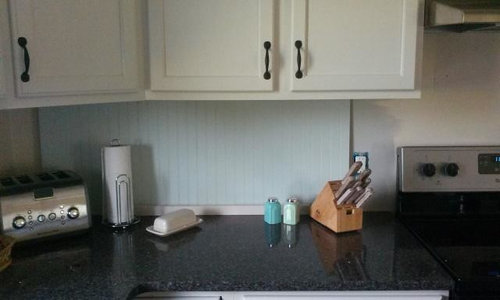
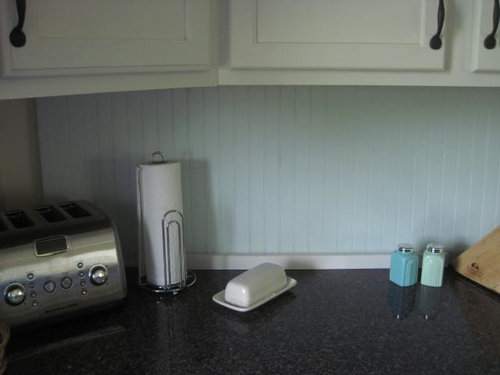
It is down to two, the Gray Owl from the first thread. or Limestone Path, a slightly grayed-down minty green.

I have a strong preference, but I will let you all speak your peace!

BUT.....

if you think the minty, is that end wall too much minty? You must also speak your mind on cab color or beadboard color for the end wall. And it is reading slightly brighter in the photos than IRL.

Here is a link that might be useful: Thread with Gray Owl pics

Comments (31)

  • Terri_PacNW
    9 years ago
    last modified: 9 years ago

    Well, I like it..goes great with your s&p shakers!
    I vote paint on the end wall too.

    And on my screen it's reading more blue than green. Very much closer to the "blue" shaker on the left. Not any where near minty green of the one on the right.

    I see you are using my fav "green" can.. Lol..I walk into ACE..and they are getting the Satin Enamel down. ;)

  • OOTM_Mom
    9 years ago
    last modified: 9 years ago

    Gray. If mint, not on endwall. The mint looks blueish on my screen on the beadboard, and only mintyish on the endwall. I like the gray much better.

  • brightm
    9 years ago
    last modified: 9 years ago

    I like the colored beadboard, but not end wall. I did like the gray too, but you probably have noticed I like color. :)

  • Gracie
    9 years ago
    last modified: 9 years ago

    While looking for a pic of Limestone Path, I came across your kitchen twin, and then I noticed the high chair rail wrapping around the side wall. Would that work with beadboard on your wall? It looks like you have a hallway and you'd be getting into beadboarding that, but it could be cool if it goes into the garage and you'd have a mudroom look with pegs on the beadboard molding. You could do the reverse with the gray or blue on the bottom, extending from the backsplash, and then use white on the top.

  • greenhaven
    Original Author
    9 years ago
    last modified: 9 years ago

    It definitely reads a little bluer under the cabs where the counter reflects onto it. It is slightly minty-er in real life.

  • greenhaven
    Original Author
    9 years ago
    last modified: 9 years ago

    may_flowers, YES! That is the answer! Whether the color be mint-ish or gray! The hallway goes to a half-bath, the technical (but not current) master bedroom and the laundry room. But I think I could end the beadboard right there at that first corner before the narrow end of the wall, and finish it with some appropriate trim.

    Except, on that end wall I would paint the beadboard and trim the cab color and paint above it the backsplash color.

    Unless I went all cab color.

    Gah.

    PS, Limestone Path is a Valspar color.

  • dcward89
    9 years ago
    last modified: 9 years ago

    I love the green. I think it adds some life and personality into your space...and I would do the wall the minty color as well. I may be a bit biased because I can't hardly stand a white wall...they all call out for color to me!!

  • romy718
    9 years ago
    last modified: 9 years ago

    I really like the blue-green. It looks pretty with your cabinet color & fabulous with the salt & pepper shakers. I also really like the high chair rail that may_flowers posted for your side wall.
    Not knowing the layout of the rest of the kitchen, I'm not sure about white cabinets, blue/green beadboard & Gray Owl walls. There are other wall in the kitchen that will be Gray Owl?
    I think (as much as I love the blue/green) my choice would be the beadboard & chair rail in white and the wall above the chair rail in Gray Owl (along with the rest of the kitchen in Gray Owl).

  • Gracie
    9 years ago
    last modified: 9 years ago

    You need Photoshop!

    I prefer the island to be painted to match the backsplash, and you didn't like the island in Gray Owl. I think both colors are too light, but I like the gray better. I would find a slightly darker gray though, with blue undertones. I have been influenced by the blue accent tiles. I have a Houzz pic in mind if you're interested.

  • greenhaven
    Original Author
    9 years ago
    last modified: 9 years ago

    Of course, I am interested, pulLEAZE! Lol

    Romy, there is no set wall color for the kitchen, yet, it will all depend on what I do for the backsplash color. Walls will either match the cabs or match the backsplash. Unless I do a high chair rail, of course, and will adjust accordingly. And that photo mayflowers posted just above? That is very nearly my exact layout. My fridge is to the left of the dw instead of a cab, and I have 24" to the right of the stove instead of about 12".

    I am definitely leaving the island the same color as the cabs because I am painting a large sink base as my sideboard in the dining room.

    I have Photoshop but have been out of use for so long I am very rusty in its use.

    Here is an older pic I took of the tile and accent:

  • romy718
    9 years ago
    last modified: 9 years ago

    Changing my vote to the blue-green until we see what May_flowers ideas are. I bet Oldbat2be would do some photoshopping.
    Greenhaven, I have really enjoyed your reno. I know you've worked hard & it's paying off.

  • Gracie
    9 years ago
    last modified: 9 years ago

    I was plodding through beadboard backsplashes on Houzz when this stopped me in my tracks. It just feels a little more sophisticated, less sweet, than the mint, and has more depth than Gray Owl. It could be a little too dark and too blue, and I think the light from the window is making it read a little purple. But that's the color family and tone I would explore. A richer gray with a slight blue undertone. Or a very grayed blue?

    [

    [(https://www.houzz.com/photos/vernacular-house-utility-farmhouse-kitchen-london-phvw-vp~15680335)

    [Farmhouse Kitchen[(https://www.houzz.com/photos/farmhouse-kitchen-ideas-phbr1-bp~t_709~s_2114) by London Cabinets & Cabinetry British Standard

  • greenhaven
    Original Author
    9 years ago
    last modified: 9 years ago

    Romy, thank you so much! I never would have made it this far without the support of you and other GW-ers. That is definitely not an empty sentiment!

    I am still going back to the cab color, but maybe on a shorter backsplash. Then an accent color for it above. I just love that last photo posted, and the pops of color in the accessories or rich wood.

  • greenhaven
    Original Author
    9 years ago
    last modified: 9 years ago

    Mayflowers, believe it or not I jusy repainted my sample piece with a rich dark gray I had onhand, just for ha has! I didn't think I liked itbutnow I am not sure. It does look rich, but this is the "bright" time of day with ambient light leaking in from the west.

    I think the mint is going, as you say, too sweet. I painted my sideboatd a much darker version and it still looked too ice cream parlor.

    Note my reply above, posted as you had posyed that last photo. I have been scrollimg through pics again, too, and keep coming back to cab color on the backsplash.

  • Gracie
    9 years ago
    last modified: 9 years ago

    Yes, too ice cream parlor/seashore for the mint.

    You can't go too dark or use a gray with no undertones. Look at this one. It's got your white cabs and dark counter, but the gray is so institutional. Depressing!

    I just thought of what color it is--Navy ship gray!

    This post was edited by may_flowers on Sun, Aug 10, 14 at 19:07

  • Errant_gw
    9 years ago
    last modified: 9 years ago

    If it were me, I would want the bead board the same color as the cabinets. Then maybe another color or even stained on the island. Having to choose between one of your two colors, I would go with the gray :)

  • greenhaven
    Original Author
    9 years ago
    last modified: 9 years ago

    This is the color I was supposed to paint my sideboard originally. It was supposed to contrast beautifully with the wall color (Gray Owl.) I am now painting the DR walls a shade LIGHTER than the Gray Owl, in order to get a light enough color. Even so that "rich" gray ends up being way too light.

    So I painted my sample beadboard with it, just for funsies.

    I feel like I am all the way back at square one, again.

    I am ready to just paint it all the cab color, pick one of the grays for whatever wall color shows (def running that beadboard over the end wall of the stove run!) I can bring in any darn color I want to pop it up, right?


    Here are several of my favorite inspiration photos from among those I think would work in this house at this time. You will see some common themes running among them.
    Please. If I can NOT pull off something that draws from these photos tell me why not. I am absolutely listening, not challenging. I have lots of favorite little goo-gaws and doo-dads and artwork I can hang to color up the space.

    At this point I am about ready to throw my hands in the air and be done. Because this is the week, even if I have to paint every surface in my house the same damn color I am getting it DONE!

    Here are several of my favorite inspiration photos from among those I think would work in this house at this time. You will see some common themes running among them.

    Please. If I can NOT pull off something that draws from these photos tell me why not. I am absolutely listening, not challenging. I have lots of favorite little goo-gaws and doo-dads and artwork I can hang to color up the space.

    At this point I am about ready to throw my hands in the air and be done. Because this is the week, even if I have to paint every surface in my house the same damn color I am getting it DONE!


    http://niagaranovice.blogspot.com/2012/02/kitchen-inspiration-month-day-six.html


    http://haphazardlyhappy.blogspot.com/2011/01/speedbump.html


    (shared by may_flowers above)


    http://niagaranovice.blogspot.com/2012/02/kitchen-inspiration-month-day-six.html


    http://www.beneathmyheart.net/2012/01/how-to-add-old-house-character-charm-to-your-newer-home-step-5/


    http://hviturlakkris.blogspot.com/search?updated-max=2010-10-27T07:58:00-04:00&max-results=10


    http://fortheloveofahouse.blogspot.com/2011/01/kitchen-details.html


    http://www.countryliving.com/outdoor/gardening/garage-turned-garden-shed#slide-1

  • Hydragea
    9 years ago
    last modified: 9 years ago

    I like the suggestion to use beadboard that's the same colour as the cabs.
    Your cabs seem creamy to me. Am I seeing that correctly?
    Your inspiration pics also show a lot of warm tones. Even the one with the grey island has a warm grey. So maybe go with warmth rather than cool minty/tealy colours. (?)
    Just some thoughts...

  • bellsmom
    9 years ago
    last modified: 9 years ago

    Hey! It's just paint. Just do it. And if you hate it, do it again.
    Or if you just don't love it, do it again.
    And again.
    And again.
    It's just paint.
    Until you get it right.
    You can always live with it a year or two between times.
    :-)

  • Gracie
    9 years ago
    last modified: 9 years ago

    You know what's not in your inspiration photos? Gray. Except for that one island, which really would look better in a different color. No blue or blue-green either. That herbal gray green is a nice farmhouse color for your walls above white beadboard.

  • schiba
    9 years ago
    last modified: 9 years ago

    Go blue. Accentuate with gray.

  • romy718
    9 years ago
    last modified: 9 years ago

    I'm feeling guilty posting that minty green pic. On a positive note, May_flowers found the pic that led to beadboard on your side wall, which will really finish off that wall.
    My first vote was white, my second vote was white, my third vote was the blue/green. My fourth vote is white.
    There will never be a WDRT? Has Linelle spoken?
    Edit:WDRT vs. WDLT

    This post was edited by romy718 on Mon, Aug 11, 14 at 0:31

  • greenhaven
    Original Author
    9 years ago
    last modified: 9 years ago

    Romy, no guilt allowed! Seriously! I have to be sure I have explored every option OR be so in love with a thing that nothing else will do. And, frankly, I am really drawn to the minty colors. I have several kitchens pinned that highlight that color. But, like Hammer146 and her granite I have to make the choice between the thing I want and the right thing. Or the thing that will do fine fine for now. ;0)

    And what the heck is WRDT? I know I am going to have a duh moment when you tell me.

    Hydrangea, you did read that right, the cabs are an off-white, really a very lightened warm gray.

    And Bellsmom is right, it is just paint, lol! How many times, after all, have I painted that beadboard sample?

  • Gracie
    9 years ago
    last modified: 9 years ago

    Greenhaven, your inspiration photos are very organic but your Gray Owl is not. That's why people put wood islands and floors with their white and gray kitchens; otherwise it's too cold. Do you want to go with that organic vibe? I think you're at the crossroads here.

    WDR (and Greenhaven) T of BM Levingston Green for walls with white beadboard? It's part of the Williamsburg Collection. It's #8 in the green column. It would also be pretty with black accents.

    Here is a link that might be useful: Levingston Green

  • greenhaven
    Original Author
    9 years ago
    last modified: 9 years ago

    Mayflowers, I agree about the wood, and why I felt so compelled to get the stools I did. I also have a couple more antique pieces for the kitchen that have that richly patina-ed wood. My kitchen was just getting too cold.

    Thanks for the link to the BM site, some really great info there! Including tips for helping color flow throughout the home. I had well-meaning people tell me each room could be a stand-alone "theme" and could do whatever I wanted, but part of the reason I am stressing over the kitchen so much is that I really need it to be cohesive with at least the rest of the first floor, especially the dining room. It may be true for some that each room stands on its own, but not for me.

    So, crossroads, yes. Which is another big factor in my placing so much value on paint color now. "Organic" is the perfect word to sum up the commonality in all those photos.

    I am going to put up the beadboard tomorrow and paint it the cab color. If I cannot choose a wall color I will do the lightest grey for now to keep it neutral and just let it be.

    With this thread I became that person who drives me nuts, the one who just can't make up her mind about what should seem like an obvious decision. It has beeen humbling.

    Thank you all for your insight and support and patience during my agony!

  • raee_gw zone 5b-6a Ohio
    9 years ago
    last modified: 9 years ago

    I think that a lot of your inspiration pics reminded me of Martha Stewart colors -- everything sort of greyed down (which I love, BTW). You might go to Home Depot and pick up one of her palette cards, find a color close to your cabs, and see what she has as the complementary colors.

    I did like the track you were on with the green. I find the darker grey too dull. I think something more like the bowls in that 1st inspiration pic, although paler? Take a look at Valspar Ante Meridian, which is what I used -- on the second try. Similar but more grey. (First try was too blue. It really is okay to not get it exactly right the 1st time. Don't forget Valspar's color guarantee!) Ante Meridian is one of those colors that subtly changes with the light and exposure, more green/grey/blue depending.

    However if you are done shopping colors, you can't go wrong with matching the cabs and putting color above the chair rail (if you do that, I think you should!). In the other thread I was going to vote for the blue-grey because I do prefer a little more color in the room.

  • raee_gw zone 5b-6a Ohio
    9 years ago
    last modified: 9 years ago

    But color is NOT an obvious decision, it can't be, because we all perceive and respond differently to it. Getting just the right shade of wall color was very important to me. And I just finished repainting the trim again because the color just wasn't right -- and am much happier with it.

    Don't beat yourself up over indecision on this!

    ps I like the Ben Moore green too

  • greenhaven
    Original Author
    9 years ago
    last modified: 9 years ago

    Raee, hilarious ( to me!) that you mention those bowls, because I have a set of plates in almost that exact shade, plus a set of dishes I should really get rid of but can't because I am so in love with them! So I will use them until they are chipped beyond recognition. Anyway, the second set I mentioned is a super pretty shade of blue, but with subtle gold brush accents, thin brown trim and plum blossom pattern on the inside. On more than one occasion I considered taking one with me to Ace. I will, actually, probably hang one of the (unchipped) plates when I get this painting done.

    I will take a photo tomorrow.

  • romy718
    9 years ago
    last modified: 9 years ago

    I'm ready for wall colors.

  • rebunky
    9 years ago
    last modified: 9 years ago

    Hi green haven,

    I just signed up here the other day but have been reading this site for a long time in hopes of doing my kitchen someday. I think your kitchen is totally adorable and is one of my inspiration kitchens!

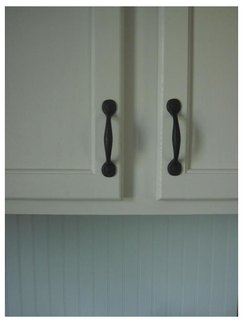
    I love your creamy white cabinets with dark pulls, dark countertop, and especially the beadboard backsplash. I want a similar look in my soon to be redo of a kitchen. So I am looking forward to see how yours turns out.

    Sorry if this is too late to help, but my vote would be to keep the beadboard the same color white as cabinets. Then paint the walls in the soft green color like in the fifth inspiration picture you posted down which seems similar to the color I think May flowers linked.

    I also love the beadboard chair rails in white on the walls to tie it around the room with the green color above. Maybe you could add it later?

    I really love the beautiful mint green picture that I think romy718 posted as I saw that one before on houzz too. However, I am not loving the minty color on your backplash for some reason. But think it would be great on the walls if you love the color. Its just hard because we cannot see the true color in real life as you can. Based on the color on my ipad though I would go a warmer light green.

    But whatever you do just take comfort that it is just paint and nothing that is permanent at least! Happy painting! Git-r-done...

  • texasgal47
    9 years ago
    last modified: 9 years ago

    Greenhaven, I've reviewed this posting and your last. My gut feel is that greige, a very greyed-down herbal green is the color you are going for. It would look lovely with your black granite and your current accessories. Refer back to mayflower's photo of her niece's kitchen in your prior posting for the color. Mayflowers says it is aqua IRL but the color reads greige on my monitor. I also love her suggestion of beadboard 2/3 up the wall, molding, and then paint above. My thoughts are your cabinet color for the wall beadboard, then the same greige for the wall above. Perhaps paint the island beadboard the same greige. You still get the Martha Stewart look but not coastal. Anyway, just my two cents for what it's worth. By the way, please sneak in some photos of your wonderful horse occasionally.