


Opinions please on stove backsplash choices
deedles
10 years ago

Sort by:Oldest
Comments (42)
Related Stories

DECORATING GUIDESNo Neutral Ground? Why the Color Camps Are So Opinionated
Can't we all just get along when it comes to color versus neutrals?
Full Story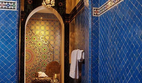
TILEMoor Tile, Please!
Add an exotic touch with Moroccan tiles in everything from intricate patterns and rich colors to subtle, luminous neutrals
Full Story
KITCHEN COUNTERTOPSKitchen Counters: Granite, Still a Go-to Surface Choice
Every slab of this natural stone is one of a kind — but there are things to watch for while you're admiring its unique beauty
Full Story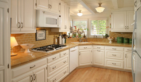
KITCHEN COUNTERTOPSKitchen Counters: Tile, the Choice for Affordable Durability
DIYers and budget-minded remodelers often look to this countertop material, which can last for decades with the right maintenance
Full Story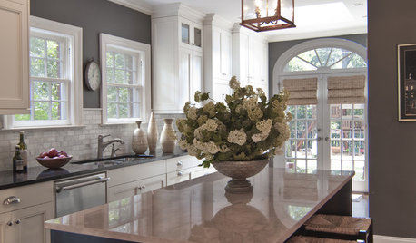
KITCHEN DESIGNReaders' Choice: The 10 Most Popular Kitchens of 2012
Citing savvy organizational solutions, gorgeous lighting and more, Houzzers saved these kitchen photos in droves
Full Story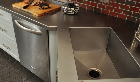
KITCHEN DESIGNKitchen Counters: Stainless Steel, the Chefs' Choice
Professional-grade strength and shining beauty unite in classic stainless steel countertops for the kitchen
Full Story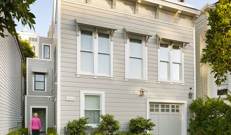
LIFE12 House-Hunting Tips to Help You Make the Right Choice
Stay organized and focused on your quest for a new home, to make the search easier and avoid surprises later
Full Story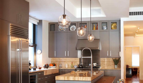
KITCHEN DESIGNReaders' Choice: The Top 20 Kitchens of 2011
Get inspired by the 20 most popular kitchens on Houzz in 2011
Full Story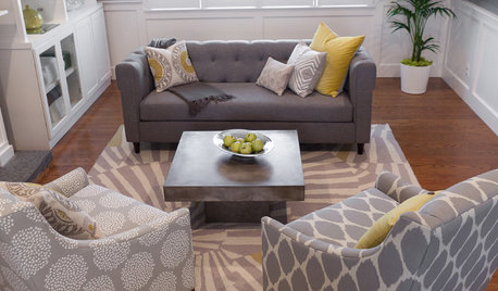
LIVING ROOMSReaders' Choice: The 10 Most Popular Living Rooms of 2012
Every design style gets a shout-out in the most saved living room photos of the past year — see if any elements speak to your own tastes
Full Story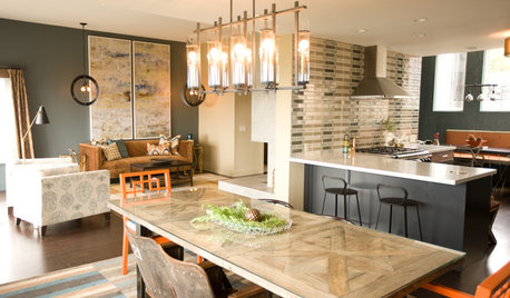
KITCHEN DESIGNKitchen of the Week: Navy and Orange Offer Eclectic Chic in California
Daring color choices mixed with a newly opened layout and an artful backsplash make for personalized luxury in a San Francisco kitchen
Full StoryMore Discussions


debrak2008
willtv
Related Professionals
Beavercreek Kitchen & Bathroom Designers · Carson Kitchen & Bathroom Designers · College Park Kitchen & Bathroom Designers · Springfield Kitchen & Bathroom Designers · United States Kitchen & Bathroom Designers · Vineyard Kitchen & Bathroom Designers · Wentzville Kitchen & Bathroom Designers · Beachwood Kitchen & Bathroom Remodelers · Richland Kitchen & Bathroom Remodelers · Prior Lake Cabinets & Cabinetry · Reading Cabinets & Cabinetry · Atascocita Cabinets & Cabinetry · Bellwood Cabinets & Cabinetry · Oak Hills Design-Build Firms · Palos Verdes Estates Design-Build Firmslocaleater
debrak2008
Spottythecat
deedlesOriginal Author
willtv
heidia
rosie
deedlesOriginal Author
eandhl
deedlesOriginal Author
Vertise
deedlesOriginal Author
deedlesOriginal Author
Vertise
a2gemini
deedlesOriginal Author
a2gemini
enduring
localeater
deedlesOriginal Author
deedlesOriginal Author
badgergal
taggie
deedlesOriginal Author
deedlesOriginal Author
eam44
enduring
Bunny
julieste
myboys1
deedlesOriginal Author
Bunny
enduring
deedlesOriginal Author
Bunny
Vertise
DiggingInTheDirt
ajinnh
a2gemini
eandhl