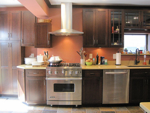
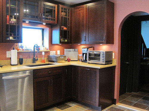
I've been slowly coming to a finish on the kitchen of my 1915 Craftsman (mostly) home for quite a while now. I'm not totally happy with the outcome - there were a lot of problems along the way due to the house not being plumb, pipes in the way which couldn't be moved, some amount of inexperience on the part of the guy who put together my cabinets, mistakes made by everyone and nobody wanting to take the heat for it, etc. Maybe some day I'll be able to afford to correct the ones which irritate me the most *sighs*
Anyway, there's a few tweaks it needs (one of which is the seating area, I'll be starting another thread shortly about that) but the biggest one is the backsplash. I think I finally found the tile I want to use but could use some other eyes to help me.
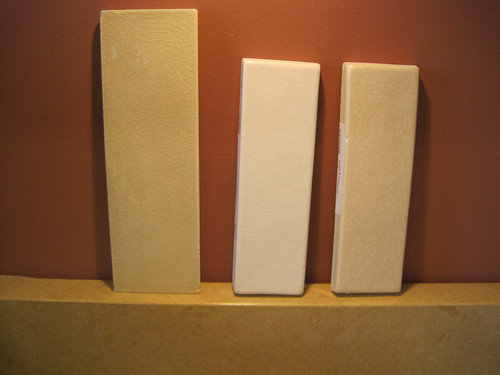
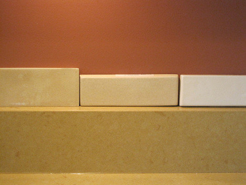
First, I apologize for the quality of light on these samples. It's my kitchen. I don't get very good light at all in it, and even with all the lights turned on, it doesn't seem to help much taking photos of these tiles. I tried using the flash but that made it worse. Plus, 2 of them are very close in tone.
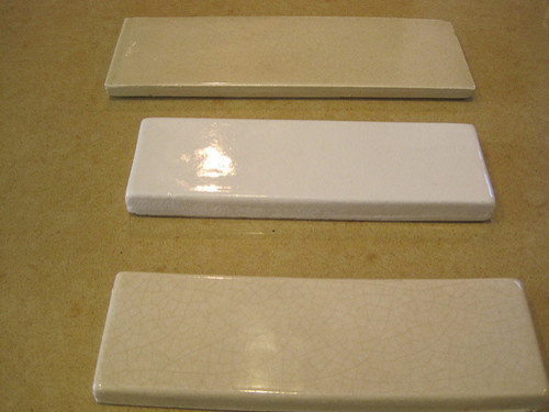
My counter is Ceasarstone "Jerusalem Sand". The samples are Walker Zanger's Gramercy Park in "Hamptons Beige" and "Heirloom White". The last one is from the "Tuileries" collection in "Breton Beige". I wasn't thinking about white for the most part, but include it for the sake of comparison as this white is the first one I've seen that I would consider using. I'm not looking for anything to make a statement for the splash, I want it to be simple. To me, it's a working kitchen - not a showplace per se. I like it to look good, but I don't really have an interest in putting a tile back there which puts my personality into it. I will, however, be using some trim strips. I have my tile guy coming out this week to let me know how much tile is required, and to give his opinion on how to handle certain aspects of the job, such as how to end it off at the run which ends near the arched doorway - nothing evens out there at all.
Also, you can see that I have a 4" splash attached to my counter. This, was a mistake on the part of the fabricator. I wasn't home when they did the installation, and decided not to have them come back to remove it since I wasn't charged for it. It's served me well for all this time, except that I find it doesn't quite do the trick of keeping things as clean as I need them to be plus, the paint is chipping in back of the sink due to the faucet handle hitting it (it had to installed closer to the wall due to a shallower deck than we anticipated). And of course, I have to get one in back of the range because it's rather dangerous not to have a splash there due to heat being generated.
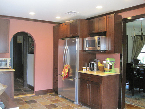
So, here's the pix I took, of each sample, and then some together. I also am including a few of the kitchen so that you can see the overall feel of the room.
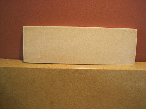
Gramercy Park "Hamptons Beige" (which is the front runner at this time)
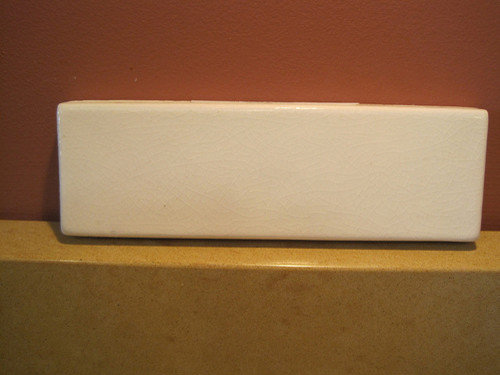
Tuileries "Breton Beige"
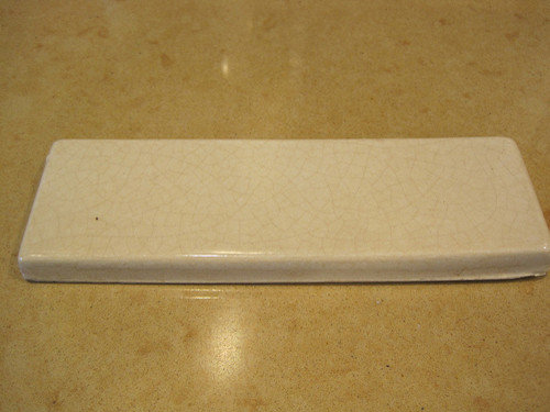
Gramercy Park "Heirloom White"
Group Shot #1 - Smaller pieces are the Gramercy Park
Group Shot #2 - Smaller pieces are the Gramercy Park
Group Shot #3 - Smaller Pieces are the Gramercy Park
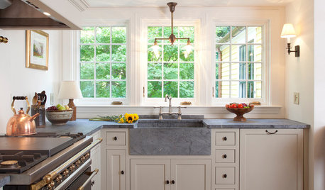
Kitchen View #1:
Kitchen Shot #2 (the tile needs to go on the area under the microwave)
Kitchen Shot #3:
I can get a discount on all of these, not sure how much yet, but it should be rather decent as I work for an architectural firm and typically they will give a percentage off to designers. I'd think at the least 20%, if not more.


nineteenoeight
64reno64
Related Professionals
South Farmingdale Kitchen & Bathroom Designers · Durham Kitchen & Bathroom Remodelers · Phoenix Kitchen & Bathroom Remodelers · Sicklerville Kitchen & Bathroom Remodelers · South Plainfield Kitchen & Bathroom Remodelers · Upper Saint Clair Kitchen & Bathroom Remodelers · Gibsonton Kitchen & Bathroom Remodelers · Hawthorne Kitchen & Bathroom Remodelers · Bullhead City Cabinets & Cabinetry · Burlington Cabinets & Cabinetry · Prior Lake Cabinets & Cabinetry · Rowland Heights Cabinets & Cabinetry · South Gate Cabinets & Cabinetry · Phelan Cabinets & Cabinetry · Oak Hills Design-Build Firmsbadgergal
LaurieOriginal Author