


Help picking quartz counters!!
heartlightgirl
10 years ago
Related Stories
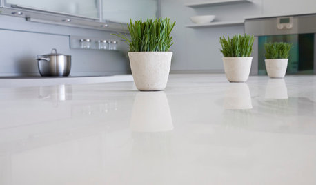
KITCHEN DESIGNKitchen Counters: Stunning, Easy-Care Engineered Quartz
There's a lot to like about this durable blend of quartz and resin for kitchen countertops, and the downsides are minimal
Full Story
COLORPick-a-Paint Help: How to Create a Whole-House Color Palette
Don't be daunted. With these strategies, building a cohesive palette for your entire home is less difficult than it seems
Full Story
COLORPaint-Picking Help and Secrets From a Color Expert
Advice for wall and trim colors, what to always do before committing and the one paint feature you should completely ignore
Full Story
COLORPick-a-Paint Help: How to Quit Procrastinating on Color Choice
If you're up to your ears in paint chips but no further to pinning down a hue, our new 3-part series is for you
Full Story
COLORPick-a-Paint Help: 11 Ways to Mine Your World for Colors
Color, color everywhere. Discover the paint palettes that are there for the taking in nature, shops and anywhere else you roam
Full Story
KITCHEN DESIGNGet Quartz and Porcelain Surfaces Super Clean
These cleaning tips for quartz, travertine, porcelain and engineered stone will help keep your countertops and sinks looking spotless
Full Story
MOST POPULAR7 Ways to Design Your Kitchen to Help You Lose Weight
In his new book, Slim by Design, eating-behavior expert Brian Wansink shows us how to get our kitchens working better
Full Story
SELLING YOUR HOUSE5 Savvy Fixes to Help Your Home Sell
Get the maximum return on your spruce-up dollars by putting your money in the areas buyers care most about
Full Story
KITCHEN DESIGNHow to Pick a Kitchen Backsplash That Wows
Design your ideal backsplash with help from these Houzz guides and inspiring ideas for every kitchen style
Full Story
PRODUCT PICKSGuest Picks: There’s a Cookie Jar for Everyone
Feed conversations as much as your sweet tooth with a fun cookie jar on the kitchen counter
Full StoryMore Discussions


Gracie
heartlightgirlOriginal Author
Related Professionals
Cuyahoga Falls Kitchen & Bathroom Designers · Saint Peters Kitchen & Bathroom Designers · Grain Valley Kitchen & Bathroom Remodelers · Normal Kitchen & Bathroom Remodelers · Artondale Kitchen & Bathroom Remodelers · Chester Kitchen & Bathroom Remodelers · Idaho Falls Kitchen & Bathroom Remodelers · Tuckahoe Kitchen & Bathroom Remodelers · Palestine Kitchen & Bathroom Remodelers · Burr Ridge Cabinets & Cabinetry · Hopkinsville Cabinets & Cabinetry · Norfolk Cabinets & Cabinetry · Saugus Cabinets & Cabinetry · Dana Point Tile and Stone Contractors · Englewood Tile and Stone ContractorsheartlightgirlOriginal Author
Vertise
heartlightgirlOriginal Author
DiggingInTheDirt
DiggingInTheDirt
Gracie
heartlightgirlOriginal Author
joaniepoanie
a2gemini
sas95
GreenDesigns
heartlightgirlOriginal Author
heartlightgirlOriginal Author
BeverlyFLADeziner
heartlightgirlOriginal Author
BeverlyFLADeziner
heartlightgirlOriginal Author
BeverlyFLADeziner
heartlightgirlOriginal Author
heartlightgirlOriginal Author
heartlightgirlOriginal Author
User
BeverlyFLADeziner
jimson11
heartlightgirlOriginal Author
juliet11
amykath
swfr
heartlightgirlOriginal Author
Gracie
bookworm4321