


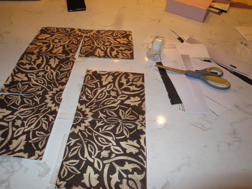
A couple ink cartridges and a new tile sample later
oldbat2be
11 years ago


Featured Answer
Comments (29)

User
11 years agoangie_diy
11 years agoRelated Professionals
Creve Coeur Kitchen & Bathroom Remodelers · Fort Washington Kitchen & Bathroom Remodelers · Idaho Falls Kitchen & Bathroom Remodelers · Idaho Falls Kitchen & Bathroom Remodelers · South Plainfield Kitchen & Bathroom Remodelers · Vashon Kitchen & Bathroom Remodelers · Prairie Village Kitchen & Bathroom Remodelers · Avocado Heights Cabinets & Cabinetry · Berkeley Heights Cabinets & Cabinetry · Lockport Cabinets & Cabinetry · University Park Cabinets & Cabinetry · North Bay Shore Cabinets & Cabinetry · Albertville Tile and Stone Contractors · Hermiston Tile and Stone Contractors · La Canada Flintridge Tile and Stone Contractorschiefy
11 years agodeedles
11 years agomarcolo
11 years ago
Bunny
11 years ago
Shades_of_idaho
11 years agogardenamy
11 years ago
poohpup
11 years agoCEFreeman
11 years agoUser
11 years agodeedles
11 years ago
williamsem
11 years agoellendi
11 years agolalithar
11 years ago
oldbat2be
11 years agooldbat2be
11 years agoCEFreeman
11 years agodeedles
11 years agobellsmom
11 years agoclaybabe
11 years agomrsmortarmixer
11 years agomtnfever (9b AZ/HZ 11)
11 years agobellsmom
11 years agolazyjane75
10 years agocathy725
10 years ago
cawaps
10 years agolazyjane75
10 years ago

Related Stories
REMODELING GUIDES9 Hard Questions to Ask When Shopping for Stone
Learn all about stone sizes, cracks, color issues and more so problems don't chip away at your design happiness later
Full Story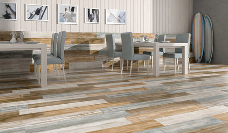
TILETop Tile Trends From the Coverings 2013 Show — the Wood Look
Get the beauty of wood while waving off potential splinters, rotting and long searches, thanks to eye-fooling ceramic and porcelain tiles
Full Story
BLACKCooking With Color: When to Use Black in the Kitchen
Consider sampling Caviar or Cracked Pepper on your kitchen walls or cabinets for richness and impact
Full Story
BATHROOM DESIGN10 Top Tips for Getting Bathroom Tile Right
Good planning is essential for bathroom tile that's set properly and works with the rest of your renovation. These tips help you do it right
Full Story
REMODELING GUIDESTop 10 Tips for Choosing Shower Tile
Slip resistance, curves and even the mineral content of your water all affect which tile is best for your shower
Full Story
BATHROOM DESIGNHow to Match Tile Heights for a Perfect Installation
Irregular tile heights can mar the look of your bathroom. Here's how to counter the differences
Full Story
REMODELING GUIDESStraight From Spain: Amazing New Trends in Tile
Innovative Shapes, Patterns, and Textures Take Tile Beyond Kitchen and Bath
Full Story
TILEHow to Choose the Right Tile Layout
Brick, stacked, mosaic and more — get to know the most popular tile layouts and see which one is best for your room
Full Story
BATHROOM DESIGN'Weave' Stone Tile for an Elegant Bath
Basketweave Mosaics Add Style and Dimension to a Tile Floor
Full Story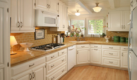
KITCHEN COUNTERTOPSKitchen Counters: Tile, the Choice for Affordable Durability
DIYers and budget-minded remodelers often look to this countertop material, which can last for decades with the right maintenance
Full Story


oldbat2beOriginal Author