


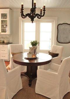
One More Time! Vote paint color, this is it!
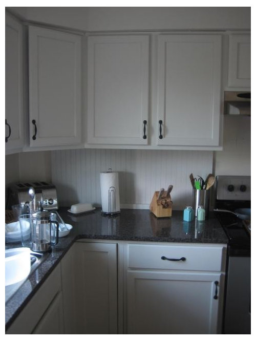
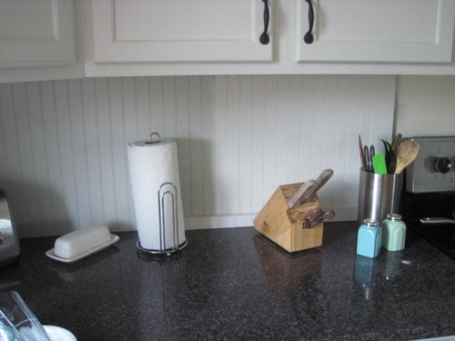
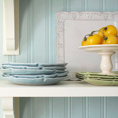
greenhaven
9 years ago

Featured Answer
Comments (43)

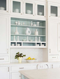
dcward89
9 years ago
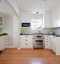
amck2
9 years agoRelated Professionals
Cuyahoga Falls Kitchen & Bathroom Designers · El Dorado Hills Kitchen & Bathroom Designers · Riviera Beach Kitchen & Bathroom Designers · Wentzville Kitchen & Bathroom Designers · South Farmingdale Kitchen & Bathroom Designers · East Tulare County Kitchen & Bathroom Remodelers · Plainview Kitchen & Bathroom Remodelers · Eureka Kitchen & Bathroom Remodelers · Oxon Hill Kitchen & Bathroom Remodelers · Panama City Kitchen & Bathroom Remodelers · Port Charlotte Kitchen & Bathroom Remodelers · Vienna Kitchen & Bathroom Remodelers · Crestview Cabinets & Cabinetry · Los Altos Cabinets & Cabinetry · Wildomar Cabinets & Cabinetrybellsmom
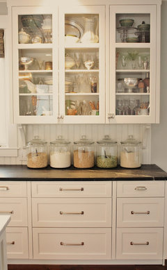
9 years ago
Terri_PacNW
9 years ago
Gracie
9 years agobrightm
9 years ago
ControlfreakECS
9 years ago
Bunny
9 years ago
romy718
9 years agogreenhaven
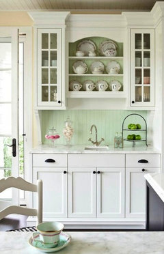
9 years agoGracie
9 years agoromy718
9 years agoGracie
9 years agonosoccermom
9 years agoredheadk
9 years agobridget helm
9 years agobridget helm
9 years agogreenhaven
9 years agoGracie
9 years agomalabacat_gw
9 years agoTexas_Gem
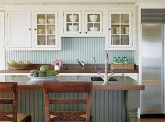
9 years agogreenhaven
9 years agoromy718
9 years agogreenhaven
9 years agodcward89
9 years agogreenhaven
9 years agoSusanNJ72
9 years agoSusanNJ72
9 years agogreenhaven
9 years agonosoccermom
9 years agoSusanNJ72
9 years agogreenhaven
9 years agoromy718
9 years agogreenhaven
9 years agoGracie
9 years ago
msrose
9 years agowags848
9 years agogreenhaven
9 years agomgmum
9 years agoromy718
9 years agocarolssis
9 years agoromy718
7 years ago


Related Stories
KITCHEN DESIGNKitchen Layouts: A Vote for the Good Old Galley
Less popular now, the galley kitchen is still a great layout for cooking
Full Story
DECORATING GUIDESA Vote for the Cable Stitch in Home Decor
Warm Up a Room With the Look, Feel and Memories of Knitting
Full Story
COLORWhy You Should Paint Your Walls More Than One Color
Using multiple colors can define zones, highlight features or just add that special something
Full Story
KITCHEN DESIGNCouple Renovates to Spend More Time in the Kitchen
Artistic mosaic tile, custom cabinetry and a thoughtful layout make the most of this modest-size room
Full Story
DECORATING GUIDESHouzz Tour: A Family Home Comes Together, One Piece at a Time
A decorator uses her expert eye to outfit her family’s home with finds from thrift stores, online resale sites and yard sales
Full Story
COLORBedroom Color: The Secret to More Sex and More Sleep
Look to surprising revelations about bedroom wall colors to get more of what you want
Full Story
DECORATING GUIDESMore Is More: The 10 Tenets of Maximalist Style
Ready to join the school of over-the-top design? Learn how to embrace excess in your interiors
Full Story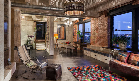
You Said It: ‘The More Dents, the Better’ and More Houzz Quotables
Design advice, inspiration and observations that struck a chord this week
Full Story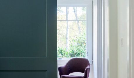
COLORMore Top Paint Picks for 2014: New Greens, Blues and Neutrals
Valspar’s new colors aim to lift spirits and express creativity. Here’s how to use 9 of them in lively ways
Full Story
COLORTime to Step Out of Your Color Comfort Zone?
If you always seem to pick warm tones, or you stick to the cool ones, bucking your natural inclination could bring new energy to a room
Full Story


Gracie