Shop Products
Houzz Logo Print
foodonastump

Another "where to end backsplash" question

foodonastump
10 years ago

Disclaimer: Yes I've googled this and I know there are different schools of thought. Just trying to get opinions on my particular case.

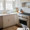
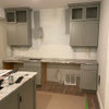
I've got this issue on both ends of my run. Here's the right side. Bill Vincent's first picture on the linked thread is very similar to my situation - angled lower and all - and has me comfortable ending at the end of the upper. Fortunately the granite is pretty tight within those last 10 inches or so.

Here is a link that might be useful: Old thread

Comments (12)

  • a2gemini
    10 years ago

    I went to the end of my countertop. I also have an angle cabinet but less of a difference between the top and bottom cabinets
    I think it is whatever you like.

  • foodonastump
    Original Author
    10 years ago

    And here's the left side. Granite gaps from zero in the front to about 1/8" in the back. I figure if I don't go to the end of the counter on the right side then I wouldn't on this side either. The question would be whether to turn the corner at all.

    If I don't, I'm thinking an appropriately colored silicone could hide the gap pretty well, plus a toaster oven will cover the worst of it.

    How would you end these?

    Tile not picked yet - I'm thinking this decision may influence my choices.

  • ellendi
    10 years ago

    Can you post a long shot of the kitchen? I think we can get a better perspective.

    I looked at your link and I do like what Bill Vincent did. It is the first time I have seen an installation done with a curved tiled!

  • foodonastump
    Original Author
    10 years ago

    Longer shots... Tile will go to 8' ceiling over the range. Right:

  • foodonastump
    Original Author
    10 years ago

    And left. Since my earlier posting I'm leaning towards not turning the corner. And while I've seen examples for the right for straight down, stepped, or continue to the corner that I like, I'm still leaning towards ending at the upper.

    The linked thread suggests using vertical art to make it look right. Great thread with a mock-up, for anyone googling! I like Beth's final result.

    Here is a link that might be useful: Other thread

  • ellendi
    10 years ago

    I know this is a done deal, and whatever you choose to do will look amazing, but may I ask why it was measured this way?

    My vote for the left side would to just have just a backsplash and not a side splash. Not a fan of the side splash.
    On the right, I am not sure if Bill Vincent's idea would work here as you have much more space.
    In your case you would have to go past the cabinet and then down, with a bullnose finish for the top tiles.

    And yes some kind of art to off set the difference.

  • rosie
    10 years ago

    Another vote for not turning the corner and ending with the upper cabinets on the right. Beth's kitchen does look terrific and makes a great argument for creating visual sense this way.

  • palimpsest
    10 years ago

    I would say no side splash and straight down from the upper cabinet to the counter falling short of the end of the end of the lower run of cabinets. In essence then you would have two areas of counter with no backsplash touching them (One a side and one the back with no upper above it).

  • foodonastump
    Original Author
    10 years ago

    Ellen - I think mine is pretty close to Beth's. Also, to be clear, I'm looking at Bill's first picture, not the one with the rounded bullnose.

    As to why I did it that way, two reasons: first of all, symmetry of the uppers. I thought putting a single wider door on the right might not look right considering the rest of the upper run has the same width doors. Second, next to that run is the entrance to the kitchen, on the other side is the fridge and I was very afraid of closing up the entrance visually. Thought holding back the upper would help avoid that.

    In retrospect the latter would not have been an issue, but I still appreciate the symmetry.

    Right or wrong, like you said it's a done deal. :-)

    This post was edited by foodonastump on Fri, Aug 2, 13 at 12:00

  • ellendi
    10 years ago

    Thanks for clarifying. What can I say I am obsessed with all things kitchen:)
    I went back to the old thread. i agree that you should follow the top cabinet down. Get a piece of art work to visually fill in the empty space.
    How far away from a door is the right side? I have seen where the tile goes past the counter and down to the floor. But only if the space between the counter and door is not too wide.

  • sosouper
    10 years ago

    Not sure if you already have your answer but our end cabinets are similar.

    Here is a link that might be useful: Backsplash

  • foodonastump
    Original Author
    10 years ago

    a2 - I looked up your beautiful kitchen and yes, you've got a LOT less difference between top and bottom!

    ICW's is closer to my situation and looks good, but I think it makes a difference that the door moulding is close.

    In my case the diff between upper and counter is 10", and then there's 18" to the corner so I think that 10x18 rectangle might look like it's kind or hanging out there.

    And so Ellen, I also think 18" is too wide to go to the floor but I did play with that idea in my mind.

    Thanks a lot for the responses. I'm quite sure my mind is made up, no sidesplash and end with upper, so I'm glad that got a few votes and more importantly that no one has said it would be a mistake!