


Color Musings
plllog
14 years ago
Related Stories
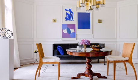
SHOP HOUZZShop Houzz: Let Matisse Be Your Muse
Mix pieces with splashy hues and fluid shapes inspired by the artist with modern, romantic or urban industrial decor
Full Story0
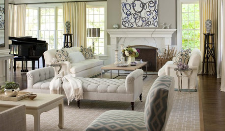
HOUZZ TOURSHouzz Tour: Playful and Elegant in New York
Designer Lauren Muse gives this suburban house a sophisticated touch for blogger Sue De Chiara's family of 5
Full Story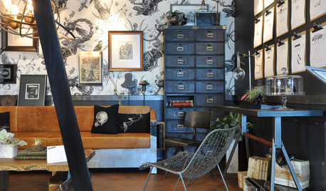
THE ART OF ARCHITECTUREDesign Practice: 11 Ways Architects Can Overcome Creative Blocks
When inspiration remains elusive, consider these strategies for finding your creative muse
Full Story
SHOP HOUZZShop Houzz: An Artful Kandinsky-Inspired Space
Go bold, beautiful and brilliant with the artist as your muse
Full Story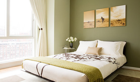
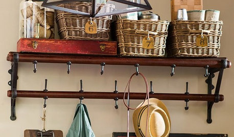
PRODUCT PICKSGuest Picks: Practical Ways to Use a Blank Kitchen Wall
Organize and keep kitchen items close with these racks, shelves, hooks and more
Full Story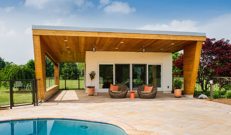
STUDIOS AND WORKSHOPSQuick Take: A Modern Pool House for Art and Entertaining
Natural light and epic views make this New Jersey outbuilding perfect for creative pursuits
Full Story
PRODUCT PICKSGuest Picks: 19 Kitchen Upgrades for When You Can't Afford an Overhaul
Modernize an outdated kitchen with these accents and accessories until you get the renovation of your dreams
Full Story
DECORATING GUIDESSlow Design: Today's 'Wabi-Sabi' Helps Us Savor the Moment
Learn about the design movement that's aiming to satisfy our real needs, leaving materialism in the past
Full Story
DECORATING STYLESFinding the 'Wabi-Sabi' in Midcentury Modern Design
Part 2 of our wabi-sabi series: in which Knoll, the Eameses and more celebrate streamlined forms around the home
Full Story


margareta_mi
marthavila
Related Professionals
Albany Kitchen & Bathroom Designers · Wesley Chapel Kitchen & Bathroom Designers · Terryville Kitchen & Bathroom Designers · Covington Kitchen & Bathroom Designers · Emeryville Kitchen & Bathroom Remodelers · Rancho Cordova Kitchen & Bathroom Remodelers · South Park Township Kitchen & Bathroom Remodelers · Princeton Kitchen & Bathroom Remodelers · Bonita Cabinets & Cabinetry · Canton Cabinets & Cabinetry · Foster City Cabinets & Cabinetry · Lakeside Cabinets & Cabinetry · Phelan Cabinets & Cabinetry · La Canada Flintridge Tile and Stone Contractors · Redondo Beach Tile and Stone Contractorsnatenvalsmom
plllogOriginal Author
cat_mom
rosie
charlikin
earthpal
rubyfig
plllogOriginal Author
donka
marthavila
marthavila
donnakay2009
rhome410
elizpiz
crzyktchnlady
earthpal
plllogOriginal Author
zeebee
zeebee
rhome410
rubyfig
palimpsest
crzyktchnlady
plllogOriginal Author
palimpsest
lisa_a
elizpiz
donka
marthavila
laurap_2007
cat_mom
lisa_a
hestia_flames
redroze
redroze
southernstitcher
southernstitcher
marthavila
plllogOriginal Author
plllogOriginal Author
rosie
plllogOriginal Author
lisa_a
southernstitcher