


Cambria Decision
mamasheshe
11 years ago

Sort by:Oldest
Comments (22)
Related Stories
BATHROOM DESIGNBathroom Countertops 101: The Top Surface Materials
Explore the pros and cons of 7 popular bathroom countertop materials
Full Story
KITCHEN DESIGNPearls of Wisdom From a Real-Life Kitchen Remodel
What your best friend would tell you if you were embarking on a renovation and she'd been there, done that
Full Story
MOST POPULARHow to Choose the Right Kitchen Sink
Learn about basin configurations, sink shapes, materials and even accessories and specialty sinks
Full Story
KITCHEN DESIGNGet Quartz and Porcelain Surfaces Super Clean
These cleaning tips for quartz, travertine, porcelain and engineered stone will help keep your countertops and sinks looking spotless
Full Story
KITCHEN DESIGNKitchen Counters: Stunning, Easy-Care Engineered Quartz
There's a lot to like about this durable blend of quartz and resin for kitchen countertops, and the downsides are minimal
Full Story
KITCHEN DESIGN3 Steps to Choosing Kitchen Finishes Wisely
Lost your way in the field of options for countertop and cabinet finishes? This advice will put your kitchen renovation back on track
Full Story
KITCHEN DESIGNKitchen Countertops 101: Choosing a Surface Material
Explore the pros and cons of 11 kitchen countertop materials. The options may surprise you
Full Story
KITCHEN DESIGNHouzz Quiz: What Kitchen Countertop Is Right For You?
The options for kitchen countertops can seem endless. Take our quiz to help you narrow down your selection
Full Story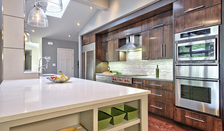
KITCHEN COUNTERTOPS7 Low-Maintenance Countertops for Your Dream Kitchen
Fingerprints, stains, resealing requirements ... who needs ’em? These countertop materials look great with little effort
Full Story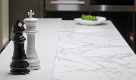
KITCHEN COUNTERTOPSKitchen Counters: High-Tech Solid Surfaces Make Maintenance Easy
Sculpted by heat and nonporous by nature, solid-surface countertops bring imagination and low maintenance to the kitchen
Full StoryMore Discussions


mamashesheOriginal Author
mamashesheOriginal Author
Related Professionals
Grafton Kitchen & Bathroom Designers · Yorba Linda Kitchen & Bathroom Designers · Reedley Kitchen & Bathroom Designers · Auburn Kitchen & Bathroom Remodelers · Bremerton Kitchen & Bathroom Remodelers · Morgan Hill Kitchen & Bathroom Remodelers · Oklahoma City Kitchen & Bathroom Remodelers · San Juan Capistrano Kitchen & Bathroom Remodelers · Superior Kitchen & Bathroom Remodelers · Toledo Kitchen & Bathroom Remodelers · Eureka Cabinets & Cabinetry · Mount Holly Cabinets & Cabinetry · Reading Cabinets & Cabinetry · Fayetteville Tile and Stone Contractors · Scottdale Tile and Stone ContractorsmamashesheOriginal Author
beeps
mamashesheOriginal Author
ae2ga
oldbat2be
ellendi
sas95
mamashesheOriginal Author
mamashesheOriginal Author
mamashesheOriginal Author
a2gemini
mamashesheOriginal Author
Gracie
mamashesheOriginal Author
mamashesheOriginal Author
a2gemini
maries1120
weimom
mamashesheOriginal Author
MeMcG