


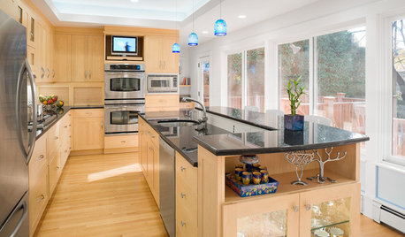
Please tell me which layout do you like better by a quick look?
mudworm
12 years ago
Sort by:Oldest
Comments (26)
Related Stories
UNIVERSAL DESIGNHow to Light a Kitchen for Older Eyes and Better Beauty
Include the right kinds of light in your kitchen's universal design plan to make it more workable and visually pleasing for all
Full Story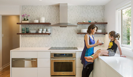
INSIDE HOUZZTell Us Your Houzz Success Story
Have you used the site to connect with professionals, browse photos and more to make your project run smoother? We want to hear your story
Full Story
LANDSCAPE DESIGNGarden Overhaul: Which Plants Should Stay, Which Should Go?
Learning how to inventory your plants is the first step in dealing with an overgrown landscape
Full Story
FUN HOUZZHouzz Call: Tell Us About Your Dream House
Let your home fantasy loose — the sky's the limit, and we want to hear all about it
Full Story
FEEL-GOOD HOMEGuys Tell Us About Their Favorite Places at Home
For Father’s Day, Houzz men show us the places in their homes where they like to hang out
Full Story
KITCHEN DESIGNOpen vs. Closed Kitchens — Which Style Works Best for You?
Get the kitchen layout that's right for you with this advice from 3 experts
Full Story
FUN HOUZZHouzz Quiz: Which Midcentury Modern Chair Are You?
Have a seat for a little fun. Better yet, have a seat that has you written all over it
Full Story
HOUZZ TOURSMy Houzz: Curiosities Tell a Story
An interiors stylist uses her house as a 3D timeline of her tales and travels
Full StoryKITCHEN DESIGN12 Great Kitchen Styles — Which One’s for You?
Sometimes you can be surprised by the kitchen style that really calls to you. The proof is in the pictures
Full Story
BATHROOM DESIGNUpload of the Day: A Mini Fridge in the Master Bathroom? Yes, Please!
Talk about convenience. Better yet, get it yourself after being inspired by this Texas bath
Full Story

remodelfla
scootermom
Related Professionals
Clarksburg Kitchen & Bathroom Designers · Fresno Kitchen & Bathroom Designers · Glens Falls Kitchen & Bathroom Designers · Queen Creek Kitchen & Bathroom Designers · Saint Peters Kitchen & Bathroom Designers · Beachwood Kitchen & Bathroom Remodelers · Normal Kitchen & Bathroom Remodelers · North Arlington Kitchen & Bathroom Remodelers · Ogden Kitchen & Bathroom Remodelers · Port Angeles Kitchen & Bathroom Remodelers · West Palm Beach Kitchen & Bathroom Remodelers · Chaparral Tile and Stone Contractors · Wyomissing Tile and Stone Contractors · Whitefish Bay Tile and Stone Contractors · Plum Design-Build Firmsflwrs_n_co
joyjoyjoy
John Liu
Mercymygft
megypt
mudwormOriginal Author
detroit_burb
NatalieChantal
rhome410
northcarolina
formerlyflorantha
dee850
mudwormOriginal Author
mudwormOriginal Author
dee850
catherine_l
mudwormOriginal Author
joyjoyjoy
breezygirl
NatalieChantal
scootermom
detroit_burb
catherine_l
formerlyflorantha