Shop Products
Houzz Logo Print
redroze_gw

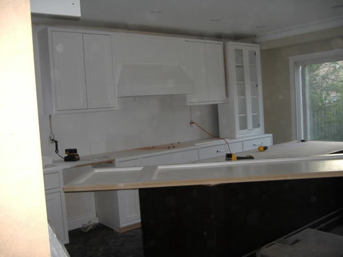
How to improve our painted range hood - Pics

redroze
15 years ago

So most of our upper cabinets are in and the island's in. The granite goes in a week from tomorrow!! The tall glass cabinet isn't in yet as it sits on top of the granite. Things are really busy.

I'm not wowed by our painted range hood. I had given them an inspiration pic that they didn't follow. It looks okay but the top part looks plain. Would you panel it with false doors? Or put a ledge on it? Please give any suggestions, thanks!! Sorry about the spotty pics, I'm going to go clean our camera lens now...


Comments (27)

  • nymommy
    15 years ago

    Maybe they can add a little shelf so that you can put some plates on it or something and add some simple corbels where the hood meets the backsplash. It might look nice when you have the rest of the kitchen done and it's just hard to see it now.

  • pbrisjar
    15 years ago

    For a great use of a shelf on a painted hood, take a look at soonermagic's hood here:
    http://ths.gardenweb.com/forums/load/decor/msg031917086097.html

    f not that, how about a nice medallion, tile piece or wood trim of some sort - something with pizzas?

  • astridh
    15 years ago

    It looks as though your cabinet doors are inset. I think that cabinet doors just laid on top of your hood won't be compatible. Would it be even possible to put an inset door above your hood now? I agree that it looks a bit plain now, but I think you should wait until everything else is done (including backsplash) and see how it looks then. Maybe you could dress up the edge of the hood with your backsplash material. Or, put up a decorative plate/tray/picture/piece of metalwork above the hood on the flat vertical part. Your cabinets look lovely.

  • remodelfla
    15 years ago

    YOu might want to wait until your backsplash is in. Granite and backsplash can make a dramatic difference.

  • redroze
    Original Author
    15 years ago

    Here's a close up. The island is pretty much centred in front of it and we'll have two pendant lights...so maybe it's better that it's simple?

    Our GC/friend suggested we do a panel similar to the cabinets. I had opted against it as I didn't really want a cabinet there and wasn't sure it would look nice. Now I think maybe I was wrong...

  • redroze
    Original Author
    15 years ago

    Here's one that gives more perspective. The two dark holes above the island is where two bell jar lantern-style pendants will hang.

  • bbstx
    15 years ago

    Could you take molding similar to the molding that runs just above the actual hood part, and use it to divide the very plain panel into vertical thirds?

  • rosie
    15 years ago

    Or how about taking that horizontal molding just above the hood and turning it into instead a shallow shelf (as mentioned by NYMommy). It needn't actually be thick enough to hold anything deeper than a couple of plates or a painting, and the corners might curve back into the vertical borders. I personally wouldn't do corbels or brackets down the sides (even though we did brackets for ours--to keep curtains from blowing in). Besides the possibility of being too busy, even simple ones would make the stove/hearth area look small and can always be added later if desired.

  • malhgold
    15 years ago

    Along the lines of bbstx, I too was going to suggest some molding on the hood. But honestly, from further back, it doesn't stand out to me as being plain. Maybe you should wait for your counters and backsplash to be installed before adding anything. Seems like it would be a pretty easy fix when everything else is finished. Looks beautiful so far!

  • redroze
    Original Author
    15 years ago

    This was the inspiration pic which as you can see, is different from our hood which explains why I didn't think we'd need panelling. Now that I'm looking at our hood, doesn't it look too low?? I'm going to go measure it now to make sure it fits the cooktop requirements...we have an electric cooktop, not a range...

  • gglks
    15 years ago

    i think close up it looked a little plain but the shot of the whole kitchen looked great. i think with granite, backsplash and pendents it will be perfect. i have used silver spring like plate hangers for about $1 each to hang plates. you can barely see them. if you are into the plate thing above the hood as decoration, you may not even need to add any molding.

    i think i would keep it as is for now. everything looks amazing. you must be soooooo excited...

  • redroze
    Original Author
    15 years ago

    Great ideas everyone! You're right, I'll wait until everything is in. Our granite is pretty busy and pendants are pretty make-a-statement so maybe it's better if this part stays simple.

    We figured out why it's low-ish...the vent hole thingy constricts how high we can put it. It looks okay. Probably only bad for some of our taller family members. =)

    Gglks - we are so excited!!

  • annes_arbor
    15 years ago

    Your kitchen is lovely! But I agree with you that the hood is not so great. To me it's not that it's plain, but that the proportions look wrong--it's very squat. I can see why you are disappointed. IMO I think your cabinet maker should redo it if you had given him/her the inspiration photo and he/she agreed to make it that way.

  • redroze
    Original Author
    15 years ago

    Darn Annes_arbor (not darn you, but darn in general)...I think you're right. It's looking awfully cramped there. Every kitchen photo I've looked at has more space between counter and range hood, and now our beautiful backsplash tile won't stand out as much. I think we need to ask our cabinet people to take it down, chop the top off, then reinstall. DARN!!!

  • rmkitchen
    15 years ago

    WOW!!! Your kitchen is coming together so beautifully. I keep scrolling back up to the top of this post so I can look and look again. Yummy.

    I'm glad you've found a (temporary) solution, to wait until the granite / backsplash / pendants are in. As it is now, the hood is really disappointing and totally not in keeping with the overall tone of your kitchen. None of my business (at all, but I'm going to keep going), but I'm not sure your inspiration photo would be right either, given those amazing pendants. I think they'd clash.

    I think that when all the elements are in place it'll be really apparent what to do (if anything) to spice up the hood.

    But oh my god, redroze, your kitchen is just so gorgeous! I can't wait until I come up to Toronto and suss you out (I'll ask all over "where's the gorgeous white kitchen?") and get to see it in person. Wow!

  • redroze
    Original Author
    15 years ago

    Thanks Rm!!! You're welcome to stop by anytime you're in Toronto. You and that beautiful son of yours! =)

    Hubby worked some magic in Photoshop. It looks much better higher. Since the crown molding isn't in, and neither is the glass cab, and granite doesn't go in til next week so we have some wiggle room. We realized we approved the height of both the range hood and upper cabs via the plans. So we'll pay for the cost of cutting the range hood.

    Looks better, eh?

  • annes_arbor
    15 years ago

    I think the photoshop change is definitely better, but (at the risk of being a complete PIA), I think the shape is still not exactly right. I've pasted in a link below. On that web page, "original" or "select series" has a shape that I think might be more pleasing--it would involve eliminating your trim piece between the hood and the flat panel and continuing the side angles on the hood a bit higher. Just a thought.

    Here is a link that might be useful: possible hoods

  • Circus Peanut
    15 years ago

    Ditto what Anne says - it's the proportions that you might want to rethink? It's as though you have an undercab hod and it looks a bit out of place without any cabs to be under, as it were.
    Perhaps a hood that uses all that space might fit your vision better? Something like this, sketched in on top of your original:

  • annes_arbor
    15 years ago

    I love circuspeanut's idea!

  • sayde
    15 years ago

    Shortening the facing above the hood made a very big improvement. If you are going to have a backsplash you might want to mock it up with some craft paper just to see how having a darker large area below the upper cabinets and the hood will balance them out before considering any additional changes to the hood. I think once it raised as in the photoshop'ed image, and your backsplash is in, it will look fine.

  • jen4268
    15 years ago

    redroze- I had an issue with our wood hood, it was too big and you knocked your head on it when you tried to cook. I had our cabinet guy come and fix it, and he had it removed and changed and back in place in 2 day! It is not that big of a deal for them to do and you should get what you want.

  • redroze
    Original Author
    15 years ago

    Thanks Jen - our cabinetry person gave us the same 2-day quote! But he is busy with other projects so hopefully he can slip us in.

    Our designer mocked-up a new look for us and said the shorter hood would look much, much better. I like it! Basically she said to add two pieces of horizontal trim to the bottom area to give it definition.

  • ravmd
    15 years ago

    redroze-I am addicted to looking for your posts and pictures!!!
    Your kitchen is looking amazing! Your above change to the hood will make it even more stunning. It's amazing to see how the little details can improve things.

    (We hope to achieve a similar look as the colors/cabs you chose so keep the photos coming!)

  • blakey
    15 years ago

    redroze:
    I think the trim is going to make all the difference. It will give the hood a little more pop. It's really coming together for you-very exciting!

  • bayareafrancy
    15 years ago

    I think that spot above the hood looks like it was designed for some artwork. Or a hanging platter type thing. So, if you want an easy fix, I would vote for adding the trim as suggested, and then putting up some art. I think you've looked at soonermagic's kitchen? I love the 'soonermagic' plaque her husband had made for her. Something like that would look very cool!

    :-)

    francy

  • redroze
    Original Author
    15 years ago

    Ravmd - I posted more pics on another post. Feel free to look and good luck with all your planning!! I know, details make such a huge difference.

    Blakey - It does make a huge difference, I know!

    Bayareafrancy - We decided to cut down the hood. We have two fairly ornate pendant lights that will be above the island, so although I really like the look of hanging something above the hood, we wanted to keep the cabinets neutral so the pendants stand out more. Soonermagic's kitchen is Gorgeous with a capital G.

  • igloochic
    15 years ago

    I'm reading this and kept thinking...YOU HAVE TO ADD TRIM TO IT!!!! So, I'm with you, raise the upper area and add the trim and it will look lovely. If you want more defination, put a bit of tile in the open area between the trim. But I think that's not totally necessary....it would just be a added bonus.

Sponsored
Kitchen Kraft
Average rating: 4.8 out of 5 stars39 Reviews
Ohio's Kitchen Design Showroom |11x Best of Houzz 2014 - 2022