


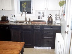
Look weird? Upper cabinets different color than lowers?
alin04
15 years ago
Featured Answer
Sort by:Oldest
Comments (12)

sunnyd_2008
15 years agoRelated Professionals
Bensenville Kitchen & Bathroom Designers · Apex Kitchen & Bathroom Remodelers · Auburn Kitchen & Bathroom Remodelers · Bellevue Kitchen & Bathroom Remodelers · Folsom Kitchen & Bathroom Remodelers · Patterson Kitchen & Bathroom Remodelers · Sioux Falls Kitchen & Bathroom Remodelers · Turlock Kitchen & Bathroom Remodelers · Fairmont Kitchen & Bathroom Remodelers · Land O Lakes Cabinets & Cabinetry · Los Altos Cabinets & Cabinetry · Tacoma Cabinets & Cabinetry · Wadsworth Cabinets & Cabinetry · Liberty Township Cabinets & Cabinetry · Channahon Tile and Stone Contractorspaulines
15 years agoscubated
15 years ago
3katz4me
15 years agojenanla
15 years agobudge1
15 years agobudge1
15 years agormkitchen
15 years agoalin04
15 years agorosie
15 years ago
Jean Farrell
15 years ago
Related Stories
BEFORE AND AFTERSA ‘Brady Bunch’ Kitchen Overhaul for Less Than $25,000
Homeowners say goodbye to avocado-colored appliances and orange-brown cabinets and hello to a bright new way of cooking
Full Story
KITCHEN DESIGNKitchen Combo to Try: Neutral Cabinets, Different-Colored Island
Avoid a too-sterile look and establish a focal point with a contrasting island hue
Full Story
KITCHEN DESIGNHow to Lose Some of Your Upper Kitchen Cabinets
Lovely views, display-worthy objects and dramatic backsplashes are just some of the reasons to consider getting out the sledgehammer
Full Story
KITCHEN DESIGNRelocated Colonial Kitchen More Than Doubles in Size
Putting the kitchen in a central location allows for a big boost in square footage and helps better connect it with other living spaces
Full Story
BUDGET DECORATING9 Tricks to Boost Your Home’s Appeal for Less Than $400
Whether you’re redecorating or just doing a quick update, check out these ways to enhance your home on a budget
Full Story
COLORWhy You Should Paint Your Walls More Than One Color
Using multiple colors can define zones, highlight features or just add that special something
Full Story
SMALL HOMES28 Great Homes Smaller Than 1,000 Square Feet
See how the right layout, furniture and mind-set can lead to comfortable living in any size of home
Full Story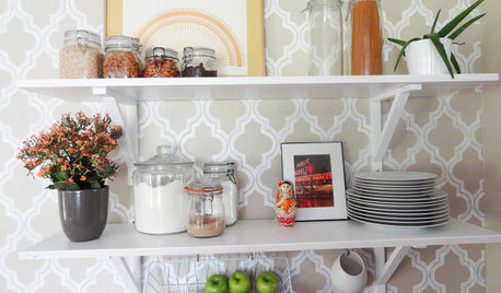
DECORATING PROJECTSDIY Home: Add Open-Shelf Storage for Less Than $40
Got an empty wall and overflowing cabinets and drawers? Curb the clutter with inexpensive open shelves you can install in a day
Full Story
FUN HOUZZWeird but Wonderful Backyard Features
These outdoor areas will have you looking at your own backyard through fresh eyes. Do you dare to be different?
Full Story
ECLECTIC HOMESMy Houzz: Eclectic Bohemian Style in a 1976 Fixer-Upper
These Southern California homeowners patiently added color, style and function to their outdated home
Full StoryMore Discussions


ci_lantro