


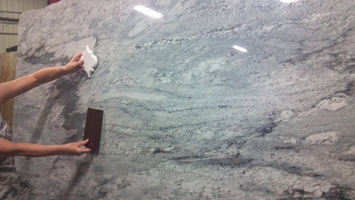
Choice #1 Vote for your favorite countertop w/Arabesque
berardmr
11 years ago
Related Stories
BATHROOM VANITIESShould You Have One Sink or Two in Your Primary Bathroom?
An architect discusses the pros and cons of double vs. solo sinks and offers advice for both
Full Story
BATHROOM DESIGNReaders' Choice: The Top 20 Bathrooms of 2011
Get ideas for your house from the 20 most popular bathroom photos added to Houzz this year
Full Story
KITCHEN DESIGNA Single-Wall Kitchen May Be the Single Best Choice
Are your kitchen walls just getting in the way? See how these one-wall kitchens boost efficiency, share light and look amazing
Full Story
COLORPick-a-Paint Help: How to Quit Procrastinating on Color Choice
If you're up to your ears in paint chips but no further to pinning down a hue, our new 3-part series is for you
Full Story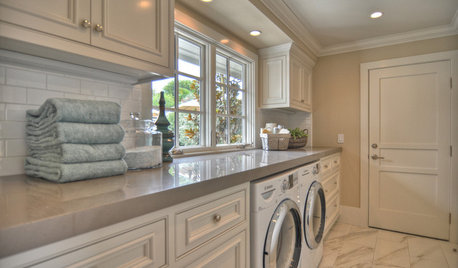
Readers' Choice: The Top 20 Laundry Rooms of 2011
Make doing the wash easier (and even fun) with ideas from the year's most popular laundry room designs
Full Story
KITCHEN DESIGNKitchen Counters: Durable, Easy-Clean Soapstone
Give bacteria the boot and say sayonara to stains with this long-lasting material that's a great choice for kitchen and bath countertops
Full Story
KITCHEN DESIGNCountertop and Backsplash: Making the Perfect Match
Zero in on a kitchen combo you'll love with these strategies and great countertop-backsplash mixes for inspiration
Full Story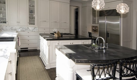
KITCHEN COUNTERTOPSKitchen Countertop Materials: 5 More Great Alternatives to Granite
Get a delightfully different look for your kitchen counters with lesser-known materials for a wide range of budgets
Full Story
KITCHEN DESIGNEco-Friendly Materials: Kitchen Countertops
Going green in the kitchen opens the door to unusual countertop materials that are beautiful, durable and kind to the planet
Full Story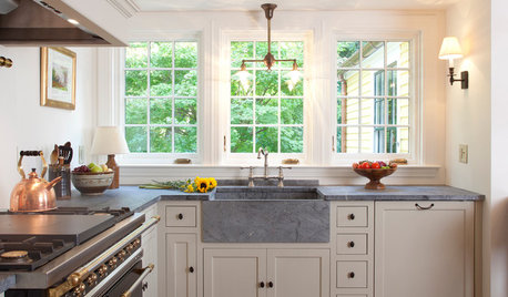
KITCHEN COUNTERTOPS10 Top Backsplashes to Pair With Soapstone Countertops
Simplify your decision-making process by checking out how these styles work with soapstone
Full Story


williamsem
Bunny
Related Professionals
Grafton Kitchen & Bathroom Designers · Wentzville Kitchen & Bathroom Designers · Beach Park Kitchen & Bathroom Remodelers · Andover Kitchen & Bathroom Remodelers · Cocoa Beach Kitchen & Bathroom Remodelers · Creve Coeur Kitchen & Bathroom Remodelers · Fremont Kitchen & Bathroom Remodelers · Lincoln Kitchen & Bathroom Remodelers · Lyons Kitchen & Bathroom Remodelers · Vancouver Kitchen & Bathroom Remodelers · West Palm Beach Kitchen & Bathroom Remodelers · Marco Island Cabinets & Cabinetry · Mount Holly Cabinets & Cabinetry · Davidson Tile and Stone Contractors · Gladstone Tile and Stone Contractorsremodelfla
berardmrOriginal Author
poohpup
berardmrOriginal Author
Ann Scheley
berardmrOriginal Author
corgimum
beekeeperswife
chitown_remodel
nuggly
babs711
springroz
beeps
selphydeg
hags00
hermajesty
Bunny
berardmrOriginal Author
KBH
peonybush
mydreamhome
gardenamy
michelle16
hobokenkitchen
amykath
Lyban zone 4
RICSFAN
chiefy
corgimum
SaraKat
nini804
aliris19
eriepatch
geomeg
tracie.erin
young-gardener
slush1422
MeMcG
wolfgang80
tea4all
chicagoans
ginzing
2LittleFishies
colorfast
msrose
michoumonster
sashasmommy
berardmrOriginal Author