


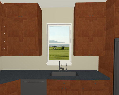
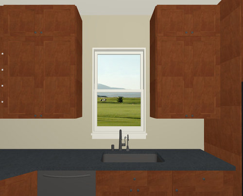
Off-Center Sink and Window...Is this TOO asymmetrical?
kolorblinding
9 years ago
Featured Answer
Sort by:Oldest
Comments (28)
 PRO
PROJoseph Corlett, LLC
9 years ago
feisty68
9 years agoRelated Professionals
El Sobrante Kitchen & Bathroom Designers · Lockport Kitchen & Bathroom Designers · Ridgewood Kitchen & Bathroom Designers · Eagle Mountain Kitchen & Bathroom Remodelers · Channahon Kitchen & Bathroom Remodelers · Glen Carbon Kitchen & Bathroom Remodelers · Pueblo Kitchen & Bathroom Remodelers · Schiller Park Kitchen & Bathroom Remodelers · Sweetwater Kitchen & Bathroom Remodelers · Thonotosassa Kitchen & Bathroom Remodelers · Bonita Cabinets & Cabinetry · Manville Cabinets & Cabinetry · Saugus Cabinets & Cabinetry · Milford Mill Cabinets & Cabinetry · Tabernacle Cabinets & Cabinetry
Gracie
9 years agotexaspenny
9 years agofishymom
9 years agoVertise
9 years agojuddgirl2
9 years agodcward89
9 years agoVertise
9 years agoUser
9 years agoTmnca
9 years ago
romy718
9 years agofeisty68
9 years agogreenhaven
9 years agorahull
9 years agokolorblinding
9 years agonosoccermom
9 years agokolorblinding
9 years agoGracie
9 years agokolorblinding
9 years agoUser
9 years agokolorblinding
9 years agomellyc123
9 years agoUser
9 years agokolorblinding
9 years agonosoccermom
9 years agoPhoneLady
9 years ago


Related Stories
DECORATING GUIDESOff-Center Art Hits the Mark for Energizing Design
Stifling a yawn over symmetry? Shift your art arrangements for design drama that's anything but middling
Full Story
DECORATING GUIDES10 Look-at-Me Ways to Show Off Your Collectibles
Give your prized objects center stage with a dramatic whole-wall display or a creative shelf arrangement
Full Story
KITCHEN DESIGNKitchen of the Week: Updated French Country Style Centered on a Stove
What to do when you've got a beautiful Lacanche range? Make it the star of your kitchen renovation, for starters
Full Story
KITCHEN DESIGNKitchen of the Week: A Seattle Family Kitchen Takes Center Stage
A major home renovation allows a couple to create an open and user-friendly kitchen that sits in the middle of everything
Full Story
DECORATING GUIDES8 Ways to Decorate a Center Table
Make a feature table look grand no matter what its size, with artistic arrangements of flowers, vases and more
Full Story
5 Questions for Houzz Design Stars
Post Ideas for Updating an Exterior, Balancing an Off-Center Window and More
Full Story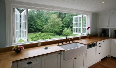
KITCHEN DESIGNRenovation Detail: The Kitchen Sink Window
Doing dishes is anything but a chore when a window lets you drift off into the view beyond the kitchen sink
Full Story
KITCHEN DESIGNPut Your Kitchen in a Good Light With a Window Backsplash
Get a view or just more sunshine while you're prepping and cooking, with a glass backsplash front and center
Full Story
REMODELING GUIDESOriginal Home Details: What to Keep, What to Cast Off
Renovate an older home without regrets with this insight on the details worth preserving
Full Story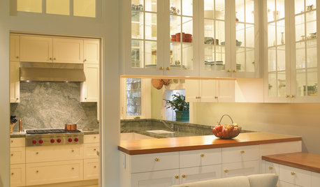
KITCHEN DESIGNHave Your Open Kitchen and Close It Off Too
Get the best of both worlds with a kitchen that can hide or be in plain sight, thanks to doors, curtains and savvy design
Full Story


brightm