


Please remove the yellow out of my cream, please...
Capegirl05
12 years ago
Related Stories
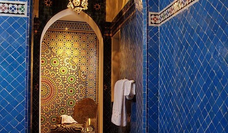
TILEMoor Tile, Please!
Add an exotic touch with Moroccan tiles in everything from intricate patterns and rich colors to subtle, luminous neutrals
Full Story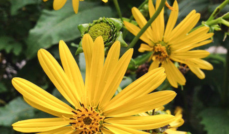
GARDENING GUIDESGreat Design Plant: Silphium Perfoliatum Pleases Wildlife
Cup plant provides structure, cover, food and water to help attract and sustain wildlife in the eastern North American garden
Full Story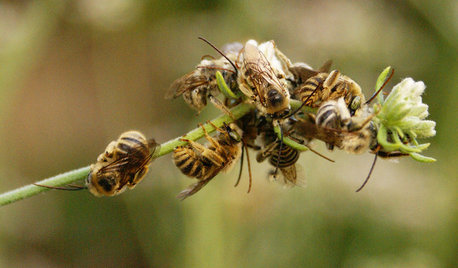
GARDENING GUIDESGreat Design Plant: California Buckwheat Pleases Pollinators
Beneficial insects go wild for this drought-tolerant plant’s summer flowers, while seed heads feed critters foraging in the cold
Full Story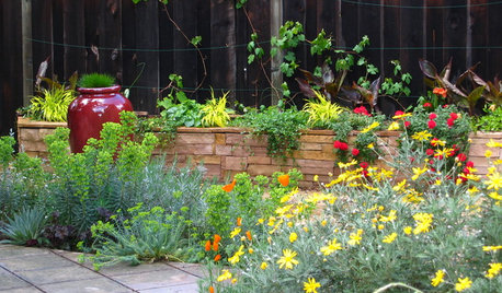
SUMMER GARDENINGHouzz Call: Please Show Us Your Summer Garden!
Share pictures of your home and yard this summer — we’d love to feature them in an upcoming story
Full Story
BATHROOM DESIGNUpload of the Day: A Mini Fridge in the Master Bathroom? Yes, Please!
Talk about convenience. Better yet, get it yourself after being inspired by this Texas bath
Full Story
DECORATING GUIDES10 Bedroom Design Ideas to Please Him and Her
Blend colors and styles to create a harmonious sanctuary for two, using these examples and tips
Full Story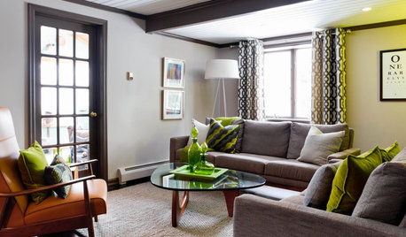
LIVING ROOMSCurtains, Please: See Our Contest Winner's Finished Dream Living Room
Check out the gorgeously designed and furnished new space now that the paint is dry and all the pieces are in place
Full Story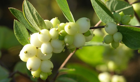
GARDENING GUIDESGreat Design Plant: Snowberry Pleases Year-Round
Bright spring foliage, pretty summer flowers, white berries in winter ... Symphoricarpos albus is a sight to behold in every season
Full Story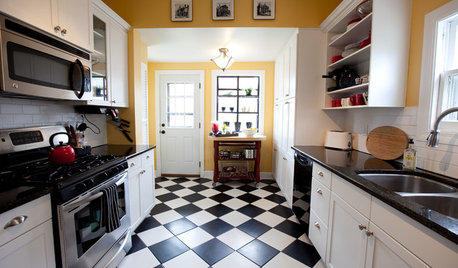
FLOORSChecks, Please! 13 Choices for Checkered Floors
Checkerboard Patterns Go From Casual to Ritzy, From Marble to Grass
Full Story
HOUSEPLANTSMother-in-Law's Tongue: Surprisingly Easy to Please
This low-maintenance, high-impact houseplant fits in with any design and can clear the air, too
Full StoryMore Discussions


mtnrdredux_gw
Capegirl05Original Author
Related Professionals
Federal Heights Kitchen & Bathroom Designers · Owasso Kitchen & Bathroom Designers · Schenectady Kitchen & Bathroom Designers · North Druid Hills Kitchen & Bathroom Remodelers · 20781 Kitchen & Bathroom Remodelers · Eureka Kitchen & Bathroom Remodelers · Linton Hall Kitchen & Bathroom Remodelers · Lynn Haven Kitchen & Bathroom Remodelers · Terrell Kitchen & Bathroom Remodelers · Toledo Kitchen & Bathroom Remodelers · Alafaya Cabinets & Cabinetry · Buena Park Cabinets & Cabinetry · Fort Lauderdale Cabinets & Cabinetry · Cornelius Tile and Stone Contractors · Castaic Design-Build Firmsboymomx2
brianadarnell
silvergirl207
paulineinmn
countrygirl217
VickieHallmark
VickieHallmark
Capegirl05Original Author
VickieHallmark
Capegirl05Original Author
kmeemsie
paulineinmn
mtnrdredux_gw
celineike