


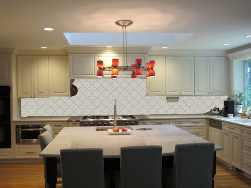
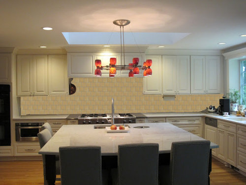
Backsplash - Drawn to Contrast (new photoshopped pics)
oldbat2be
11 years ago


Sort by:Oldest
Comments (44)
Related Stories
COLORKitchen Color: 15 Beautiful Blue Backsplashes
Blue is the new cool kid on the backsplash block, showing up in shades from pale ice to cobalt
Full Story
KITCHEN DESIGN15 Creative Backsplashes Full of Character
You’ll find personality aplenty in these distinctive backsplashes — and lots of inspiration too
Full Story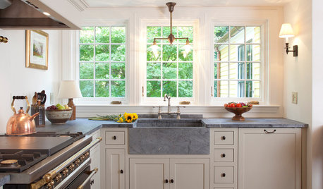
KITCHEN COUNTERTOPS10 Top Backsplashes to Pair With Soapstone Countertops
Simplify your decision-making process by checking out how these styles work with soapstone
Full Story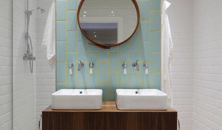
BATHROOM TILEBathroom Backsplashes Make a Style Statement
Be inspired to turn this small bathroom detail into a big design feature
Full Story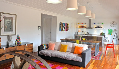
HOUZZ TOURSMy Houzz: Quirky Charm on Aussie Farmland
With skateboards adorning the kitchen, a trash-inspired backsplash and a retro trailer, this home shows passionate creativity
Full StoryHOUZZ TOURSMy Houzz: Domesticating a Rugged Amsterdam Garage
Strong contrasts, myriad collections and vintage touches give a designer’s converted home in the Netherlands creative flair
Full Story
REMODELING GUIDESArchitectural Images: Truth or Fiction?
Technology draws an ever-fainter line between photo and rendering. Can you tell the difference in these 17 images?
Full Story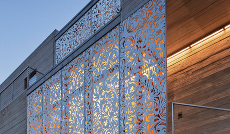
ARCHITECTUREDesign Workshop: Getting a Feel for Steel
Versatile and strong beyond belief, steel can create amazing expressions in homes and landscapes
Full Story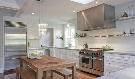
KITCHEN DESIGNCooking With Color: When to Use White in the Kitchen
Make sure your snowy walls, cabinets and counters don't feel cold while you're riding white's popularity peak
Full Story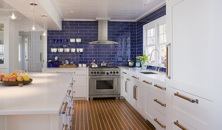
KITCHEN DESIGNKitchen of the Week: Crisp and Coastal on the Connecticut Shore
Water views from a galley kitchen inspire marine touches with a contemporary edge
Full StorySponsored
More Discussions
berardmr
chiefy
Related Professionals
East Peoria Kitchen & Bathroom Designers · Lafayette Kitchen & Bathroom Designers · Southbridge Kitchen & Bathroom Designers · Adelphi Kitchen & Bathroom Remodelers · University City Kitchen & Bathroom Remodelers · Beaverton Kitchen & Bathroom Remodelers · Rancho Palos Verdes Kitchen & Bathroom Remodelers · Waukegan Kitchen & Bathroom Remodelers · East Saint Louis Cabinets & Cabinetry · Gaffney Cabinets & Cabinetry · Harrison Cabinets & Cabinetry · Kaneohe Cabinets & Cabinetry · Newcastle Cabinets & Cabinetry · Elmwood Park Tile and Stone Contractors · Oak Hills Design-Build Firmsoldbat2beOriginal Author
willtv
deedles
oldbat2beOriginal Author
User
remodelfla
deedles
User
cawaps
deedles
sixtyohno
natebear zone 10B
dilly_ny
Karen.1288
oldbat2beOriginal Author
onedogedie
oldbat2beOriginal Author
onedogedie
oldbat2beOriginal Author
natebear zone 10B
chiefy
Circus Peanut
Ann Scheley
oldbat2beOriginal Author
remodelfla
slonewby
marcolo
hobokenkitchen
biochem101
oldbat2beOriginal Author
vidyaram
bons
enright5
enright5
p.ball2
chris11895
Shades_of_idaho
wolfgang80
oldbat2beOriginal Author
vidyaram
Susied3
oldbat2beOriginal Author