


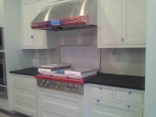
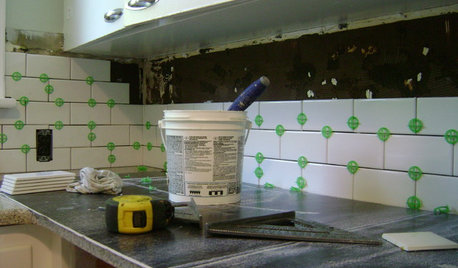
What backsplash and hardware for my kitchen?
maggie530
10 years ago
Sort by:Oldest
Comments (31)
Related Stories
MOST POPULAR19 Kitchen Projects Every Homeowner Should Know About
Could your kitchen use a new sink, a backsplash, updated hardware, better organization, a good cleaning? Here's how to get started
Full Story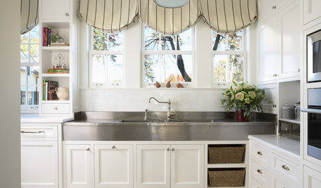
KITCHEN DESIGN8 Top Hardware Styles for Shaker Kitchen Cabinets
Simple Shaker style opens itself to a wide range of knobs and pulls. See which is right for your own kitchen
Full Story
KITCHEN DESIGNTop 9 Hardware Styles for Flat-Panel Kitchen Cabinets
Accentuate this simple cabinet style to best advantage in a modern or contemporary kitchen with the right pulls or latches
Full Story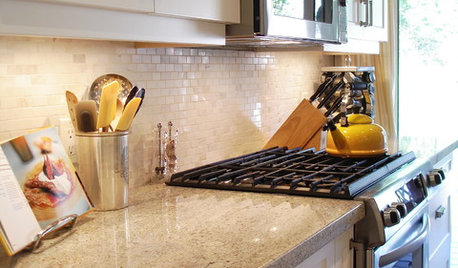
KITCHEN DESIGNThe Right Hardware: Jewelry for Your Home
Elevate Your Design With the Perfect Pulls, Hinges and Handles
Full Story
KITCHEN DESIGNCountertop and Backsplash: Making the Perfect Match
Zero in on a kitchen combo you'll love with these strategies and great countertop-backsplash mixes for inspiration
Full Story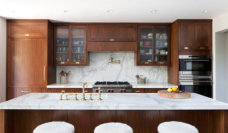
KITCHEN CABINETSNew This Week: 3 Kitchen Cabinet and Hardware Pairings to Try
Consider one of these pairings whether your cabinet color is light, medium or dark
Full Story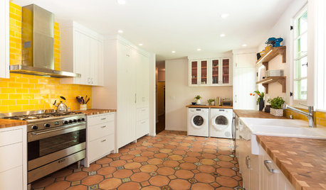
KITCHEN DESIGNNew This Week: 4 Surprising Backsplash and Countertop Pairings
Make your kitchen workspace stand out with colored ceramic tile, back-painted glass, butcher block and more
Full Story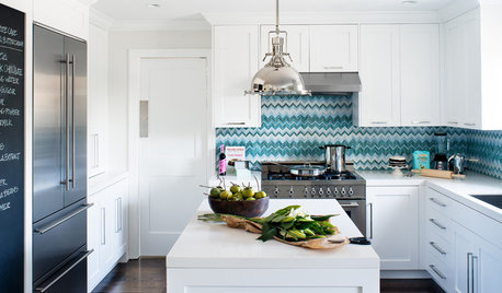
KITCHEN DESIGNKitchen of the Week: Bold Chevrons for a Backsplash
Blue and white zigzags punctuate an otherwise all-white kitchen, completely gutted and redesigned for a Northern California homeowner
Full Story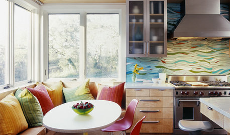
KITCHEN DESIGNKitchen of the Week: Exquisite Artistic Backsplash
Rippling colored glass forms an imaginative wall, while a clever layout embraces practicality in this stunning Texas kitchen
Full Story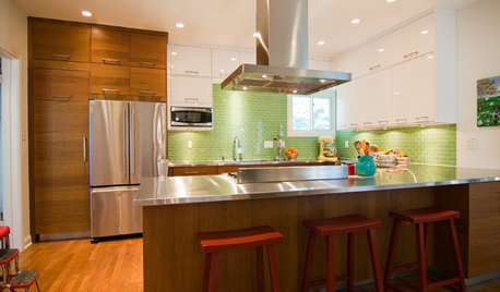
KITCHEN COUNTERTOPS10 Great Backsplashes to Pair With Stainless Steel Counters
Simplify your decision-making with these ideas for materials that work well with stainless steel counters
Full Story

maggie530Original Author
maggie530Original Author
Related Professionals
Agoura Hills Kitchen & Bathroom Designers · Arlington Kitchen & Bathroom Designers · San Jose Kitchen & Bathroom Designers · Saint Charles Kitchen & Bathroom Designers · Plainview Kitchen & Bathroom Remodelers · Garden Grove Kitchen & Bathroom Remodelers · Londonderry Kitchen & Bathroom Remodelers · Weymouth Kitchen & Bathroom Remodelers · Lawndale Kitchen & Bathroom Remodelers · Fairmont Kitchen & Bathroom Remodelers · Forest Hills Cabinets & Cabinetry · Middletown Cabinets & Cabinetry · Radnor Cabinets & Cabinetry · Rowland Heights Cabinets & Cabinetry · Englewood Tile and Stone Contractorsppbenn
ellendi
maggie530Original Author
maggie530Original Author
ellendi
maggie530Original Author
jess1979
a2gemini
caitlinmagner
kksmama
kitchendetective
sixtyohno
Gooster
kitchendetective
maggie530Original Author
maggie530Original Author
maggie530Original Author
heidia
maggie530Original Author
kksmama
maggie530Original Author
kksmama
maggie530Original Author
kksmama
ellendi
maggie530Original Author
maggie530Original Author
kksmama
Gooster