


Backsplash color advice?
lwerner
10 years ago
Sort by:Oldest
Comments (5)
Related Stories
DECORATING GUIDES10 Design Tips Learned From the Worst Advice Ever
If these Houzzers’ tales don’t bolster the courage of your design convictions, nothing will
Full Story
KITCHEN DESIGNSmart Investments in Kitchen Cabinetry — a Realtor's Advice
Get expert info on what cabinet features are worth the money, for both you and potential buyers of your home
Full Story
TASTEMAKERSBook to Know: Design Advice in Greg Natale’s ‘The Tailored Interior’
The interior designer shares the 9 steps he uses to create cohesive, pleasing rooms
Full Story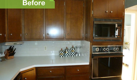
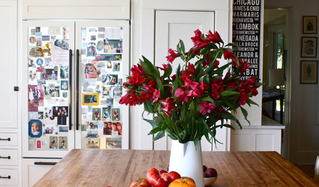
KITCHEN DESIGN3 Dark Kitchens, 6 Affordable Updates
Color advice: Three Houzzers get budget-friendly ideas to spruce up their kitchens with new paint, backsplashes and countertops
Full Story
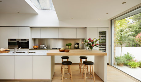
KITCHEN DESIGNCountertop and Backsplash: Making the Perfect Match
Zero in on a kitchen combo you'll love with these strategies and great countertop-backsplash mixes for inspiration
Full Story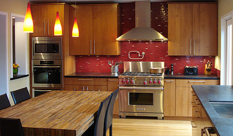
MATERIALSKitchen Ideas: How to Choose the Perfect Backsplash
Backsplashes not only protect your walls, they also add color, pattern and texture. Find out which material is right for you
Full Story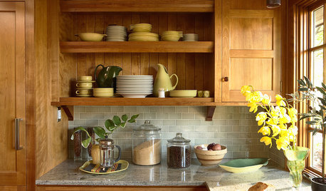
KITCHEN BACKSPLASHESHow to Choose a Backsplash for Your Granite Counters
If you’ve fallen for a gorgeous slab, pair it with a backsplash material that will show it at its best
Full Story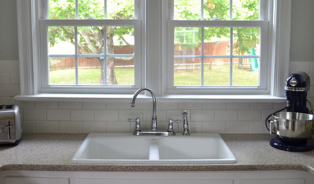
KITCHEN BACKSPLASHESHow to Install a Tile Backsplash
If you've got a steady hand, a few easy-to-find supplies and patience, you can install a tile backsplash in a kitchen or bathroom
Full Story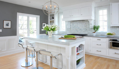
KITCHEN DESIGNHow to Add a Kitchen Backsplash
Great project: Install glass, tile or another decorative material for a gorgeous and protective backsplash
Full StorySponsored
Professional Remodelers in Franklin County Specializing Kitchen & Bath
More Discussions


cawaps
lwernerOriginal Author
Related Professionals
Kalamazoo Kitchen & Bathroom Designers · Pleasant Grove Kitchen & Bathroom Designers · United States Kitchen & Bathroom Designers · Cherry Hill Kitchen & Bathroom Designers · Adelphi Kitchen & Bathroom Remodelers · Hunters Creek Kitchen & Bathroom Remodelers · Morgan Hill Kitchen & Bathroom Remodelers · Payson Kitchen & Bathroom Remodelers · Richardson Cabinets & Cabinetry · Saugus Cabinets & Cabinetry · Roxbury Crossing Tile and Stone Contractors · Scottdale Tile and Stone Contractors · Englewood Tile and Stone Contractors · Mililani Town Design-Build Firms · Pacific Grove Design-Build FirmslwernerOriginal Author
herbflavor
lwernerOriginal Author