


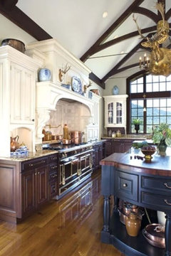
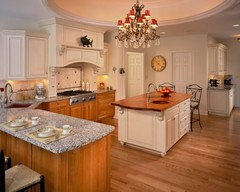
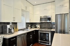
All cherry or white uppers/cherry below?
lisa0527
12 years ago
Featured Answer
Sort by:Oldest
Comments (20)

lisa0527
12 years agojessicaml
12 years agoRelated Professionals
Bonita Kitchen & Bathroom Designers · Lafayette Kitchen & Bathroom Designers · North Versailles Kitchen & Bathroom Designers · Beach Park Kitchen & Bathroom Remodelers · Auburn Kitchen & Bathroom Remodelers · Pearl City Kitchen & Bathroom Remodelers · South Jordan Kitchen & Bathroom Remodelers · Joppatowne Kitchen & Bathroom Remodelers · Beaumont Cabinets & Cabinetry · Christiansburg Cabinets & Cabinetry · Little Chute Cabinets & Cabinetry · Red Bank Cabinets & Cabinetry · Lake Nona Tile and Stone Contractors · Gardere Design-Build Firms · Glassmanor Design-Build FirmsSYinUSA, GA zone 8
12 years agoCapegirl05
12 years agoflwrs_n_co
12 years agojessicaml
12 years agolisa0527
12 years agosayde
12 years agocolorlady
12 years agodilly_ny
12 years agolisa0527
12 years agoboxerpups
12 years agobossanova2
12 years agoboxerpups
12 years agolisa0527
12 years agobossanova2
12 years agolisa0527
12 years agobossanova2
12 years agolisa0527
12 years ago


Related Stories
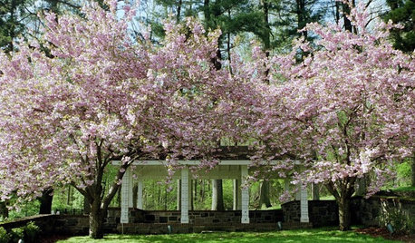
MORE ROOMSCherry Blossoms Spring to 100
This years marks the centennial of the beautiful trees' arrival on our shores. Below, a few ways to celebrate with your landscape and décor
Full Story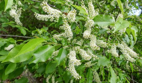
GARDENING GUIDESPlant Black Cherry Trees for the Birds and Bees
Plant Prunus serotina in the Central and Eastern U.S. for spring flowers, interesting bark and beautiful fall color
Full Story
MATERIALSWoodipedia: Is It Cherry or Is It Alder?
Learn the differences between these two wood types, as well as costs, sustainability and a caution about finishing
Full Story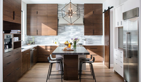
KITCHEN DESIGNNew This Week: Moody Kitchens to Make You Rethink All-White
Not into the all-white fascination? Look to these kitchens for a glimpse of the dark side
Full Story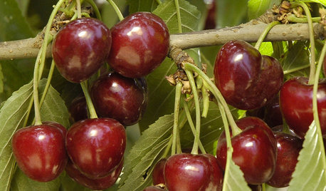
EDIBLE GARDENSHow to Grow Your Own Luscious Cherries
Nope, they’re not the easiest fruit to grow. But with spectacular blossoms and pies as possibilities, cherries are sure worth a try
Full Story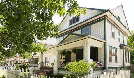
HOUZZ TOURSHouzz Tour: A Fixer-Upper Becomes a Labor of Love
A thrifty spirit and endless vision enable a hardworking Kansas couple to create a charming home on a small budget
Full Story
LIVING ROOMSBelow My Houzz: An Inviting Basement With Industrial Edge
Reconfiguring a cramped, damp basement opens up a new world of sleek, functional spaces
Full Story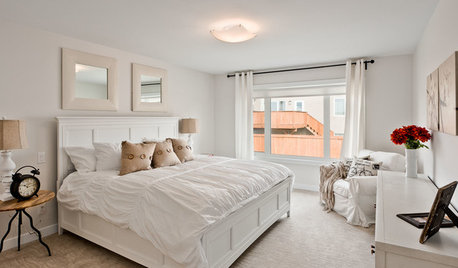
DECORATING GUIDES9 Ways to Boost Your All-White Color Scheme
Grays, seafoam, metal, wood and more help embolden a white-on-white look so it doesn't leave you cold
Full Story
COLORPlay Tricks With Color in Your All-White Room
Splash something unexpected into your sea of white to call attention to a favorite piece or just for fun
Full Story
KITCHEN DESIGNPopular Cabinet Door Styles for Kitchens of All Kinds
Let our mini guide help you choose the right kitchen door style
Full StoryMore Discussions


dilly_ny