


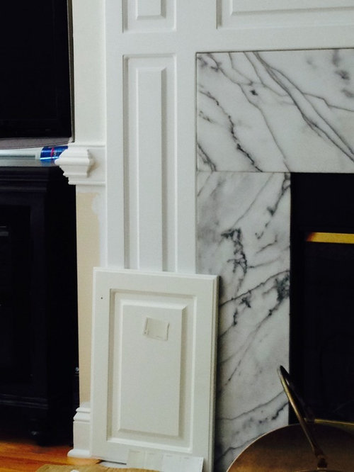
Over-thinking This Color Combo? Pic
tuxedord2
9 years ago
Sort by:Oldest
Comments (7)
Related Stories
SMALL KITCHENS10 Things You Didn't Think Would Fit in a Small Kitchen
Don't assume you have to do without those windows, that island, a home office space, your prized collections or an eat-in nook
Full Story
DECORATING GUIDESHot Color Combo: Cool Blues and Warm Brass
It's trending all over, but navy or royal blue with brass or gold just also might become a new classic pairing
Full Story
BATHROOM WORKBOOKStandard Fixture Dimensions and Measurements for a Primary Bath
Create a luxe bathroom that functions well with these key measurements and layout tips
Full Story
HOUZZ TOURSHouzz Tour: Visit a Forward Thinking Family Complex
Four planned structures on a double lot smartly make room for the whole family or future renters
Full Story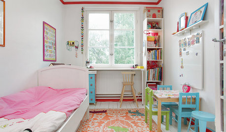
LIFEStop the Toy Takeover by Changing the Way You Think
Make over your approach and get gift givers onboard with your decluttering efforts by providing meaningful toy alternatives
Full Story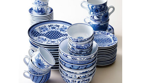
PRODUCT PICKSGuest Picks: Blue and White and Right All Over
Go for a timeless summer color pairing that travels from classic to bohemian without missing a beat
Full Story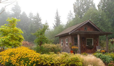
PLANTING IDEASGreat Garden Combo: A Fall Landscape Scene That Lasts
Span the seasons with trees, shrubs and grasses that offer color and texture in abundance
Full Story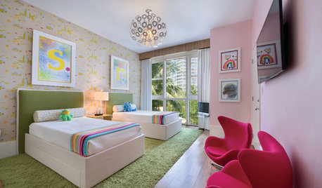
COLORSummer Color Combos: 8 Refreshing Ice Cream Palettes
July 19 is National Ice Cream Day, so scoop up these delectable combinations for sumptuous interiors
Full Story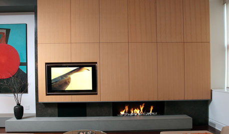
MOST POPULAR7 Ways to Rock a TV and Fireplace Combo
Win the battle of the dueling focal points with a thoughtful fireplace arrangement that puts attention right where you want it
Full Story
PETSSo You're Thinking About Getting a Dog
Prepare yourself for the realities of training, cost and the impact that lovable pooch might have on your house
Full Story


ktj459
Terri_PacNW
Related Professionals
Magna Kitchen & Bathroom Designers · Sunrise Manor Kitchen & Bathroom Remodelers · Los Alamitos Kitchen & Bathroom Remodelers · Pinellas Park Kitchen & Bathroom Remodelers · Placerville Kitchen & Bathroom Remodelers · Roselle Kitchen & Bathroom Remodelers · Saint Augustine Kitchen & Bathroom Remodelers · Warren Kitchen & Bathroom Remodelers · Sharonville Kitchen & Bathroom Remodelers · East Moline Cabinets & Cabinetry · Palos Verdes Estates Cabinets & Cabinetry · Ridgefield Cabinets & Cabinetry · Watauga Cabinets & Cabinetry · Brentwood Tile and Stone Contractors · Roxbury Crossing Tile and Stone Contractorstuxedord2Original Author
nosoccermom
tuxedord2Original Author
palimpsest
Bunny