


Farrow and Ball paint suggestions for walls
I have been looking and looking at Farrow and Ball paint samples. I have never used the paint before but would like to in my kitchen when I make some changes. I really need some suggestions for a wall color that will be cheerful and will go with the following: heart pine floors, upper cabinets that will be a creamy white as well as subway tile, and green lower cabinets that are close to the color of BM's Lafeyette Green, and white wainscoting. I am sure that most of you are tired of seeing my kitchen pictures so I am not posting them again.
My DH would like a yellow, but I'm not sure if that would work. I have a lot of saturated color throughout my home and I am looking for a toned down cheery look for a country kitchen. Plan to add an island sometime later after our cabinets have been repainted.
For those of you familiar with Farrow and Ball paint, do you have any suggestions. Thanks so much.
Comments (93)

rococogurl
11 years agoI'm thinking Matchstick may work best with the green but the question for me will be which of the 3 also works with the backsplash and how sis's very red pine floor pushes undertones in each of the colors. That floor and corner cabinet are major. But 3 great color choices. Hats off to you Pirula.
And thanks for the far too kind words, Anna. ~~~ waving!

sis2two
Original Author11 years agoThank you all. Tomorrow I plan to order more samples. Thanks for the pictures pirula. Your friend's kitchen is so pretty! When I look at the Dorset Cream, even though it may work, I am thinking that I want to go lighter. I may try the lighter ones first and if they are not right, I'll try the Dorset Cream.
Related Professionals
Greensboro Kitchen & Bathroom Designers · Newington Kitchen & Bathroom Designers · North Versailles Kitchen & Bathroom Designers · Philadelphia Kitchen & Bathroom Designers · South Farmingdale Kitchen & Bathroom Designers · Waianae Kitchen & Bathroom Designers · Beach Park Kitchen & Bathroom Remodelers · Honolulu Kitchen & Bathroom Remodelers · Pasadena Kitchen & Bathroom Remodelers · Spanish Springs Kitchen & Bathroom Remodelers · Waukegan Kitchen & Bathroom Remodelers · Middlesex Kitchen & Bathroom Remodelers · Manville Cabinets & Cabinetry · Salisbury Cabinets & Cabinetry · South Riding Cabinets & Cabinetrykimiko232
11 years agoOh, I'm reminded how I picked the wrong color for my walls. Sigh. I picked revere pewter thinking I was being more fashion forward than the cream I picked. Blah, blah, blah. Grey is so trendy now... Oh well. It was pirula's kitchen that made me want to do the cream. I did pick out the FPE paint done in an ivory white (bm match) for our cabs. So, I did pick something similar to the pointing I should have picked. Though the ivory white is more creamy than the pointing. When I repaint next time, I'm going with the FB for the walls. I love the colors of your home. So beautiful. Thanks for asking this question so I can dream again! :)
Kimsis2two
Original Author11 years agopirula and rococogurl-My plan is to try and match my creamy crackle subway tile to the color of the upper cabinets to try to have a more seamless look. I am looking at the Alpine White color by Woodmode since I am changing my upper doors to the shaker style . Just wanted to run this past you two to see if that is the right direction. As you're aware I had so many slices of color before that I am trying to avoid that look. Thank you again.
rococogurl
11 years agoSo you're saying that you plan to match/coordinate the Woodmode color for the new upper doors to the backsplash tile and you're also looking to coordinate those with the wall color -- is that right?
If that's the plan, I absolutely concur. Reason is that you have a different color on the base cabinets.
I also think glass uppers in your kitchen will make a big difference for you in terms of updating. Very smart.
sis2two
Original Author11 years agoThanks so much rococogurl. I was planning to go with a light color that would distinguish itself from the upper cabinet color but nothing dramatic. I'm thinking that I don't want an exact match. When I look at your cabinets, I love the warmth of the wall color. I remember you saying that your wall color is the same but it looks darker to me. Now, my wainscoting is another issue. Would you try to match it to the upper cabinets?
pirula
11 years agoI agree with rococogurl. Find the white that works with the backsplash first, then find the perfect cream for the walls to go with both. And yes, I would do the same white on the wainscot.
pirula
11 years agoI'm not sure what's going on with the toe kicks, but they really stand out in the picture. Are they white or light wood? Have you considered painting them? Either to match the green, or do what I did. Paint them black and they virtually disappear. Just a thought, I don't want to add to your workload, I just think it would make a nice difference for the better.
rococogurl
11 years agoThing with F&B even if there is a match, which was lucky for me, it looks a bit different on the walls because the surface is matte and cabinets are not. So no worries on that.
I paint wainscot and all the trim, including windows, doors, crown molding the same, as Pirula says. That matches upper cabinets which, essentially, are the same finish as trim paint (i.e. not flat). Then you have the slightly darker wall color that coordinates. Then that's the scheme.
I use Pointing for ceilings btw.
Wondering why you cannot change the bottom cabinet color?
rococogurl
11 years agoAlso wondering: can the little wood valance over the window be removed and cut down so it's essentially just a bar? The window frame is very nice and the arch isn't needed.
sis2two
Original Author11 years agoThanks guys. We are planning to remove the window valance when they take the cabinets out for painting. Speaking of painting, rococogurl had questioned why we aren't painting the lowers. We contacted Woodmode to ask about refinishing our cabinets and they said that we should have them removed to have them sanded and sprayed. The representative that we spoke with said that with the finish that's on the cabinets that the sanding required would not be conducive to doing that in place. He also said that we would not be happy with having them brush painted. With the soapstone and backsplash and flooring it's just not worth it to try and have them taken out.So they are removing the uppers, having them sprayed and we are replacing the doors. The toe kick really isn't noticeable irl. It is stained and actualy blends into the floor.
I love the idea of pointing for the ceiling. I have all white ceilings except my dining room. That would definitely help the crown molding to stand out.
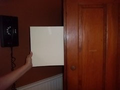
Where do you all get the largevfoam boards for sample painting. Our BM store has the 8x10 but I haven't seen the larger size.When I have all of the samples done I would like to get your opinions. You have helped me so much already and I hate to keep bothering you but it is obvious that picking paint is not my gift. Thank you so much.
francoise47
11 years agoSlightly off topic, but I am intrigued by rococogurl's comment that she likes to paint ceilings in F & B Pointing -- sounds lovely.
I'm curious what sheen level rococogurl (and others) suggest for a ceiling.
I've always used good ol' BM ceiling white in a flat finish.
If I go crazy and paint my formal dining room ceiling in Pointing,
what finish do you recommend for a plaster ceiling? Estate Eggshell? Dead Flat?(I'm still trying to figure out what F & B color to use for my walls --
but some time this summer I will be painting the room.)pirula
11 years agoall my ceilings are also Pointing (ah great minds....), I used the Modern Emulsion because with my large windows letting in lots of light, the slight reflection really brightens the spaces and makes the ceilings feel higher. Most people like flat on their ceilings, I don't.
Pointing is hands down my favorite F&B color. It's exquisite in eggshell, where it's a true glass of milk (on all our woodwork, windows, doors) and just slightly creamier on the ceiling where it meets up with the eggshell Pointing on the woodwork, and a gorgeous soft ivory white in the flat Estate Emulsion in a friend's house (whom I talked into using Pointing in a huge room recently and she's over the moon happy with it).
You'll need to think about sheen sis2two. F&B on your kitchen walls I recommend the modern emulsion which holds up to humidity, and is cleanable etc. Although I've found the estate emulsion cleanable too after it cures. Not an issue. But F&B recommends the Modern Emulsion for kitchens and bathrooms. The sheen is very slight, you won't even notice it unless you have light blasting on it as my windows do to my ceilings. A little slice of heaven.
sis2two
Original Author11 years agoI am glad that you asked that Francoise because I need to know too. We have used the same as you for our ceilings. I meant to tell you that I love your kitchen and I saw your post with your clock over your banquette. That looks perfect!
For your kitchens, what finish did you you all use?
rococogurl
11 years agoI get foam boards at Rite Aid or at one of the discount places -- anywhere moms go for kid projects. I just get the white 36 x 24 -- poster size. They deform slightly from the moisture in the paint but are light enough to stay up with loops of painters tape. By far the best option I found. Can use both sides. I put them up serially, not side-by-side. That way I can see how each color "wears" on me. Takes me a long time to decide (which Ivette will remember LOL).
Sis if you don't have the fandeck, I do and I can easily scan the colors for a scheme and post. I always do color schemes -- in fact I did it for the whole house so I was able to see the room-to-room relationships and set up a chart of the various finishes for the painters.
Francoise, I use the estate emulsion on ceilings. On plaster it's phenomenally beautiful. We had 1929 plaster walls and ceilings in the apartment and the F&B were so gorgeous and luminous neighbors were coming to the open house to see the paint, which it seems became a thing about our place.
I used Modern on the range and sink walls but used Estate Emulsion in the same color on adjacent walls -- practical and not noticeable. I did use Modern in the bath (below). I also feel their Eggshell finish is tops for beadboard cabinets, trim, baseboard, doors, door frames and picture molding. We repainted our kitchen cabinets with Eggshell. Crown Point also offers it as an option now.
The Estate, at least in Blackened which I used a lot, wasn't extensively cleanable IME but was patchable. Everything else held up perfectly. Here's the bathroom in Modern (Lamproom Gray)

and when I had a can of hair mousse explode in there I was able to completely clean it all off the ceiling without a trace.
Like Ivette, I think Pointing's the perfect all purpose white. It's my default and it looks great even with very close white colors.
Francoise, what color are you thinking about for your dining room? With plaster oh my, will you get an amazing look.
marthavila
11 years agoI used Pointing on my plaster ceilings and crown mouldings as well as on my wood wainscotting and trim work. On the plaster, I used Estate Emulsion; for the woodwork, I used Estate Eggshell. Beautiful!
sis2two
Original Author11 years agoI had a friend come over today and question whether painting my upper cabinets was the thing to do or not since I'm not repainting them all. Now I thought I was going in the right direction until she mentioned that she would consider changing the door style, removing the valance, and adding more glass. If I did that, I could look at painting the walls and wainscoting both the same color in a light color. If you had to keep the lowers green, what would you do honestly. If the uppers are going to look better in my kitchen painted white, that's what I want to do. If not, I don't want to spend the money( 6800.00 ) just to repaint. That doesn't include the other changes to the cabinets.Looking forward to getting your feedback. Thanks again.
pirula
11 years agoWith all due respect to your friend, I completely and utterly disagree with her. The changes discussed above are the absolute right thing to do for the change you want and will be tremendously better. In fact, I think the contrast between your light uppers and your cream walls and those dark lowers are going to make you like your lowers a lot more than you ever thought you would.
sis2two
Original Author11 years agoThanks so much pirula! Now I need to stay on course! I received 2 of the samples today, House White and Cream. While the House White is pretty, it's too light I think and goes lemony. The cream is better but I will post pictures hopefully tonite if they turn out. Can't wait to get the others. I have a feeling matchstick may work the best but we'll see! I actually like the bone but it won't give me the look that I am trying to achieve. It does work with the green nicely though.
Rococogurl-You are so sweet to be willing to scan the fan deck. F&B is actually out of the fan decks for a couple of weeks. I would love to see Matchstick and Farrow's Cream. Thanks so much!
wolfgang80
11 years agoI wouldn't let others dismiss brush painting your lowers without actually considering it. I think there's something special about brush strokes on simple shaker style cabinetry, especially in what you describe as a country kitchen. In fact, I much prefer that appearance over a perfectly uniform sprayed cabinet. This is not to say that your green needs to be changed. I would just not let others tell you you're not going to like it. I understand that many want the indestructible factory finish but there is a place for brush painted woodwork.
rococogurl
11 years agoI can't scan the fan deck. It's far too large. Happy to scan the color scheme for reference/discussion when you finalize.
Francoise actually scanned some color schemes above -- if you look there you will see Matchstick is included. I just scanned Farrow's Cream and it looks lemon yellow -- nothing like the swatch. This link to colors on the F&B website should be most useful. This isn't the easiest paint to work with and until recently they were mostly catering to designers so they don't have the usual consumer support.
If you can get to an F&B showroom or a place where they sell the paints they have brushouts -- actual paint samples on boards. It would be worth a trip if you have any leftover backsplash tile to take along. Their site has a place to put in the zip code and get their nearest store/showroom.
sis2two
Original Author11 years agoWolfgang80- I have nothing against brush painted cabinets at all and agree that it fits the country look. However, I don't want the uppers spray painted and the lowers painted by hand. The sanding down is the issue inside and I'm not willing to possibly ruin my floors or soapstone and I do know they would have to use an orbital sander. Not to mention in my household, I need indestructible!!
rococogurl-I see what you mean now. I have been on their website and that's when I found out their fan decks are out of stock. I think their closest store is about 2 1/2 hours away from me. I will make a trip to actually get the paint when the time is closer. It will probably be about 3 months before we have our cabinets painted because of the expense. Our plan is to have the kitchen painted while the cabinets are out.
sis2two
Original Author11 years agoJust checked and found out that there is a store in Richmond which is about an hour and 45 minutes away. I may try to make that trip this week!
allison0704
11 years agoIf you had to keep the lowers green, what would you do honestly. If the uppers are going to look better in my kitchen painted white, that's what I want to do.
Sounds like the majority - and especially the ones that know F&B colors like the back of their hands - have given their advice. It's a big step to take, but I think you will truly love your kitchen after you make changes. As you've told me, you're not happy with it now - that's not going to change.
fwiw, I painted DD2's builder grade kitchen cabinets with a brush over a year ago. Primer, then two coats of paint. Distressed and glazed. She has 4 dogs, 2 cats and a 10 month old. There is not a scratch on them.
I understand you wanting a factory finish, but agree with wolfgang about brushstrokes.
sis2two
Original Author11 years agoallison- I am glad that you have weighed in. You have been so helpful with this kitchen makeover. My plan is to use many of your suggestions that you made earlier. We are also going with the same style door as the lowers and plan to have glass doors on the left and right side of the sink, but not the glass doors that I have now because they are outdated. I plan to add a skirt underneath my sink once my cabinets are all done. An island will come later as finances permit. You were right about asking the paint experts about the F&B paints. I have always wanted to use them.
Did you havevyour cabinets painted on site or were they painted and brought in. I love all of your finishes!pirula
11 years agoi agree with wolfgang and allison too. I would, since my kitchen cabinets are hand painted by moi, and has brushstrokes. I wanted the brushed, hand painted truth of what they were. What could be better? I didn't use F&B on the cabinets, I used FPE, but not from any lack of faith with regard to F&B. Six years later, the cabinets look exactly the same. This kitchen is used hard, and I love that I was able to just touch up the one little drawer, where the darned cat uses her back claws to get up on the counter by the window.... um, another subject altogether. Anyway, looks like new.
Stick with the plan, it's a very good one.....
sis2two
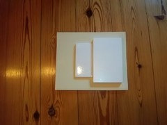
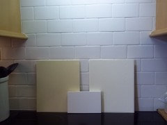
Original Author11 years agoI have taken pics of the house white and cream samples. These aren't done on large boards but here goes. House White:


Cream and some of both side by side:


pirula
11 years agoWell, for the moment, this is a good start. I see the tile, what is the other white sample? What your cabinets will be? And is that "Cream". JUST "Cream"? I like the House White where it's darker, and like the Cream where it's lighter, so I suspect that either Matchstick or Farrow's Cream will be the way to go. But you are definitely on the riight track here.
allison0704
11 years agoMy island and black hutch were painted before shipped. The fridge section was painted, but not the fridge panels as they were made here and painted at my house.
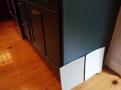
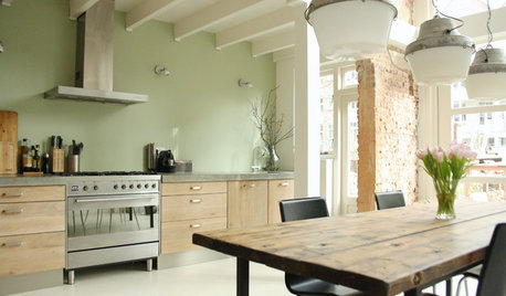
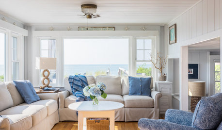
I saw this a few minutes ago, and thought of you. Picture cream and green, and visualize it more country than this lean toward modern - just wanted you to see the dark lower cabs with the monochromatic backsplash, uppers and walls.
sis2two
Original Author11 years agopirula-- My feelings are the same about the paints. And last night the cream did turn into baby poop. Oh the memories that brought back! The one sample is the cabinet color that I am considering which is Woodmode's Alpine White. Hopefully my other samples will be here in a couple of days. I plan to get bigger sample boards as rococogurl suggested.
allison-I love that inspiration picture! Thank you for posting it.
sis2two
Original Author11 years agoI love the iron chandelier that you have over your heart pine table and was wondering where you purchased it. I would love to have something like that over my table in the kitchen. My fixture doesn't give off much light and I love the airiness of yours. Thank you.
pirula
11 years agoI assume you mean me. I don't see any other chandeliers above, so thank you, i'm glad you like it. We really love it. Unfortunately, I can't help you much. It was a gift from my dad and was handmade in New England somewhere. It's signed by the artist who made it. He had a website, but I just spent several minutes googling every parameter I could think of and couldn't find what I vaguely remember to be his website. So I can't help with my specific one. However, there are myriad wrought iron chandeliers out there so you won't have any trouble at all finding one you love. It appears much larger in real life than it does in the picture for some reason, so the airiness was key. I like to hang them low and I like them to be almost as wide as the table (sigh, I break all the rules). So the airiness was a major factor in the choice. Good luck finding one, I'm sorry I can't help more.
sis2two
Original Author11 years agoThank you pirula! I bet you didn't see that I had put your name in the subject for posting when I asked about the chandelier. I love looking at that picture of your dining room, so pretty and serene. Thanks so much for the link.
sis2two
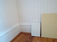
Original Author11 years agoToday I received my farrow's cream and matchstick samples. Neither one looked as I expected in my particular kitchen. What I found is that the Farrow's Cream almost looked yellowy with my floors and cabinet in the corner. The matchstick went lighter as the day went on and not in a good way. I loved them on the large sample boards. The other thing that I am finding is that light colors look almost anemic in my breakfast area with my furniture and floors. I know that I am used to have deeper colors but I don't really think that's it. I have ordered the Dorset Cream. As much as I was hoping a soft color would work, I need something with more oomph so to speak.
When I was choosing color for my foyer, I went with a paint that had more peach undertones because of my floors. So many colors that I tried went green. Speaking of green, I painted a large foam board in the cream today and it has enough deepness to work in the room but does go a little green at times.
I am feeling kind of frustrated and am not sure what to do other than hope the dorset cream works. To get the muted look that I want in the kitchen, I'm not sure the breakfast room is going to have the depth it needs and especially on top of the white wainscoting.
rococogurl
11 years agoI'm going to make a suggestion that I hope you won't take in the wrong way. Without a fan deck it's simply more reasonable to go to the paint store with the tile and pull Benjamin Moore samples. That will be far easier. Aura is lovely paint and has a very nice surface. It dries quickly, is low odor and about half the price.
This isn't because you don't know about paint. It's not. You seem to know what you want. However, this is like trying to learn to drive on a Ferrari with a stick shift on hills in San Francisco.
allison0704
11 years agoAura is nice paint. DD2's house interior is painted in Aura, by DH. He couldn't say enough good things about it. Roc's right, it has a very nice surface.
sis2two
Original Author11 years agorococogurl and allison- I understand exactly what you are saying and I agree. I do plan to get a fan deck as soon as F&B has some in stock. Currently they are out. Most of my home is painted in aura paint so I do know that it's good paint. I also have two rooms painted with Ellen Kennon's paint which is also a great paint. I have always wanted to try F&B paint because the chalky finish is appealing to me. However if I can't find a color that works, I will probably use one of the brands I've used before.
I do have a question about the fan deck. Are there many more colors than the brochure? The brochure is very limited it seems.
Thank you so much for all of your help.
rococogurl
11 years agoThe colors are very limited, yes. All their paint is premixed in England, it's not mixed at the hardware store. Even some of my color consultant pals don't want to bother because they feel the palette is too limited and they can't get paint quickly.
In the past I had wanted to try Donald Kaufman paints but the logistics were terrible. It wasn't worth the work. Just the way it sometimes goes with that paint in some regions. This sounds like an eye roller but honestly, it's so dependent on the light.
You've used Ellen K in the past and she's such a lovely person. You can get her on the phone so she can help you do a color scheme for your kitchen. Might be worth considering.
pirula
11 years agoYour peach comment got me thinking. I have Donald Kauffman number 3 in my bathroom. A gorgeous creamy yellow with an undertone of pink that is not remotely fleshy. It's a gorgeous color with a bit more oomph than the farrows cream and zero green, ever. Might be worth a look.
Cox paint online makes getting DKC and F&B easy peasy.
sis2two
Original Author11 years agoThanks rococogurl If the F&B paint doesnt work out for me, I may look at contacting Ellen. She is a sweet person and has some beautiful colors too.
The good thing is that I have some time before the cabinets are taken out.
Thanks again for all of your input. Deedramarthavila
11 years agoI have Donald Kaufman in one of my bathrooms as well! :-) Don't remember the exact color -- but it doesn't matter so much for purposes of this discussion because it's a pale blue. Point is, I remember searching high and low for a color that would "match" the vintage listello border tile in that bathroom. Only DK had it. Went on like a dream and has lasted for years! I highly recommend DK, along with FB, if you can get it.
wolfgang80
11 years agoI get what you're saying about needing some oomph on the walls in your breakfast area. I would prime over the copper brown with white to give yourself a clean slate to begin with. Any white-ish colour is going to get lost when you have such a dominant colour that a) you're used to and b) drowns out any sample board you put up.
Speaking of BM, I saw a LR on Remodelista about a year ago that had walls in Overcast and trim in White Chocolate. I'm not sure how it'll play with your floors but I think it's a sensational combination for your wainscoting and walls. It has a presence while still light and ethereal.Is the strip of wall above your cabs the only painted surface in your kitchen?
sis2two
Original Author11 years agoPirula-I will definitely check out the Cox website. Thank you for that suggestion.
marthavila- I have heard of Donald Kaufman and will have to check it out.
wolfgang-I was actually thinking last night about the darkness in the room really hindering me from getting a feel for actual color samples. We do have a little more wall space in the kitchen area to the left of the refrigerator and a small strip of vertical space at the end of the cabinet run on the microwave side... I will check out the overcast
Will keep you all posted.
sis2two
Original Author11 years agopirula--I just saw that you had asked about the Dorset Cream. It was just too strong for the look I was going for.
We have decided after all that we are going to have our upper and lower cabinets painted white. All of the doors will be replaced in the shaker door style by Woodmode. Thank you so much for your help. I plan to post pictures when it is complete.


sis2twoOriginal Author