


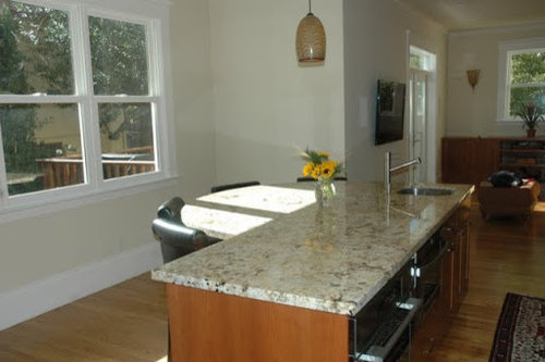
Need some help with fabric choice in kitchen
marcydc
12 years ago
Sort by:Oldest
Comments (19)
Related Stories

COLORPick-a-Paint Help: How to Quit Procrastinating on Color Choice
If you're up to your ears in paint chips but no further to pinning down a hue, our new 3-part series is for you
Full Story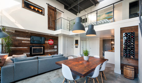
HOUZZ TOURSHouzz Tour: A Modern Loft Gets a Little Help From Some Friends
With DIY spirit and a talented network of designers and craftsmen, a family transforms their loft to prepare for a new arrival
Full Story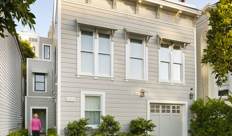
LIFE12 House-Hunting Tips to Help You Make the Right Choice
Stay organized and focused on your quest for a new home, to make the search easier and avoid surprises later
Full Story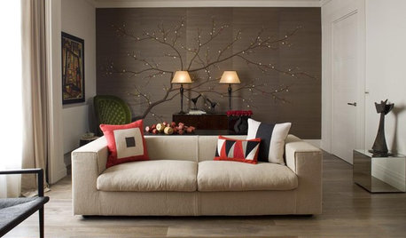
PRODUCT PICKSGuest Picks: Help Your Home Blossom With Floral Decor
Sprinkle hints of spring around your rooms with fabrics, wall coverings and more that recall nature's charms
Full Story
KITCHEN DESIGNKey Measurements to Help You Design Your Kitchen
Get the ideal kitchen setup by understanding spatial relationships, building dimensions and work zones
Full Story
DECLUTTERINGDownsizing Help: Choosing What Furniture to Leave Behind
What to take, what to buy, how to make your favorite furniture fit ... get some answers from a homeowner who scaled way down
Full Story
DECORATING GUIDESDownsizing Help: Color and Scale Ideas for Comfy Compact Spaces
White walls and bitsy furniture aren’t your only options for tight spaces. Let’s revisit some decorating ‘rules’
Full Story
SELLING YOUR HOUSE10 Tricks to Help Your Bathroom Sell Your House
As with the kitchen, the bathroom is always a high priority for home buyers. Here’s how to showcase your bathroom so it looks its best
Full Story
KITCHEN DESIGNA Single-Wall Kitchen May Be the Single Best Choice
Are your kitchen walls just getting in the way? See how these one-wall kitchens boost efficiency, share light and look amazing
Full Story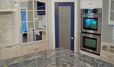
KITCHEN COUNTERTOPSKitchen Counters: Granite, Still a Go-to Surface Choice
Every slab of this natural stone is one of a kind — but there are things to watch for while you're admiring its unique beauty
Full Story

EMH107
lavender_lass
marcolo
ellendi
plllog
melissastar
formerlyflorantha
mikomum
formerlyflorantha
marcolo
marcydcOriginal Author
plllog
suzanne_sl
User
calimama
formerlyflorantha
honorbiltkit
marcydcOriginal Author
calimama