


Thoughts please
kacee2002
9 years ago

Related Stories
BEFORE AND AFTERSMore Room, Please: 5 Spectacularly Converted Garages
Design — and the desire for more space — turns humble garages into gracious living rooms
Full Story

HOME OFFICESQuiet, Please! How to Cut Noise Pollution at Home
Leaf blowers, trucks or noisy neighbors driving you berserk? These sound-reduction strategies can help you hush things up
Full Story
BATHROOM DESIGNUpload of the Day: A Mini Fridge in the Master Bathroom? Yes, Please!
Talk about convenience. Better yet, get it yourself after being inspired by this Texas bath
Full Story
HOUZZ TOURSHouzz Tour: A Neutral Palette Pleases By the Sea
Designer Phoebe Howard creates earth-toned elegance for a family's Florida beach getaway
Full Story
DECORATING GUIDESPlease Touch: Texture Makes Rooms Spring to Life
Great design stimulates all the senses, including touch. Check out these great uses of texture, then let your fingers do the walking
Full Story
GARDENING GUIDESGreat Design Plant: Snowberry Pleases Year-Round
Bright spring foliage, pretty summer flowers, white berries in winter ... Symphoricarpos albus is a sight to behold in every season
Full Story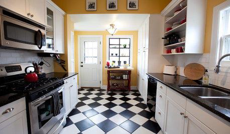
FLOORSChecks, Please! 13 Choices for Checkered Floors
Checkerboard Patterns Go From Casual to Ritzy, From Marble to Grass
Full Story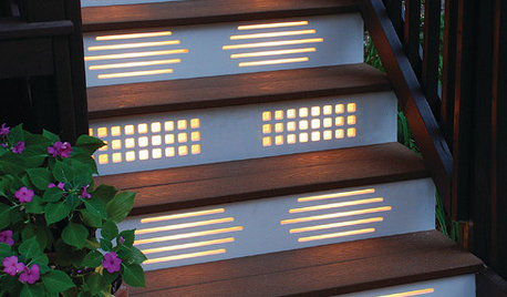
GARDENING AND LANDSCAPINGNo Fall Guys, Please: Ideas for Lighting Your Outdoor Steps
Safety and beauty go hand in hand when you light landscape stairways and steps with just the right mix
Full StoryMore Discussions


autumn.4
jennifer132
Related Professionals
Ojus Kitchen & Bathroom Designers · Hopewell Kitchen & Bathroom Remodelers · Albuquerque Kitchen & Bathroom Remodelers · Athens Kitchen & Bathroom Remodelers · Rochester Kitchen & Bathroom Remodelers · Tuckahoe Kitchen & Bathroom Remodelers · Aspen Hill Cabinets & Cabinetry · Lockport Cabinets & Cabinetry · Watauga Cabinets & Cabinetry · Whitehall Cabinets & Cabinetry · Central Cabinets & Cabinetry · Milford Mill Cabinets & Cabinetry · Corsicana Tile and Stone Contractors · Green Valley Tile and Stone Contractors · Boise Design-Build Firmskacee2002Original Author
jaynes123_gw
jaynes123_gw
jaynes123_gw
live_wire_oak
jaynes123_gw
jaynes123_gw
julie1973