Shop Products
Houzz Logo Print
slonewby_gw

BS again..please don't be tired of my BS questions....

slonewby
11 years ago

Hi all! so many of you have helped me through this remodel and we are SO close to being done! I took a break from thinking about backsplashes due to brain overload...(many have been following my ongoing BS saga...sigh...thank you!!!) well, .....I'm back at it now, hopefully with a clear head. I've gotten the okay from hubby to do whatever I want (within reason). I really want the kitchen to stay light and airy. Most of the colored tile I've liked tends to feel "heavy" and glass is too contemporary. I have three questions for you...

1. Am I crazy to do a simple white subway tile? Some people have told me that plain subway in white lessens the elegance we have going on in there and kinda looks like we skimped on the BS. I love white and feel that the dark floor and busy granite add enough to the overall picture..what do you think?

2. Do you see using an accent tile to go along with the simple white subway? I was thinking about using three 4"X4" embossed decorative (white) tiles under each window but with as much detail we have going on, do I really need that to break up the subway?

3. Would off white muddy up the granite as much as I think it would? Our cabinets are not a stark white so choosing between white and offwhite is a hard thing for me.

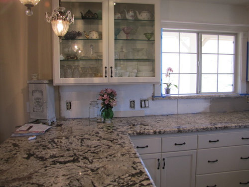
Here are the pics ....please don't be too tired of seeing my kitchen~ :-)

Honestly, I've looked at cracked glass, greys, browns, creams, even pressed tin...and I keep coming back to simple, plain subways. No bevels, no arabesque, just plain subway. thoughts???

Comments (30)

  • bahacca
    11 years ago

    Crackle subway!

  • hags00
    11 years ago

    I love how the middle one pulls that color out of your granite. It just happens to be one of my favorite in the color palette anyway. With two windows and white cabinets you have a lot of light in there. I would pull my favorite color out of the granite. I do prefer the brick or subway shape to the 4x4. I would use a non-contrasting grout and just put some nice color into those walls

  • KBH
    11 years ago

    I love the left one in every picture except the close up one, where it looks way too creamy. I love the color of the middle, too, esp the way it complements the granite - but I like the subway shape better.

  • a2gemini
    11 years ago

    Ditto!

  • auroraborelis
    11 years ago

    I live the middle option as well! Can you get that color in a rectangular tile?

  • springroz
    11 years ago

    I am FOR on the middle one, too!!

  • cawaps
    11 years ago

    I really like the one on the left. The one in the middle fades into nothingness in the wide pics--though that is probably due at least in part to the fact that it isn't as big as the others with only two tiles. It is a good match for your counter, though, and I think it would have more impact over a larger area (not more impact in a bad way; just more in comparison to the fact that I didn't even notice it in the wide pics, only in the closeup).

    I really don't like the stark white on the right. Too white-white, too shiny.

  • Bunny
    11 years ago

    I like the one in the middle, but I prefer a subway shape. Second choice is the cream on the left. Don't care for the white.

  • slonewby
    Original Author
    11 years ago

    haha...of course all of you like the most expensive option ! Yes, that tile does come in a 3X6..it also has some pretty accent pieces if I choose to go that way. It is the same color as the hardiebacker on the walls right now...you don't think it will be too dark? too blah? It *is* a perfect match to the granite...but it has a color variance grading of 4 (5 being the highest) so there will be varying shades of the tile as well. Does that change anything?

    The tile is by Fireclay and the color is "malt". It has a reddish-brown undertone with a creamy greyish brown glaze.

    Any thoughts on adding accent pieces anywhere?

  • hags00
    11 years ago

    I think your beautiful stone has a lot of movement. I would tend not to use accent pieces and keep the backsplash simple so it compliments the granite instead of competing with it.

  • Bunny
    11 years ago

    Your kitchen is light in the best way, so I think it can handle a darker b/s. Hardibacker is ugly and flat. Your tile will glow and have life. Can you get some 3x6 samples? Of course it's the most expensive. :p

  • slonewby
    Original Author
    11 years ago

    Did I mention that the tile everyone likes IS a crackle? You can't tell very well from the photos but it has an ever so slight crazing to the finish....I'm liking it more and more. I don't think I can get 3X6 samples. I called the manufacturer to get these...they sent 3 4X4's to show the variation in coloring.

    Hags...I think you're right about no accent. Between the granite movement and the crackle to the tile, no need for accent.

    I'm going to research pricing and see if I can find a better deal on it.

  • badgergal
    11 years ago

    Another vote for the "malt" tile but in the 3x6 size. I don't think you will need accent tiles with it. It will look great all on its own.

  • glo1751
    11 years ago

    This is just toooo funny. My Bianco Antico was just installed last week. I have white cabinets and am exhausted running around and searching on line for a bs that I can afford. My contractor wants to finish up the job and the tile guy's equipment is setting on my front porch! Good luck Slonewby, can't wait to see what you choose. Keep the posts coming it's helping me tremendously.

  • slonewby
    Original Author
    11 years ago

    glo...what are you using??? We Bianco owners need to stick together! lol I'm now considering what to use for switchplate covers as I have alot of them. I'm thinking about using either of these:

    http://www.wallplatesonline.com/Arabesque-Antique-Bronze-Cover-Plates_p_2422.html

    or
    http://www.wallplatesonline.com/Arabesque-White-Cover-Plates_p_2446.html

    sorry...you have to cut and paste..I'm not sure how to share links.

    It would be a shame to put ugly plastic over lovely tile....still have to pick a tile though! haha

  • MIssyV
    11 years ago

    Why Hello There Old Friend :-) I check in here from time to time and was afraid I missed what you chose for your backsplash! Glad to see I am not the only BA owner on here without a backsplash yet .... !!

    Boy your kitchen is sure turning out beautiful. It has such a bright, yet soft, feminine touch to it, very well done! I think the first pic you posted tells it the best and shows you need something solid (no accent pieces on your backsplash) and something more in the creamy/white line. While that middle more expensive tile matches the granite, it seems like it would be comparable to the paint color swatch you have under your window right now by your mixer and I think I would want to stay lighter than that in your space. I think letting your backsplash just blend into the rest of your kitchen suits it better than adding some contrast with color. But that's just my two cents....from a fellow BA'r with no backsplash :-)

  • cakelly1226
    11 years ago

    Agree with Linelle- too lazy to type the same thing!

  • dragonfly08
    11 years ago

    I also vote for the middle tile without accent tiling! It's really a gorgeous color and I think the overall effect will add elegance to your already beautiful kitchen. And I love that it'll have variation... It'll provide a subtle dramatic look without competing with your countertop. And yes, of course it's the most expensive one! I think that happened with every s how one of my decisions during our Reno! Good luck!! Cannot wait to see the finished pics!

  • glo1751
    11 years ago

    Slonewby, I'm still undecided and have to go looking again today. I would really like glass, my designer friend really wants that too, and am going to the Tile Shop and Walter Zanger today. If I have no luck I'm thinking of going with White Venatino Random from A&S Marble and Granite, they are having a Marble sale this month. Only problem is, it will have to be sealed. I would really like easier maintenance.

    My DH is taking all this in stride. He changed the new white electrical outlets to brown once we bought some other glass tile we thought was going to work. Now he will have to change them back to white if I go with the marble.

  • kateskouros
    11 years ago

    beveled or straight cut white subway but use darker grout. i like the way the sample you have looks. love the scale, love everything about it. and yeah, i'd stay far away from glass. i don't pay attention to what people tell me. i do what i think will work best in the space. i really love the tile shown in the pix. GL!

    Here is a link that might be useful: elegant white subway tile

  • kateskouros
    11 years ago

    sorry ...i see you're showing two different tiles. my eye went straight to the first sample -the off white. yes. go with that one. the first, it's a beauty in your kitchen.

  • juliet11
    11 years ago

    What a beautiful counter and kitchen! I think the Fireclay malt tile in a 3"x6" subway would look great with it. (I'm also biased towards crackle finishes and subtle color variation in tiles.) If you think the malt is too dark, the cream would work too. The white tile looks much too stark white to me to go with the rest of your kitchen.

  • pricklypearcactus
    11 years ago

    You have a lovely kitchen and I don't think any of us could tire of seeing it. I like the middle and the left. To me, the right is too white and will take away from the color of the cabinets and the granite. I think your kitchen would do well with a creamy or very light gray tile in just about any shape. I also think a very pale blue green (or blue or green) would work well too. Something along the lines of the color of the pale glass you are using to hold up the tiles. (Though I realize glass is too contemporary for the look you want.) I don't think you can go wrong with something in creamy white or gray either if you prefer not to use a color.

  • Annie Deighnaugh
    11 years ago

    I always seem to be the voice of dissension around here, so here i go again.

    When I look at your first picture, my eye went immediately to the dark gray backer board on the right. It blends beautifully with you counter, your SIMPLIFY sign and the gray in the stainless appliances.

    Of course that shade is dull and maybe a little too dark, but I would definitely go with a soft shade of gray in the tile to add interest, to unify the colors in the room and yet not shout at you.

  • suzyqtexas
    11 years ago

    Have you looked at the slate tile (I think) that is your floor? I liked the darker gray backer board color on the right.

  • slonewby
    Original Author
    11 years ago

    Hey Missy (waving~)

    You guys are very perceptive! The color swatches on the wall are color matches to two different tiles. I wanted to see how dark the tiles would make the kitchen so I took them to Home Depot and did a color match. Of course tile is so much different than paint but the overall darkness is all I was concerned with. The paint by the mixer is the center 4x4 tile and the darker one was Stellar Gloss in "Bellini"...I ruled that one out as too dark based on the paint.

    Suzyq - I actually cut up some of our floor tile but didn't like the look at all..too dark and much too much texture/coarseness. Great thought though!

    Annie- I've played with several greys but prefer the brown/grey the most...standard greys just don't look quite right.

    Kate- family doesn't care for the scale of that tile. wow it would be so easy to install that one though! The price is awesome as well. I'm still looking at it. I wish it were a tad less creamy though. Creams seem to muddy up the granite.

    Pricklypear....LOVE that green color but have been down that road and failed (bought 60 sq ft of tile and ended up not liking it one bit ...ugh) I agree the white is too stark. Thank you for your comments. I'm loving my kitchen but this final detail is still making me kinda nuts!

    I know any of the tiles (even the white) would look lovely. I just need to pull a trigger and commit to one. I'm very afraid of making a mistake here b/c I know we won't re-do the b/s anytime soon...if ever again!

    I think I'm going to call Fireclay and see if they'll send me some samples of a shade lighter than the malt tile... and check on pricing again!

    Thank you , all!!!!

  • sixtyohno
    11 years ago

    I can't really judge the colors, but I definitely vote for subways and no accents. Your lovely kitchen has a lot of details, in the granite, the lights and behind the glass doors, etc. I think a fussy BS will detract from your very pretty accessories.

  • maries1120
    11 years ago

    Do you have a tile store that carries Sonoma Tiles? They have a lot of colors and size options. You might be able to use the same tile in different sizes to get some added interest that way while still keeping the tile all the same color. Or maybe add a few small (1/2 - 1") accents picking up the floor color and darker vein in the countertop.

  • glo1751
    11 years ago

    kateskouros, why do I need to stay away from glass? I had just placed my order 2 minutes b4 I read your post.

  • kateskouros
    11 years ago

    glo: my comments on glass pertain to this posters kitchen. i have nothing against glass, although i prefer it in modern spaces only.