


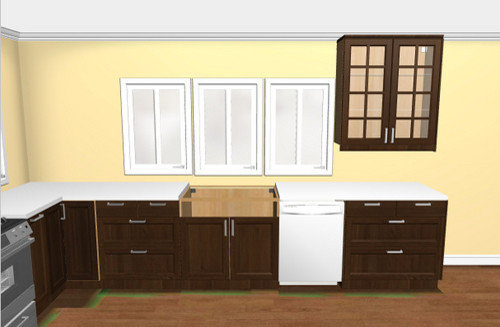
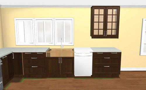
Please help - window and upper cabs
momo7
12 years ago


Related Stories

HOUZZ TOURSMy Houzz: Saturated Colors Help a 1920s Fixer-Upper Flourish
Bright paint and cheerful patterns give this Spanish-style Los Angeles home a thriving new personality
Full Story
SUMMER GARDENINGHouzz Call: Please Show Us Your Summer Garden!
Share pictures of your home and yard this summer — we’d love to feature them in an upcoming story
Full Story
OUTDOOR KITCHENSHouzz Call: Please Show Us Your Grill Setup
Gas or charcoal? Front and center or out of the way? We want to see how you barbecue at home
Full Story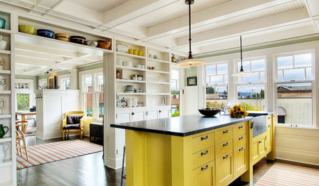
KITCHEN DESIGNHow to Lose Some of Your Upper Kitchen Cabinets
Lovely views, display-worthy objects and dramatic backsplashes are just some of the reasons to consider getting out the sledgehammer
Full Story
KITCHEN DESIGNKey Measurements to Help You Design Your Kitchen
Get the ideal kitchen setup by understanding spatial relationships, building dimensions and work zones
Full Story
EXTERIORSHelp! What Color Should I Paint My House Exterior?
Real homeowners get real help in choosing paint palettes. Bonus: 3 tips for everyone on picking exterior colors
Full Story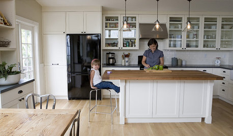
ORGANIZINGDo It for the Kids! A Few Routines Help a Home Run More Smoothly
Not a Naturally Organized person? These tips can help you tackle the onslaught of papers, meals, laundry — and even help you find your keys
Full Story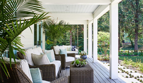
STANDARD MEASUREMENTSThe Right Dimensions for Your Porch
Depth, width, proportion and detailing all contribute to the comfort and functionality of this transitional space
Full Story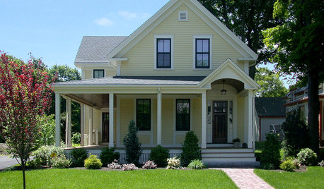
SELLING YOUR HOUSE10 Low-Cost Tweaks to Help Your Home Sell
Put these inexpensive but invaluable fixes on your to-do list before you put your home on the market
Full Story
HOUSEKEEPINGWhen You Need Real Housekeeping Help
Which is scarier, Lifetime's 'Devious Maids' show or that area behind the toilet? If the toilet wins, you'll need these tips
Full Story

breezygirl
colorfast
Related Professionals
Hemet Kitchen & Bathroom Designers · Cocoa Beach Kitchen & Bathroom Remodelers · Fort Washington Kitchen & Bathroom Remodelers · Franconia Kitchen & Bathroom Remodelers · Fremont Kitchen & Bathroom Remodelers · Idaho Falls Kitchen & Bathroom Remodelers · Richland Kitchen & Bathroom Remodelers · Weston Kitchen & Bathroom Remodelers · Billings Cabinets & Cabinetry · Christiansburg Cabinets & Cabinetry · Harrison Cabinets & Cabinetry · Kaneohe Cabinets & Cabinetry · Bellwood Cabinets & Cabinetry · Shady Hills Design-Build Firms · Yorkville Design-Build Firmsmarcolo
blfenton
brickton
rhome410
herbflavor
brianadarnell
momo7Original Author
momo7Original Author
rhome410
breezygirl
brianadarnell
bigjim24
enduring
blfenton
rhome410
momo7Original Author
rhome410