


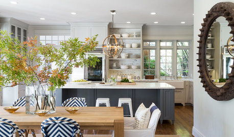
too-neutral kitchen- please help
danapie23
13 years ago
Related Stories

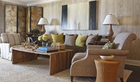
HOUZZ TOURSHouzz Tour: A Neutral Palette Pleases By the Sea
Designer Phoebe Howard creates earth-toned elegance for a family's Florida beach getaway
Full Story
MOST POPULAR7 Ways to Design Your Kitchen to Help You Lose Weight
In his new book, Slim by Design, eating-behavior expert Brian Wansink shows us how to get our kitchens working better
Full Story
KITCHEN DESIGNDesign Dilemma: My Kitchen Needs Help!
See how you can update a kitchen with new countertops, light fixtures, paint and hardware
Full Story
SELLING YOUR HOUSE10 Tricks to Help Your Bathroom Sell Your House
As with the kitchen, the bathroom is always a high priority for home buyers. Here’s how to showcase your bathroom so it looks its best
Full Story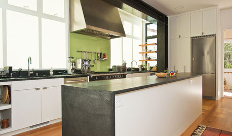
KITCHEN DESIGNSexy Color Touches for Neutral Kitchens
Bring a little vavoom to a practical palette with small but colorful updates to your kitchen's backsplash, walls and fixtures
Full Story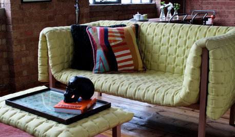
DECORATING GUIDESPlease Touch: Texture Makes Rooms Spring to Life
Great design stimulates all the senses, including touch. Check out these great uses of texture, then let your fingers do the walking
Full Story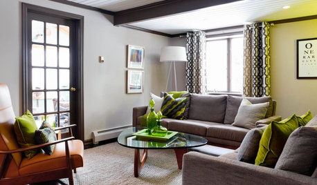
LIVING ROOMSCurtains, Please: See Our Contest Winner's Finished Dream Living Room
Check out the gorgeously designed and furnished new space now that the paint is dry and all the pieces are in place
Full Story
KITCHEN DESIGN6 Ways to Spice Up Your Neutral Kitchen
Look to these details to prevent a white kitchen from feeling a bit stark
Full StoryMore Discussions


joyjoyjoy
plllog
Related Professionals
Arcadia Kitchen & Bathroom Designers · Barrington Hills Kitchen & Bathroom Designers · Plymouth Kitchen & Bathroom Designers · Saratoga Springs Kitchen & Bathroom Designers · Avondale Kitchen & Bathroom Remodelers · Hanover Township Kitchen & Bathroom Remodelers · Oxon Hill Kitchen & Bathroom Remodelers · Sun Valley Kitchen & Bathroom Remodelers · Vista Kitchen & Bathroom Remodelers · Wilmington Kitchen & Bathroom Remodelers · Middlesex Kitchen & Bathroom Remodelers · East Saint Louis Cabinets & Cabinetry · Eureka Cabinets & Cabinetry · Liberty Township Cabinets & Cabinetry · Cornelius Tile and Stone Contractorsformerlyflorantha
lazy_gardens
formerlyflorantha
boxerpups
danapie23Original Author
lee676
joyjoyjoy
granite-girl
boxerpups
plllog