


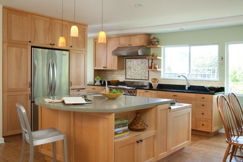
What do you think of these paint colors?
Kristen Hallock
10 years ago


Sort by:Oldest
Comments (24)
Related Stories

HOUZZ TOURSHouzz Tour: Visionary Thinking Clicks With a San Francisco Entrepreneur
An open mind and an unusual process help a successful software engineer get an interior design that suits and celebrates his life
Full Story
LANDSCAPE DESIGNThink Turquoise to Energize or Soothe the Garden
Turquoise combines the tranquility of blue with the energy of green. Use it as an accent color in the landscape
Full Story
CURB APPEAL5 Bright Palettes for Front Doors
Splash bold green, blue, orange or red on your front door, then balance it with a more restrained hue on the rest of the house
Full Story
KITCHEN DESIGNPalatable Palettes: 8 Great Kitchen Color Schemes
Warm and appetizing or cool and relaxing? These 8 paint palettes can help you choose the best colors for your kitchen
Full Story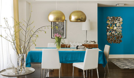
COLORBest Uses for the Boho Blue Color of 2015
PPG Pittsburgh Paints’ Color of the Year is a bold bohemian blue best used in small doses
Full Story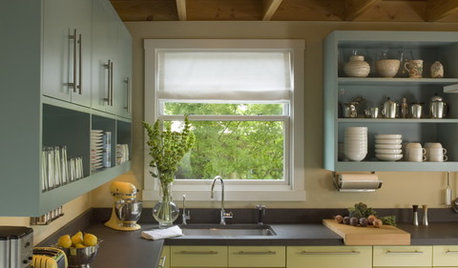
MOST POPULAR8 Great Kitchen Cabinet Color Palettes
Make your kitchen uniquely yours with painted cabinetry. Here's how (and what) to paint them
Full Story
EXTERIORSHelp! What Color Should I Paint My House Exterior?
Real homeowners get real help in choosing paint palettes. Bonus: 3 tips for everyone on picking exterior colors
Full Story
TRIMWhat Color Should You Paint Your Trim?
Learn the benefits of painting your trim white, black, neutral, a bold color and more
Full Story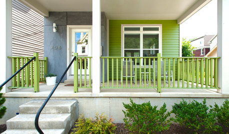
EXTERIOR COLORThe Joyful Exterior: Perk Up Curb Appeal With a Splash of Green
You may not want to douse your whole house with it, but green can work wonders as an exterior accent color
Full Story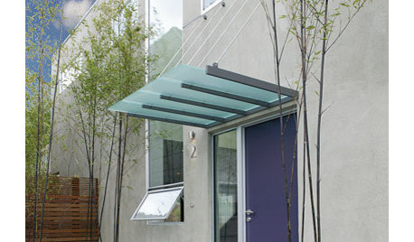
COLORFront and Center Color: When to Paint Your Door Purple
From grapelicious to lavender, a front door cloaked in the color of royalty might just reign supreme in the neighborhood
Full Story


Bunny
cawaps
Related Professionals
Pleasanton Kitchen & Bathroom Designers · North Druid Hills Kitchen & Bathroom Remodelers · Sunrise Manor Kitchen & Bathroom Remodelers · Glade Hill Kitchen & Bathroom Remodelers · Albuquerque Kitchen & Bathroom Remodelers · Cleveland Kitchen & Bathroom Remodelers · Folsom Kitchen & Bathroom Remodelers · Lakeside Kitchen & Bathroom Remodelers · Mooresville Kitchen & Bathroom Remodelers · Ogden Kitchen & Bathroom Remodelers · Burlington Cabinets & Cabinetry · Wyckoff Cabinets & Cabinetry · Milford Mill Cabinets & Cabinetry · Eastchester Tile and Stone Contractors · Santa Paula Tile and Stone ContractorsKristen HallockOriginal Author
calumin
Bunny
joaniepoanie
rkb21
ellendi
Kristen HallockOriginal Author
andreak100
nosoccermom
Kristen HallockOriginal Author
Kristen HallockOriginal Author
Sherrie Moore
Kristen HallockOriginal Author
remodelfla
Vertise
Bunny
Kristen HallockOriginal Author
sis2two
Vertise
Caya26
raee_gw zone 5b-6a Ohio
Kristen HallockOriginal Author