Shop Products
Houzz Logo Print
jamaraz_gw

I don't love my backsplash

jamaraz
13 years ago

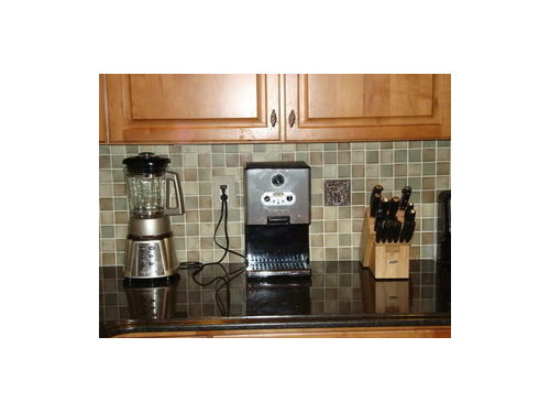
Hi. I waited a long time to get a backsplash. There was nothing I loved and when I stumbled upon my backsplash, I was thrilled and ended up paying double my original budget. I didn't care because I found something interesting that would give my kitchen a focal point (I kept my original cabinets). The backsplash looked great before it was grouted but now that it is complete, it just looks blah. I don't know if I chose the wrong grout but the tiles just fade into the background in my kitchen. I had wanted to keep the backsplash relatively simple but now I think it just looks boring.

Is there anything I can do to spice it up a bit? I spent too much money on the backsplash and can't just rip it out and start over again. Any help would be appreciated.

Comments (24)

  • igloochic
    13 years ago

    It's actually really pretty, but because I can't see the whole room I can only gues at a suggestion. My suggestion is to pull a deeper tone from the backsplash and paint your walls that tone. It looks like there is brick, tan, gray...(Computer monitors do change that) so grab the most prevelant and splash :) It on your walls. It will make the BS become a focal point.

    I love it...it's very appealing.

  • katsmah
    13 years ago

    I really like your backsplash. Would you mind sharing what it is?

  • vampiressrn
    13 years ago

    Your kitchen is beautiful. :-)

    My monitor shows your colors as moss green, tan & brown...I think it is beautiful. I don't know if you would be interested in doing this but it did help my pale green Corian counter pop in my white kitchen...colored (jade milk glass) door/drawer hardware.

    Maybe the crystal green on this sight might add energy to the decor.

    Here is a link that might be useful: glass kitchen handles and knobs

  • pudgybaby
    13 years ago

    I agree with both the paint and glass knob suggestions. As far as the paint color, I would avoid a taupe or brown/gray color as I think it won't look as nice with your honey toned cabinets. I think a moss green would be nice.

    Your backsplash is really beautiful. Is there any way to move one or two of the appliances/knife block off the counter or group them closer? You've got them spaced so that they interrupt the backsplash. I would like to see a bigger section of backsplash.

  • ellendi
    13 years ago

    I like your backsplash! The good news is, you don't HATE it!
    Sometimes after waiting so long to make a decison it is almost a downer when you finally pick something. I think you will begin to like your backsplash more as time goes on. You will get many nice compliments from honest people on this blog.
    I love the idea of a green accent paint. You might like the suggestion of glass knos, although that is not my thing.

  • susanka
    13 years ago

    I think your backsplash is beautiful. Agree with the posters who suggested clustering your small things on the counter, and the paint ideas to bring out one of the colors in your BS. You can find all kinds of unusual cabinet knobs online; maybe pick a color from your BS and look for knobs in that color. A photo of your entire kitchen would help with ideas, though.

  • ccoombs1
    13 years ago

    I really like the backsplash tile. It is calm and soothing and very pretty. What I don't care for is the collection of small appliances and knife block, all scattered out on it. I think I'd get a drawer-type knife block and move the knives off the counter. I'd also consider moving appliances that are not used daily to cabinets where they can be easily accesed when you do what to use them. Then you can put some nice decorative accent on the counter instead, such as a fruit bowl that brings out the color in the tile.

  • trudymom
    13 years ago

    I'm sorry you don't love it, but I think it's really nice. I would pick out a color in it that you really do like and paint your walls that color or bring out that color in accessories. Maybe a little tin lamp in there, maybe bring out the grays? Just a thought...

  • jamaraz
    Original Author
    13 years ago

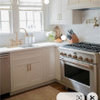
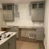
    Here are a few pictures of the whole kitchen. After suggestions from the home decorating forum, I decided to paint the kitchen green instead of brown. I think the green looks nice overall but unfortunately, I think it is making the backsplash fade into the background. The mixer will go away once I find a nice paper towel holder to go in the corner. I guess I can move the knife block by the fridge but I don't have the pantry/drawer space to move the other small appliances. I spread them out a bit because I had added a few metal accent tiles in the backsplash and I didn't want the appliances to block the tiles. Ignore the stuff by the fridge. I had to move my junk somewhere to take a picture. :) By the way, it's a very dark, dreary day today. My kitchen is normally a little brighter than the pictures are showing.

  • remodelfla
    13 years ago

    I can't tell for sure but it looks like your backsplash material is some sort of stone/slate/quartzite. Use a stone enhancer on it if you want to punch up the colors in it. If you wet the stone with water; it'll give you an idea of what it will look like.

  • warmfridge
    13 years ago

    I think part of the problem is your lighting. Try sticking up a couple of undercabinet lights and see if it makes a difference.

  • jamaraz
    Original Author
    13 years ago

    It's actually handmade ceramic tiles. It's Walker Zanger from the Ceramica Allehambra line. I forgot to put the undercabinet lighting on in the picture. Unfortunately, with the grout color I think the lighting makes the backsplash look more washed out looking with the brighter light.

  • charlikin
    13 years ago

    I really like the backsplash - nice colors when you look closely, and I like that they don't scream out at you. Very soothing. The green paint color is nice too. I agree with suggestions on bringing out the color more with colored knobs - that would be really pretty with your cabinets.

    Looking at the new pics you posted of the whole kitchen - I dunno, just my opinion, but I *really* like it. :-)

  • dlr98004
    13 years ago

    I agree with others, it looks nice! A couple of ideas to make it pop a little more - perhaps oil rubbed bronze handles (I spray painted ours and they turned out great!) and perhaps a few splashes of color that compliment your green - maybe red flower vase with flowers, red hand towel, rug, etc. Just a splash - don't overdo!
    I think that might add a sparkle that would be interesting. Good luck!

  • pamelah
    13 years ago

    I think the room needs an accent color in the blue to blue violet range to cool the warm yellow shades from your cabinets and floors. Take a look at a color wheel. Your complementary colors are in that range. I would used a shaded blue violet. I have used this color combination with very pleasing results.

    Re the previous poster's suggestion of red - if you go that route you will definately complement the greens, but I am worried about the effect with the golden toned woods.

    Have fun with your new kitchen!

  • rhome410
    13 years ago

    I love the paint color, but I think I'm agreeing with Igloo in imagining that a shade or two darker would bring out the deeper tones in the backsplash and liven it up a bit. Right now the cabinets, backsplash, and wall are all the medium tones and are blending, rather than having some contrast and interest to energize the space. I also agree that the equal spacing of equally sized appliances/accessories on the counter create a monotonous rhythm, whereas some more interesting or even random grouping might be preferable. Maybe throw in a sugar and creamer or something of varied color, shape, and height to add to the mix.

  • Jeane Gallo
    13 years ago

    I was thinking that replacing the cabinet hardware with black ones would make the backsplash pop more. When we put ours in, it made the ORB hardware stand out more.

  • prairie-girl
    13 years ago

    Hi, I know some folks have stained their grout with really good success. You might want to try darkening it a tad. That might help you love it. :o)
    ~Missy

    Here is a link that might be useful: how to stain grout

  • doggonegardener
    13 years ago

    It's too bad you don't like it. I really think it looks wonderful. Love the mix of colors and shades. I think it looks super!

  • jamaraz
    Original Author
    13 years ago

    Thanks everyone. It's not that I hate it...it's just it looked much nicer before it was grouted and the room was painted green. Now everything blends too well and the backsplash just fades into the background instead of being a showpiece. I don't know if it's a function of being grouted and the whole piece looks 2 dimensional instead of 3 dimensional with the individual tiles.

    The grout color is definitely lighter than I had intended. I picked an ivory and although it's the correct color, it comes out looking much whiter than I had anticipated. Would staining it a darker color help me or am I just spinning my wheels?

  • blondelle
    13 years ago

    Here's how it looks with a gray green, and a rusty colored grout. It should an easy fix and it adds a bit more interest.

  • jamaraz
    Original Author
    13 years ago

    blonelle, that is so cool. Do you think you can do it in an almond color?

  • blondelle
    13 years ago

    It's not far from almond now, but the grout is a warmer color now.

  • jamaraz
    Original Author
    13 years ago

    Thanks Blondelle. That's much closer to the color that I actually picked. Do you think it's worth changing out the grout? It's not a huge difference but the darker is definitely warmer.