


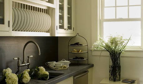
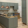
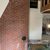
What do you think of this kitchen?
yttocs3
12 years ago


Sort by:Oldest
Comments (24)
Related Stories
KITCHEN DESIGNThink Zinc for Kitchen Countertops
Adaptability is the hallmark of zinc for kitchen countertops, combining the durability of metal with the natural look of stone
Full Story
SMALL KITCHENS10 Things You Didn't Think Would Fit in a Small Kitchen
Don't assume you have to do without those windows, that island, a home office space, your prized collections or an eat-in nook
Full Story
SHOP HOUZZShop Houzz: What’s Hot in the Kitchen? Think Pink
A little hot pink can make a grand statement paired with neutrals in the kitchen
Full Story
MODERN ARCHITECTUREBuilding on a Budget? Think ‘Unfitted’
Prefab buildings and commercial fittings help cut the cost of housing and give you a space that’s more flexible
Full Story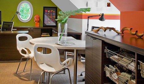
DECORATING GUIDESPro to Pro: Learn Your Client’s Thinking Style
Knowing how someone thinks can help you determine the best way to conduct an interior design presentation
Full Story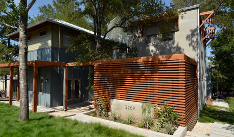
HOUZZ TOURSHouzz Tour: Visit a Forward Thinking Family Complex
Four planned structures on a double lot smartly make room for the whole family or future renters
Full Story
LIFEStop the Toy Takeover by Changing the Way You Think
Make over your approach and get gift givers onboard with your decluttering efforts by providing meaningful toy alternatives
Full Story
BATHROOM WORKBOOKStandard Fixture Dimensions and Measurements for a Primary Bath
Create a luxe bathroom that functions well with these key measurements and layout tips
Full Story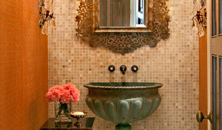
DECORATING GUIDESFor Your Next Sink, Think Unique
Any kind of vessel can do the trick — from buckets to barrels, outsized shells to old-fashioned washers
Full Story
ARCHITECTUREDesign Workshop: Thinking Differently About Doors
Go beyond utilitarian openings to use doors as art, space definers and experience enhancers
Full Story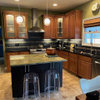
breezygirl
yttocs3Original Author
Related Professionals
Carlisle Kitchen & Bathroom Designers · Highland Kitchen & Bathroom Designers · Knoxville Kitchen & Bathroom Designers · Owasso Kitchen & Bathroom Designers · Pico Rivera Kitchen & Bathroom Remodelers · Port Charlotte Kitchen & Bathroom Remodelers · Saint Helens Kitchen & Bathroom Remodelers · Schiller Park Kitchen & Bathroom Remodelers · Sun Valley Kitchen & Bathroom Remodelers · Harrison Cabinets & Cabinetry · Los Altos Cabinets & Cabinetry · Phelan Cabinets & Cabinetry · Brookline Tile and Stone Contractors · Englewood Tile and Stone Contractors · Lake Butler Design-Build Firmsblfenton
breezygirl
Fori
harrimann
harrimann
lascatx
yttocs3Original Author
herbflavor
User
remodelfla
marcolo
maruha
adel97
yttocs3Original Author
davidro1
pricklypearcactus
formerlyflorantha
rosie
yttocs3Original Author
marcolo
Fori
davidro1