


Design Around #20 Post Real Estate REmodels.
palimpsest
11 years ago


Related Stories
SELLING YOUR HOUSE15 Questions to Ask When Interviewing a Real Estate Agent
Here’s what you should find out before selecting an agent to sell your home
Full Story
CLOSETSDesign Your Closet for the Real World
Let a professional organizer show you how to store all your clothes, shoes and accessories without blowing your budget
Full Story
KITCHEN DESIGN20 of the Coziest Kitchens Around
Reclaimed wood, exposed brick, fireplaces and distressed surfaces add warmth and character to the heart of the home
Full Story
DECORATING GUIDESWorld of Design: Decorating Ideas From 10 Renters Around the Globe
Even if you don’t own your home, you can live beautifully. Browse these ideas from international tenants who’ve made their spaces special
Full Story
KITCHEN DESIGNPearls of Wisdom From a Real-Life Kitchen Remodel
What your best friend would tell you if you were embarking on a renovation and she'd been there, done that
Full Story
LIVING ROOMS8 Reasons to Nix Your Fireplace (Yes, for Real)
Dare you consider trading that 'coveted' design feature for something you'll actually use? This logic can help
Full Story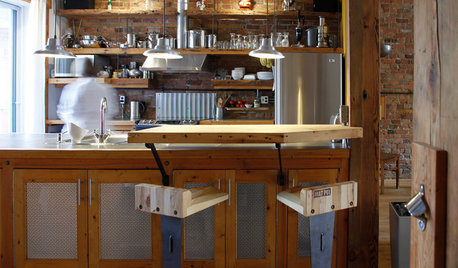
KITCHEN DESIGNPersonal Style: 50 Clever Real-Life Kitchen Design Details
Get ideas from savvy homeowners who have a knack for creating kitchens celebrating personal style
Full Story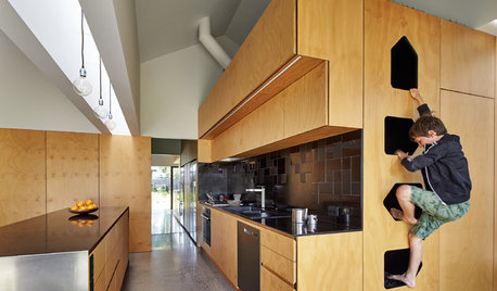
MOST POPULARKitchens Down Under: 20 Design Ideas to Inspire You
These popular Australian kitchens have exciting ideas to borrow no matter where you live
Full Story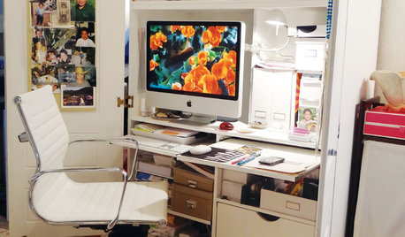
MORE ROOMS28 Great Real-Life Home Offices
Houzz Readers Prove You Can Turn Any Room Into Inspiration Central
Full Story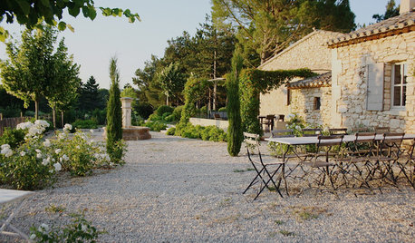
TRADITIONAL HOMESMy Houzz: A Centuries-Old French Estate Charms Again
Time and local artisans help a couple realize an idyllic French country retreat — and you can rent it
Full StoryMore Discussions


marcolo
mjsee
Related Professionals
Brownsville Kitchen & Bathroom Designers · East Peoria Kitchen & Bathroom Designers · Manchester Kitchen & Bathroom Designers · Ridgewood Kitchen & Bathroom Designers · Yorba Linda Kitchen & Bathroom Designers · Fremont Kitchen & Bathroom Remodelers · Hoffman Estates Kitchen & Bathroom Remodelers · Port Angeles Kitchen & Bathroom Remodelers · Rancho Cordova Kitchen & Bathroom Remodelers · West Palm Beach Kitchen & Bathroom Remodelers · Cranford Cabinets & Cabinetry · Land O Lakes Cabinets & Cabinetry · Lindenhurst Cabinets & Cabinetry · Watauga Cabinets & Cabinetry · North Plainfield Cabinets & Cabinetryenduring
cawaps
palimpsestOriginal Author
palimpsestOriginal Author
cawaps
lavender_lass
palimpsestOriginal Author
cawaps
orcasgramma
palimpsestOriginal Author
mjsee
mjsee
cawaps
formerlyflorantha
palimpsestOriginal Author
palimpsestOriginal Author
formerlyflorantha
formerlyflorantha
cawaps
palimpsestOriginal Author
palimpsestOriginal Author
cawaps
palimpsestOriginal Author
palimpsestOriginal Author
formerlyflorantha
pricklypearcactus
cawaps
sochi
lavender_lass
marcolo
SYinUSA, GA zone 8
cawaps
Circus Peanut
purplepansies
Circus Peanut
cawaps
lavender_lass
SYinUSA, GA zone 8
lavender_lass
SYinUSA, GA zone 8
pricklypearcactus
sochi
cawaps
angie_diy
cawaps
angie_diy
cawaps
cawaps