


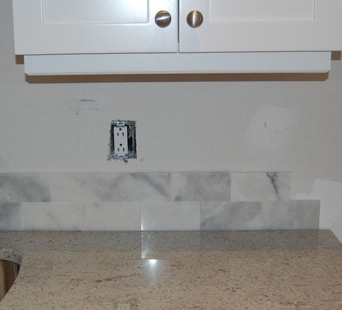
Really looking for advice about backsplash
barista9
9 years ago
Related Stories
TASTEMAKERSBook to Know: Design Advice in Greg Natale’s ‘The Tailored Interior’
The interior designer shares the 9 steps he uses to create cohesive, pleasing rooms
Full Story
DECORATING GUIDES10 Design Tips Learned From the Worst Advice Ever
If these Houzzers’ tales don’t bolster the courage of your design convictions, nothing will
Full Story
KITCHEN DESIGNSmart Investments in Kitchen Cabinetry — a Realtor's Advice
Get expert info on what cabinet features are worth the money, for both you and potential buyers of your home
Full Story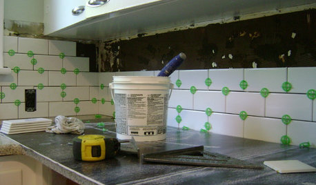
MOST POPULAR19 Kitchen Projects Every Homeowner Should Know About
Could your kitchen use a new sink, a backsplash, updated hardware, better organization, a good cleaning? Here's how to get started
Full Story
LIFEGet the Family to Pitch In: A Mom’s Advice on Chores
Foster teamwork and a sense of ownership about housekeeping to lighten your load and even boost togetherness
Full Story
DECORATING GUIDESDecorating Advice to Steal From Your Suit
Create a look of confidence that’s tailor made to fit your style by following these 7 key tips
Full Story
BATHROOM DESIGNDreaming of a Spa Tub at Home? Read This Pro Advice First
Before you float away on visions of jets and bubbles and the steamiest water around, consider these very real spa tub issues
Full Story
REMODELING GUIDESContractor Tips: Advice for Laundry Room Design
Thinking ahead when installing or moving a washer and dryer can prevent frustration and damage down the road
Full Story
Advice to Kate Middleton: Keep Calm and Carry On
Royal-Wedding Jitters? Let This Ubiquitous British Print Soothe Your Nerves
Full Story
LIFEEdit Your Photo Collection and Display It Best — a Designer's Advice
Learn why formal shots may make better album fodder, unexpected display spaces are sometimes spot-on and much more
Full StoryMore Discussions


barista9Original Author
barista9Original Author
Related Professionals
Manchester Kitchen & Bathroom Designers · South Farmingdale Kitchen & Bathroom Designers · Alpine Kitchen & Bathroom Remodelers · Auburn Kitchen & Bathroom Remodelers · Honolulu Kitchen & Bathroom Remodelers · Niles Kitchen & Bathroom Remodelers · Middlesex Kitchen & Bathroom Remodelers · Christiansburg Cabinets & Cabinetry · Land O Lakes Cabinets & Cabinetry · Potomac Cabinets & Cabinetry · Universal City Cabinets & Cabinetry · Liberty Township Cabinets & Cabinetry · Farragut Tile and Stone Contractors · Hermosa Beach Tile and Stone Contractors · Glassmanor Design-Build Firmsemmarene9
crl_
nosoccermom
michellemarie
barista9Original Author
fishymom
localeater
Bunny
annac54
barista9Original Author
farmhousebound
mominHI
barista9Original Author
Michelle
OOTM_Mom
ellendi
barista9Original Author
Evan
crl_
dcward89
greenhaven
2ajsmama
eam44
michellemarie
plumberry
barista9Original Author
Ivan I
a2gemini