


What color do you like to "POP" in your kitchen?
stacylh
10 years ago
Related Stories
DECORATING GUIDESPop Culture Watch: 12 Home Trends from the '80s Are Back
Hold on to your hat (over your humongous hair); interior design elements of the 1980s have shot forward to today, in updated fashion
Full Story
HOUZZ TOURSMy Houzz: Candy Colors Add Pop to a Once-Neglected Home
Blue cabinetry, Orla Kiely wallpaper and a reimagined staircase are just the right touches for a young family
Full Story
DECORATING GUIDESDandelions Pop Up in Home Décor
Creative wall treatments, textiles and lights are elevating the embattled weed to art
Full Story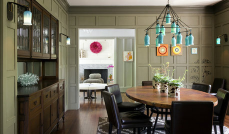
TURQUOISEColor Crush: A Pop of Turquoise
Use blue-green for happy accents and soothing walls in all types of homes
Full Story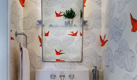
MOST POPULAR102 Eye-Popping Powder Rooms
Flip through our collection of beautiful powder rooms on Houzz and fill your eyes with color and style
Full Story
BUDGET DECORATINGPop Culture Watch: Get a Good Rap With Thrift Store Scores
Eight rooms that rock secondhand finds, in an ideabook inspired by rappers taking YouTube by storm
Full Story
DECORATING GUIDESWhy White Is the Ultimate Pop of Color
Forget bursts of orange or splashes of turquoise. Pure white can break up patterns, soften bold decor and a whole lot more
Full Story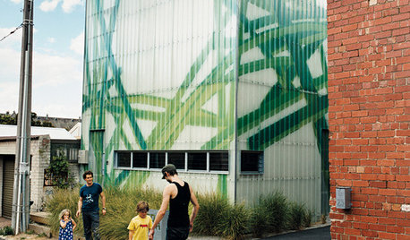
ARCHITECTURESuperb Family Homes Pop Up in Forgotten Urban Spaces
Take a look at how these innovative houses take advantage of underused spaces and improve their cities in the process
Full Story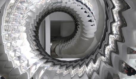
ARCHITECTUREDesign Surprises Amaze in an Eye-Popping Manhattan Penthouse
Mathematics meets fun in a most unusual 7,000-square-foot space topping a landmark New York City building
Full Story


kal34
palimpsest
Related Professionals
Baltimore Kitchen & Bathroom Designers · Barrington Hills Kitchen & Bathroom Designers · Haslett Kitchen & Bathroom Designers · Philadelphia Kitchen & Bathroom Designers · Salmon Creek Kitchen & Bathroom Designers · Bensenville Kitchen & Bathroom Designers · Fort Washington Kitchen & Bathroom Remodelers · Hickory Kitchen & Bathroom Remodelers · Islip Kitchen & Bathroom Remodelers · Richland Kitchen & Bathroom Remodelers · Salinas Kitchen & Bathroom Remodelers · Southampton Kitchen & Bathroom Remodelers · Country Club Cabinets & Cabinetry · Drexel Hill Cabinets & Cabinetry · Rowland Heights Cabinets & CabinetryUser
rosylady
Molly Phillips
fouramblues
aurorasur
mama goose_gw zn6OH
stacylhOriginal Author
Gooster
rosie
matti5
leela4
a2gemini
cawaps
motherof3sons
oldbat2be
bellsmom
mama goose_gw zn6OH
Bunny
alexx
angie_diy
Bunny
stacylhOriginal Author