


Effect of small tile patterns on the soul...
formerlyflorantha
13 years ago
Sort by:Oldest
Comments (29)
Related Stories
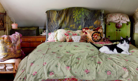
DECORATING STYLESGypsy in Your Soul: 10 Steps to a Bohemian Bedroom
If your inner boho is clamoring to be released, feed your fantasies in a gorgeously unconventional bedroom
Full Story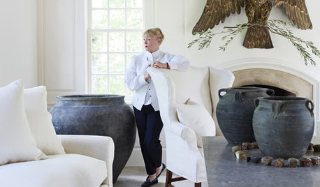
TASTEMAKERSA Designer Edits — and Adds — for Dramatic Effect
Interior designer Nancy Braithwaite’s new book shows how it’s possible to edit rooms of all styles to create their best look
Full Story
BUDGET DECORATING8 Cost-Effective Ways to Get a High-End Look
Don’t discount that expensive material yet. By using a small amount in a strategic way, you can get a luxurious look without the expense
Full Story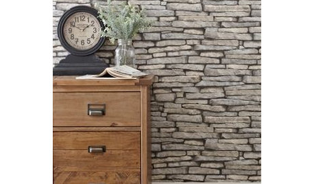
PRODUCT PICKSGuest Picks: Get in Touch With Textured-Effect Wallpapers
Mimic the look of fancy paneling, stacked stone or funky scrap wood with new wallpaper patterns on a trompe l'oeil roll
Full Story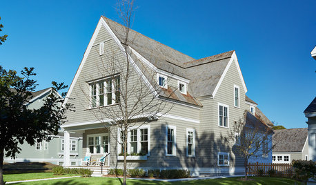
HOUZZ TOURSHouzz Tour: Traditional Shingle With a Modern Soul
A home’s shingle-style exterior fits in with the neighborhood and allows for an open, harmonious flow inside
Full Story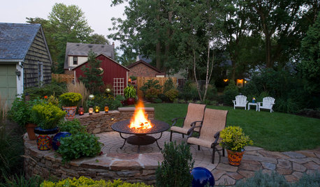
GARDENING AND LANDSCAPING7 Outdoor Fire Features Fuel the Soul
Spark some backyard bonding with a fireplace or fire pit, taking inspiration from these shining examples of great design
Full Story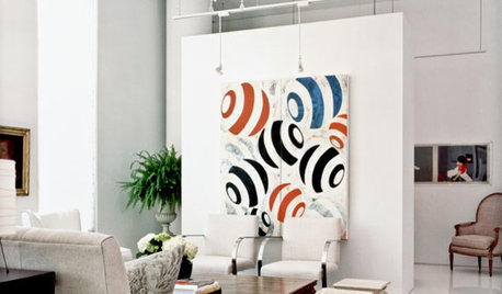
DECORATING GUIDESFrameless Art Bares Its Soul
Have you no frame? Then your artwork will fit right in with the minimalist style of today's home interiors
Full Story
REMODELING GUIDES10 Tile Patterns to Showcase Your Floor
There's more to a tile floor than the tile itself; how you lay out your tile can change the look and feel of the room
Full Story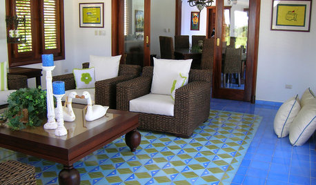
PATTERNFit to be Tiled: Get Some Pattern on the Floor for Excitement Underfoot
Get all the visual delight of a rug with more durability by treating your floors to a pattern done up in tile
Full Story
TILECelebrate the Rectangle With This Very Contemporary Tile Pattern
There are so many ways to work with stack bond tile. Here's how to keep the look super sleek — and how to change it up
Full StoryMore Discussions

calimama
chicagoans
Related Professionals
East Peoria Kitchen & Bathroom Designers · Four Corners Kitchen & Bathroom Designers · Grafton Kitchen & Bathroom Designers · Pleasant Grove Kitchen & Bathroom Designers · Eureka Kitchen & Bathroom Remodelers · Garden Grove Kitchen & Bathroom Remodelers · Republic Kitchen & Bathroom Remodelers · Spokane Kitchen & Bathroom Remodelers · Vashon Kitchen & Bathroom Remodelers · Alton Cabinets & Cabinetry · Farmers Branch Cabinets & Cabinetry · White Oak Cabinets & Cabinetry · Wyckoff Cabinets & Cabinetry · Channahon Tile and Stone Contractors · Oak Hills Design-Build Firmsmacybaby
formerlyfloranthaOriginal Author
flwrs_n_co
ekatiel
formerlyfloranthaOriginal Author
flseadog
palimpsest
dickross
boxerpups
bmorepanic
doraville
rookie_2010
zeebee
flwrs_n_co
formerlyfloranthaOriginal Author
gopintos
palimpsest
doraville
golddust
formerlyfloranthaOriginal Author
zeebee
flwrs_n_co
jcla
kippee
chocolatebunny
formerlyfloranthaOriginal Author
carybk