


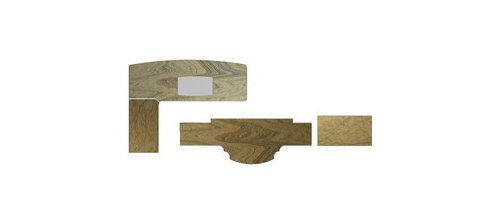
Radius details for counter edge
Megan Meyers
10 years ago


Sort by:Oldest
Comments (6)
Related Stories
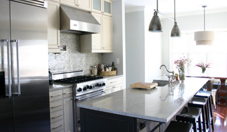
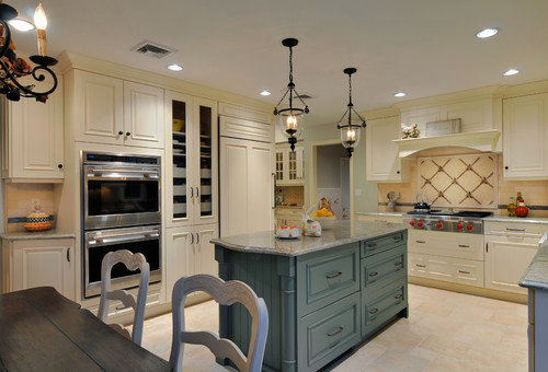
KITCHEN DESIGNKitchen Details: The Right Edge for Your Countertop
Square, Mitered, Waterfall or Bullnose? See What Counter-Edge Style Looks Best to You
Full Story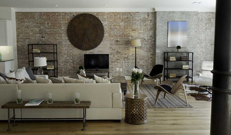
DECORATING GUIDESGet Your Edge On: 11 Ideas for Style in the Fast Lane
Show off your personality and give your design a surprising twist with one of these slightly edgier touches
Full Story
REMODELING GUIDESThe Good House: Little Design Details That Matter
Tailored trim, cool counters and a nice weighty door — such details add so much to how a home feels to the people inside
Full Story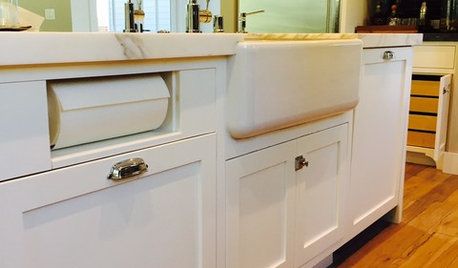
KITCHEN DESIGNKitchen Details: Out-of-Sight Paper Towel Holder
See how some homeowners are clearing the counter of clutter while keeping this necessity close at hand
Full Story
HOUZZ TOURSHouzz Tour: A Prewar Brooklyn Home Gains a Modern Edge
With geometrical cabinets, brass accents and a live edge here and there, an older home makes a presence in the present
Full Story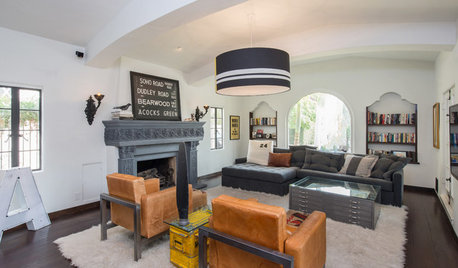
ECLECTIC HOMESHouzz Tour: Classic Spanish Style Gets a Modern Edge
Rounded curves, modern furniture and vintage ads mingle beautifully in a 1930s Los Angeles home
Full Story
LOFTSHouzz Tour: Asian Elegance With an Industrial Edge
Once a grocery warehouse, this Denver loft is now stocked with a mix of dramatic, raw and refined pieces
Full Story
HOUZZ TOURSMy Houzz: Industrial-Edged Chic in Rotterdam
DIY efforts and unplanned aesthetics with happy results create a gorgeous home for a Dutch couple
Full Story
HOUZZ TOURSMy Houzz: Industrial-Edged Comfort in Pittsburgh
Copper, cantilevers and a cat named Mr. Martin come together in this contemporary homage to regional style
Full Story


herbflavor
Megan MeyersOriginal Author
Related Professionals
Corcoran Kitchen & Bathroom Designers · Fresno Kitchen & Bathroom Designers · Ojus Kitchen & Bathroom Designers · Ramsey Kitchen & Bathroom Designers · United States Kitchen & Bathroom Designers · Gilbert Kitchen & Bathroom Remodelers · Islip Kitchen & Bathroom Remodelers · New Port Richey East Kitchen & Bathroom Remodelers · Overland Park Kitchen & Bathroom Remodelers · Rolling Hills Estates Kitchen & Bathroom Remodelers · Lawndale Kitchen & Bathroom Remodelers · Town 'n' Country Cabinets & Cabinetry · Warr Acres Cabinets & Cabinetry · Des Moines Tile and Stone Contractors · Oak Hills Design-Build FirmsUser
breezygirl
Megan MeyersOriginal Author
sombreuil_mongrel