Shop Products
Houzz Logo Print
crl_

If you chose a colorful backsplash. . .

crl_
9 years ago

If you chose a colorful backsplash, how did you decide to go for it? And how did you decide on which color? And do you regret it?

By way of background: We are in the planning stage for a small kitchen renovation in a 1926 French revival house. We are planning on white shaker cabinets and soapstone countertops, which are lovely. But I'm thinking those neutral choices might mean there's an opportunity for a colorful backsplash. Dh tends to veer widely between white subway tiles and very brightly colored, high contrast patterned tiles. I'm thinking more of a middle ground along the lines of fireclay or Heath square tiles in a solid color. I've looked at tons of inspiration pictures, looked at pictures of 1920s kitchens, thought about the colors in the existing original or near to original kitchen, and thought about colors in the rest of the house; but I haven't come to any conclusion yet.

Thanks!

Comments (17)

  • plllog
    9 years ago

    I decided on a highly colored and patterned backsplash to tone down my bamboo cabinets--which look browner and quieter in the picture. They're actually bright bambooy yellow and deeply patterned. When I ordered them, I started calling my to-be kitchen "The Bamboo Forest" and went through agonies here trying to keep them from looming and overwhelming. It's an old design trick to fight busy with busy. Instead of one thing slapping you in the face, it all becomes white noise.

    I'm concerned that "very brightly colored, high contrast patterned tiles" may overwhelm your kitchen. Tiled 1920's originals would have had tile counters to play off of, and contrast trims. You can do it if you're careful, but for a look that will wear best (i.e, that won't get tiresome), I'd go with a tile that has a significant amount of white in it, to blend with the cabinets, and add lightness over the darker soapstone. Another way to make it wear better is if you use mostly complex and secondary colors, rather than primaries. You can definitely make it work, but it's going to shout amid all that tranquility if you're not careful.

  • sas95
    9 years ago

    We used a colorful, patterned backsplash. I knew from moment one that we would be using color in our kitchen, and I love tile. So contrary to what most here on GW do, we picked the tile first and coordinated all the rest of the choices based on the tile. The shades of green and cream of the cabinets were pulled from the tile, as were the sand colored countertops. I don't regret my decisions at all.

    The trickiest thing with using color, for me, is making things look cohesive and not random. I was lucky to have a friend with a good eye for color to help me make my choices.

  • eam44
    9 years ago

    The trick is to chose ahead of time which surface you want as the showstopper, the counter or the bs (or the cabinets if you're using walnut or exotic woods). If you want an extraordinary bs to look beautiful that means no brass range hoods or stripy cabs, and a quiet counter.

    Have you seen OB2B's kitchen? It's not on the finished kitchens blog and hard to find with GWSearch, but here's an image of her extraordinary tile. She has one of the prettiest bs I've seen and it harmonizes beautifully with her kitchen.

  • dcward89
    9 years ago

    plllog...that is one of the most interesting, unique and beautiful backsplashes I have ever seen. I don't think I could ever be brave enough to do something like that but I LOVE IT!!!

  • crl_
    Original Author
    9 years ago

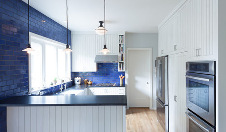
    Thank you for the pictures and thoughts! One of my saved photos has a white kitchen with a blue backsplash; I will link it.

    I have also considered a color for the cabinets with a neutral backsplash, but am a little concerned about finding a good frameless cabinet that comes in factory finished paint other than white at a price point I can afford. Maybe I should start a new thread on that.

    Here is a link that might be useful: [Houzz kitchen with blue backsplash[(https://www.houzz.com/photos/eco-historical-victorian-update-contemporary-kitchen-san-francisco-phvw-vp~989603)

  • laurencp
    9 years ago

    I also just had soapstone installed and my cabinets painted white. I love love love the look of a bright backsplash, but I was not brave enough!

    I ordered samples from Fireclay but they did not work. The colors they offer are absolutely stunning and someone with the right eye could pull together something amazing!

    I am well familiar witht he inspration blue kitchen from Houzz - loved it! I ended up going with a muted blue crackle.

    I look forward to following your choices! Good luck!

  • malabacat_gw
    9 years ago

    crl, I love that kitchen's bs in your link. I absolutely think you should go for a colorful bs with the countertop and cabinets you've chosen. Imo it will be a lovely focal point that enhances your kitchen. And I think you're on the right track that all one color would work best. If you don't have an eye for color (and I certainly don't) get someone who does to help pick out a good color for your particular slab of soapstone. I'm a big fan of color but my husband is color phobic :-) so I have lived in our house for two decades with white walls and white tile and neutral boring everything as my husband has slowly come to enjoy color. So our choice was easy-we are adding color. We don't start our remodel in June, but have chosen for our bs Fireclay's Island Flower, a blue glass tile to brighten our otherwise neutral kitchen, and tie in to a blue glass table we have.

  • feisty68
    9 years ago

    You can design your own encaustic cement tile and even use early 20th century patterns - they are very beautiful and definitely what I would use if I wanted a colourful backsplash.

    Here is a link that might be useful: Encaustic cement tiles

  • crl_
    Original Author
    9 years ago

    Malabacat, you make a good point about making the final color choice after the soapstone slab has been identified. I am hoping for a hard grey/charcoal stone, but who knows what we will be able to find and exactly what the undertones might be. I'm thinking yellow might be the easiest to coordinate with the soapstone.

    Feisty, such pretty tiles. Dh loves those. I'm a bit pattern phobic and I'm not sure I can commit to that much pattern in a space I work in everyday. I'd love them for an entryway I think.

    Thank you all!

  • plllog
    9 years ago

    Crl,

    Here's some analysis: Notice in your Houzz picture that the cabinets go wall to wall to ceiling (soffit or beam or whatever) and the blue is in plain subways. Also note that the counter is light, so there is a value (light/dark) contrast to the tiles.

    With the soapstone, especially if you're going to oil it, going a bit lighter will make it easier to find a tile that looks good.

    Dcward89, thanks for the kind words. :) I hope Crl can use my arguments if she gets pushback on the pattern issue. :)

  • nmjen
    9 years ago

    Sadly, I don't yet have pictures to share, but we've chosen a color scheme very similar to your Houzz inspiration pic--off-white cabinets, leathered black granite and blue arabesque tiles. I will share pictures as soon as I'm able!

    You might also like a look like this, where the tile is slightly more muted: https://www.houzz.com/photos/mt-tabor-kitchen-remodel-transitional-kitchen-portland-phvw-vp~1808685-Tabor-Remodel-transitional-kitchen-portland

  • oldbat2be
    9 years ago

    Pillog - what a pleasure to see your tile again, gorgeous!

    EAM44 - Thanks!! Your kind words were very much appreciated. I love reading your tile posts and recommendations.

    CRL_ - I picked the bold tile to draw attention away from other mistakes (way too much white) and overall, am very pleased 2+ years later. Don't forget texture and shape as options as well.

    Ann Saks Nottingham:

    Ann Sacks hex:

    I don't know if this qualifies as colorful :)

  • crl_
    Original Author
    9 years ago

    Thank you all so much for the pictures and helpful input! I had thought if doing a white tile backsplash with lots of texture, but dh did not like any of the pictures I showed him. Weirdo. Just kidding.

    He did really like the blue backsplash so that's progress of a sort.

  • eam44
    9 years ago

    Crl, just keep working on him!

    OB2B, you're welcome, and of course that qualifies as colorful! I don't think I've seen that image before. So gorgeous!!!

  • laurencp
    9 years ago

    Bumping to see if you have reached a decision! Keep us posted!

  • crl_
    Original Author
    9 years ago

    We are a ways off from any final decisions. Our contractor is very busy these days and we are waiting on his availability. I'm trying to make choices now because I want him to give us a real bid, which he will gladly do as soon as I get enough data for him; and because I tend to be a bit obsessive when it comes to planning.

    I really appreciate all the input here, so helpful!

    And since this got bumped, I'm linking another blue backsplash I like. This one is paler and a different shaped tile.

    Here is a link that might be useful: [Paler blue backsplash[(https://www.houzz.com/photos/kenwood-cottage-traditional-kitchen-minneapolis-phvw-vp~5569719)

  • laurencp
    9 years ago

    That is beautiful - I love it!