


Picking paint and the tale of 2/3
mrsmortarmixer
11 years ago
Related Stories

PRODUCT PICKSGuest Picks: Tell a Folklore Design Tale
Take a page from traditional crafts around the world with these accessories offering rich colors and patterns
Full Story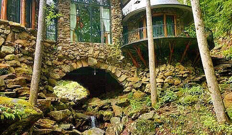
FUN HOUZZ31 True Tales of Remodeling Gone Wild
Drugs, sex, excess — the home design industry is rife with stories that will blow your mind, or at least leave you scratching your head
Full Story
MOST POPULARThanksgiving Tales: When the Turkey Tanks
Houzz readers prove adept at snatching victory from the jaws of entertaining defeat
Full Story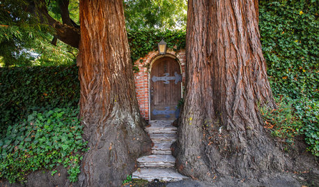
FUN HOUZZ14 Gardens Straight Out of Fairy Tales
Escape into landscapes that conjure the magical worlds of folklore and literature
Full Story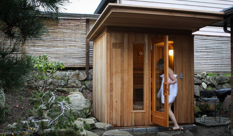
OUTBUILDINGSMy Houzz: A Tale of 2 Saunas
A trip to Finland, an inspiring photo and a twinge of envy lead two Seattle couples to build their versions of a dream sauna
Full Story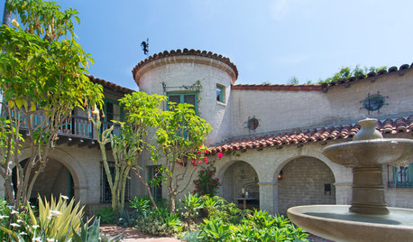
HOUZZ TOURSMy Houzz: Fairy-Tale Charm in a Historic Hollywood Landmark
Just a stone’s throw away from Hollywood Boulevard, vine-covered walls hide a magical courtyard and a couple’s condo
Full Story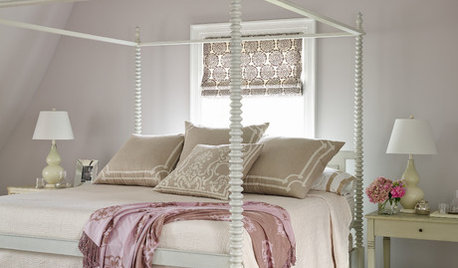
DECORATING GUIDES11 Fairy-Tale Bedroom Flourishes to Fall in Love With
Add an enchanting finishing touch to a luxurious boudoir with these pretty accessories and small furnishings
Full Story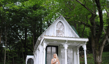
HOUZZ TOURSVisit a Victorian Fairy-Tale Retreat in the Woods
This renovated cabin is an ultra-feminine getaway
Full Story
COLORPick-a-Paint Help: How to Quit Procrastinating on Color Choice
If you're up to your ears in paint chips but no further to pinning down a hue, our new 3-part series is for you
Full Story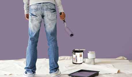
PAINTINGBulletproof Decorating: How to Pick the Right Kind of Paint
Choose a paint with some heft and a little sheen for walls and ceilings with long-lasting good looks. Here are some getting-started tips
Full StoryMore Discussions


weissman
eleena
Related Professionals
Albany Kitchen & Bathroom Designers · Federal Heights Kitchen & Bathroom Designers · Peru Kitchen & Bathroom Designers · Calverton Kitchen & Bathroom Remodelers · Hoffman Estates Kitchen & Bathroom Remodelers · Omaha Kitchen & Bathroom Remodelers · Middlesex Kitchen & Bathroom Remodelers · Westminster Kitchen & Bathroom Remodelers · Murray Cabinets & Cabinetry · Newcastle Cabinets & Cabinetry · Norfolk Cabinets & Cabinetry · Prior Lake Cabinets & Cabinetry · Red Bank Cabinets & Cabinetry · Rowland Heights Cabinets & Cabinetry · Yorkville Design-Build FirmsSalmon Falls Cabinetry
Molly Phillips
Molly Phillips
hemera
Holly- Kay
Vertise
soibean
mommaklee
ginny20
localeater
Vertise
mrsmortarmixerOriginal Author
Gooster
deedles
oldbat2be
mrsmortarmixerOriginal Author
mpagmom (SW Ohio)
laughablemoments
laughablemoments
mark_rachel
cawaps
beachpea3
mrsmortarmixerOriginal Author
mpagmom (SW Ohio)
rococogurl
mpagmom (SW Ohio)
mpagmom (SW Ohio)
aannneeee
laughablemoments
mrsmortarmixerOriginal Author
mrsmortarmixerOriginal Author
powermuffin
deedles
Holly- Kay
raee_gw zone 5b-6a Ohio
mrsmortarmixerOriginal Author