


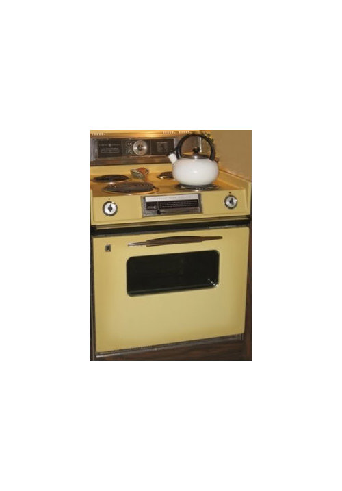
Design Around #19:Chestertown Buff & Rosemary Sprig.
palimpsest
12 years ago


Sort by:Oldest
Comments (17)
Related Stories

COLOR12 Tried-and-True Paint Colors for Your Walls
Discover one pro designer's time-tested favorite paint colors for kitchens, baths, bedrooms and more
Full Story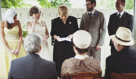
WEDDINGSHouzz Call: Show Us Your Backyard Wedding!
Did you say ‘I do’ at home? We want to hear and see everything about it. Share your photos and you could be featured in an upcoming ideabook
Full Story
FEEL-GOOD HOME21 Ways to Waste Less at Home
Whether it's herbs rotting in the fridge or clothes that never get worn, most of us waste too much. Here are ways to make a change
Full Story
DECORATING GUIDESPaint Color Ideas: 8 Uplifting Ways With Yellow and Green
Dial up the cheer with yellow and green paint combinations sure to cast off winter doldrums
Full Story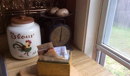
KITCHEN DESIGN5 Home Cooks Share Their Favorite Family Recipes
Peek inside the kitchens of these Houzz users and learn how to cook their time-tested, passed-down dishes
Full StorySponsored
Industry Leading Interior Designers & Decorators in Franklin County
More Discussions


formerlyflorantha
palimpsestOriginal Author
Related Professionals
Carson Kitchen & Bathroom Designers · El Dorado Hills Kitchen & Bathroom Designers · Peru Kitchen & Bathroom Designers · Philadelphia Kitchen & Bathroom Designers · Plymouth Kitchen & Bathroom Designers · Williamstown Kitchen & Bathroom Designers · Reedley Kitchen & Bathroom Designers · South Farmingdale Kitchen & Bathroom Designers · University City Kitchen & Bathroom Remodelers · Salinas Kitchen & Bathroom Remodelers · Alton Cabinets & Cabinetry · Daly City Cabinets & Cabinetry · Middletown Cabinets & Cabinetry · Charlottesville Tile and Stone Contractors · Oak Hills Design-Build FirmspalimpsestOriginal Author
cj47
purplepansies
palimpsestOriginal Author
seashellsandpearls
lavender_lass
marcolo
angie_diy
palimpsestOriginal Author
cawaps
debrak_2008
palimpsestOriginal Author
cj47
marcolo
palimpsestOriginal Author